我将使用
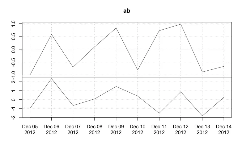
考虑以下对plot.xts函数的调用:
xtsExtra来绘制两个xts对象。考虑以下对plot.xts函数的调用:
plot.xts(merge(a,b),screens=c(1,2))
这是用于在两个独立面板中绘制xts对象a和b的函数。
我该如何控制y轴的间距?具体来说,我遇到了y轴标签过于接近甚至重叠的问题。
理想情况下,我希望指定最小填充空间,以便在两个y轴标签之间保持一定距离。感谢任何帮助!
编辑:一个可复现的示例:
#install if needed
#install.packages("xtsExtra", repos="http://R-Forge.R-project.org")
library(xtsExtra)

ab=structure(c(-1, 0.579760106421202, -0.693649703427259, 0.0960078627769613,
0.829770469089809, -0.804276208608663, 0.72574639798749, 0.977165659135716,
-0.880178529686181, -0.662078620277974, -1, 2.35268982675599,
-0.673979231663719, 0.0673890875594205, 1.46584597734824, 0.38403707067242,
-1.53638088345349, 0.868743976582955, -1.8394614923913, 0.246736581314485
), .Dim = c(10L, 2L), .Dimnames = list(NULL, c("a", "b")), index = structure(c(1354683600,
1354770000, 1354856400, 1354942800, 1355029200, 1355115600, 1355202000,
1355288400, 1355374800, 1355461200), tzone = "", tclass = "Date"), class = c("xts",
"zoo"), .indexCLASS = "Date", .indexTZ = "", tclass = "Date", tzone = "")

plot.xts(ab,screens=c(1,2))
这将产生:
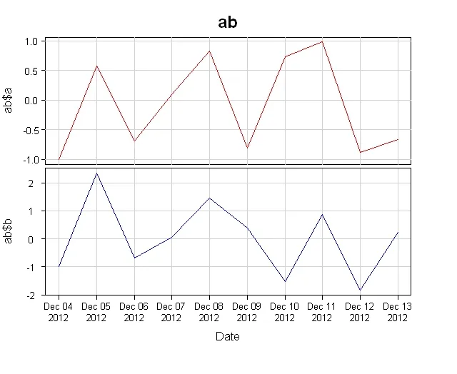
plot(merge(a,b), yax.loc='flip')- GSee