我正在尝试使用ggvis为2014赛季创建NFL强度排名图表。数据来自FootballOutsiders.com,稍后我将制作一个Shiny应用程序,在赛季更新时自动从网站上抓取数据。下面的示例非常接近,但我想做一些修改。我想要:
这是图表: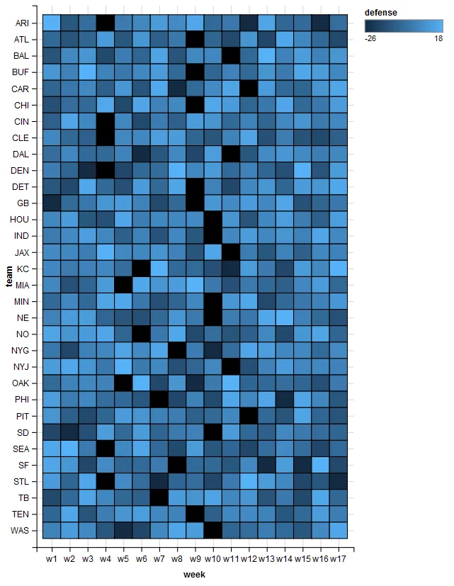 这是数据:
这是数据:
在图表的每个单元格中包含“防守”数值,使可视化效果类似于原始的“df”数据框。
自定义颜色比例,使正值越来越橙色,负值越来越蓝色(即更负=更蓝)。
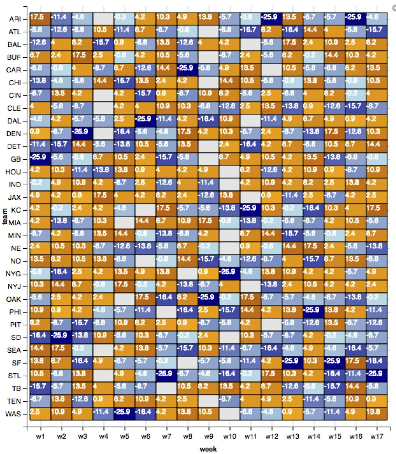
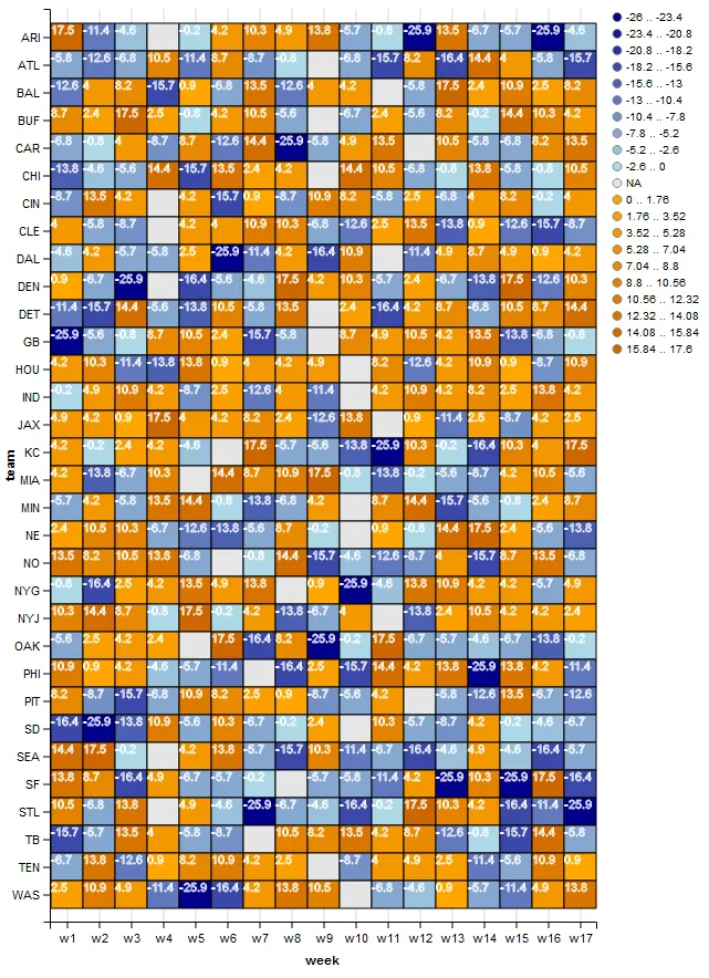
替代方案2可以是从橙色到蓝色的渐变,并使“防御”的值接近零时不透明度降低至0.5。
能够选择NA的颜色,因为它目前在图表中显示为黑色。
这是图表:
这是数据:df <- structure(list(team = c("ARI", "ATL", "BAL", "BUF", "CAR", "CHI",
"CIN", "CLE", "DAL", "DEN", "DET", "GB", "HOU", "IND", "JAX",
"KC", "MIA", "MIN", "NE", "NO", "NYG", "NYJ", "OAK", "PHI", "PIT",
"SD", "SEA", "SF", "STL", "TB", "TEN", "WAS"), w1 = c(17.5, -5.8,
-12.6, 8.7, -6.8, -13.8, -8.7, 4, -4.6, 0.9, -11.4, -25.9, 4.2,
-0.2, 4.9, 4.2, 4.2, -5.7, 2.4, 13.5, -0.8, 10.3, -5.6, 10.9,
8.2, -16.4, 14.4, 13.8, 10.5, -15.7, -6.7, 2.5), w2 = c(-11.4,
-12.6, 4, 2.4, -0.8, -4.6, 13.5, -5.8, 4.2, -6.7, -15.7, -5.6,
10.3, 4.9, 4.2, -0.2, -13.8, 4.2, 10.5, 8.2, -16.4, 14.4, 2.5,
0.9, -8.7, -25.9, 17.5, 8.7, -6.8, -5.7, 13.8, 10.9), w3 = c(-4.6,
-6.8, 8.2, 17.5, 4, -5.6, 4.2, -8.7, -5.7, -25.9, 14.4, -0.8,
-11.4, 10.9, 0.9, 2.4, -6.7, -5.8, 10.3, 10.5, 2.5, 8.7, 4.2,
4.2, -15.7, -13.8, -0.2, -16.4, 13.8, 13.5, -12.6, 4.9), w4 = c(NA,
10.5, -15.7, 2.5, -8.7, 14.4, NA, NA, -5.8, NA, -5.6, 8.7, -13.8,
4.2, 17.5, 4.2, 10.3, 13.5, -6.7, 13.8, 4.2, -0.8, 2.4, -4.6,
-6.8, 10.9, NA, 4.9, NA, 4, 0.9, -11.4), w5 = c(-0.2, -11.4,
0.9, -0.8, 8.7, -15.7, 4.2, 4.2, 2.5, -16.4, -13.8, 10.5, 13.8,
-8.7, 4, -4.6, NA, 14.4, -12.6, -6.8, 13.5, 17.5, NA, -5.7, 10.9,
-5.6, 4.2, -6.7, 4.9, -5.8, 8.2, -25.9), w6 = c(4.2, 8.7, -6.8,
4.2, -12.6, 13.5, -15.7, 4, -25.9, -5.6, 10.5, 2.4, 0.9, 2.5,
4.2, NA, 14.4, -0.8, -13.8, NA, 4.9, -0.2, 17.5, -11.4, 8.2,
10.3, 13.8, -5.7, -4.6, -8.7, 10.9, -16.4), w7 = c(10.3, -8.7,
13.5, 10.5, 14.4, 2.4, 0.9, 10.9, -11.4, -4.6, -5.8, -15.7, 4,
-12.6, 8.2, 17.5, 8.7, -13.8, -5.6, -0.8, 13.8, 4.2, -16.4, NA,
2.5, -6.7, -5.7, -0.2, -25.9, NA, 4.2, 4.2), w8 = c(4.9, -0.8,
-12.6, -5.6, -25.9, 4.2, -8.7, 10.3, 4.2, 17.5, 13.5, -5.8, 4.2,
4, 2.4, -5.7, 10.9, -6.8, 8.7, 14.4, NA, -13.8, 8.2, -16.4, 0.9,
-0.2, -15.7, NA, -6.7, 10.5, 2.5, 13.8), w9 = c(13.8, NA, 4,
NA, -5.8, NA, 10.9, -6.8, -16.4, 4.2, NA, NA, 4.9, -11.4, -12.6,
-5.6, 17.5, 4.2, -0.2, -15.7, 0.9, -6.7, -25.9, 2.5, -8.7, 2.4,
10.3, -5.7, -4.6, 8.2, NA, 10.5), w10 = c(-5.7, -6.8, 4.2, -6.7,
4.9, 14.4, 8.2, -12.6, 10.9, 10.3, 2.4, 8.7, NA, NA, 13.8, -13.8,
-0.8, NA, NA, -4.6, -25.9, 4, -0.2, -15.7, -5.6, NA, -11.4, -5.8,
-16.4, 13.5, -8.7, NA), w11 = c(-0.8, -15.7, NA, 2.4, 13.5, 10.5,
-5.8, 2.5, NA, -5.7, -16.4, 4.9, 8.2, 4.2, NA, -25.9, -13.8,
8.7, 0.9, -12.6, -4.6, NA, 17.5, 14.4, 4.2, 10.3, -6.7, -11.4,
-0.2, 4.2, 4, -6.8), w12 = c(-25.9, 8.2, -5.8, -5.6, NA, -6.8,
2.5, 13.5, -11.4, 2.4, 4.2, 10.5, -12.6, 10.9, 0.9, 10.3, -0.2,
14.4, -0.8, -8.7, 13.8, -13.8, -6.7, 4.2, NA, -5.7, -16.4, 4.2,
17.5, 8.7, 4.9, -4.6), w13 = c(13.5, -16.4, 17.5, 8.2, 10.5,
-0.8, -6.8, -13.8, 4.9, -6.7, 8.7, 4.2, 4.2, 4.2, -11.4, -0.2,
-5.6, -15.7, 14.4, 4, 10.9, 2.4, -5.7, 13.8, -5.8, -8.7, -4.6,
-25.9, 10.3, -12.6, 2.5, 0.9), w14 = c(-6.7, 14.4, 2.4, -0.2,
-5.8, 13.8, 4, 0.9, 8.7, -13.8, -6.8, 13.5, 10.9, 8.2, 2.5, -16.4,
-8.7, -5.6, 17.5, -15.7, 4.2, 10.5, -4.6, -25.9, -12.6, 4.2,
4.9, 10.3, 4.2, -0.8, -11.4, -5.7), w15 = c(-5.7, 4, 10.9, 14.4,
-6.8, -5.8, 8.2, -12.6, 4.9, 17.5, 10.5, -13.8, 0.9, 2.5, -8.7,
10.3, 4.2, -0.8, 2.4, 8.7, 4.2, 4.2, -6.7, 13.8, 13.5, -0.2,
-4.6, -25.9, -16.4, -15.7, -5.6, -11.4), w16 = c(-25.9, -5.8,
2.5, 10.3, 8.2, -0.8, -0.2, -15.7, 0.9, -12.6, 8.7, -6.8, -8.7,
13.8, 4.2, 4, 10.5, 2.4, -5.6, 13.5, -5.7, 4.2, -13.8, 4.2, -6.7,
-4.6, -16.4, 17.5, -11.4, 14.4, 10.9, 4.9), w17 = c(-4.6, -15.7,
8.2, 4.2, 13.5, 10.5, 4, -8.7, 4.2, 10.3, 14.4, -0.8, 10.9, 4.2,
2.5, 17.5, -5.6, 8.7, -13.8, -6.8, 4.9, 2.4, -0.2, -11.4, -12.6,
-6.7, -5.7, -16.4, -25.9, -5.8, 0.9, 13.8)), .Names = c("team",
"w1", "w2", "w3", "w4", "w5", "w6", "w7", "w8", "w9", "w10",
"w11", "w12", "w13", "w14", "w15", "w16", "w17"), row.names = c(NA,
32L), class = "data.frame")
以下是目前的代码:
require(dplyr)
require(ggvis)
require(tidyr) # For the gather function

df2 <- df %>% gather(key, value, w1:w17)
names(df2) <- c("team", "week", "defense")

df2 %>%
  ggvis(~week, ~team, fill = ~defense) %>%
  layer_rects(width = band(), height = band()) %>%
  scale_nominal("x", padding = 0, points = FALSE) %>%
  scale_nominal("y", padding = 0, points = FALSE)
ggvis了,因为它一直在快速发展。我同意让比例函数来处理这个问题会更好。希望现在或不久的将来会有解决方法。我还想找到一种方法来更好地控制数字放置在单元格中的位置。 - eipi10