如何将新Material Design的BottomAppBar实现为BottomNavigationView
4
解决方案
基本上,我没有尝试强制将菜单资源放入所需的布局中,而是使用了另一种解决方案,我只是在BottomAppBar内部使用LinearLayout,如@dglozano所建议的,使用“空”元素。
使用?attr/selectableItemBackgroundBorderless,我也能够实现一个与BottomNavigationView非常相似的效果。
<com.google.android.material.bottomappbar.BottomAppBar
    android:id="@+id/bar"
    android:layout_width="match_parent"
    android:layout_height="wrap_content"
    android:layout_gravity="bottom"
    android:gravity="center"
    app:layout_anchorGravity="start"
    app:hideOnScroll="true"
    app:fabAnimationMode="scale"
    app:fabAlignmentMode="center"
    app:contentInsetEnd="16dp"
    app:contentInsetStart="16dp"
    app:backgroundTint="@color/colorPrimary">

    <LinearLayout
        android:layout_width="match_parent"
        android:layout_height="wrap_content"
        android:weightSum="5">
        <ImageButton
            android:layout_width="0dp"
            android:layout_height="wrap_content"
            android:layout_weight="1"
            app:srcCompat="@drawable/ic_home_white_24dp"
            android:background="?attr/selectableItemBackgroundBorderless"
            android:tint="@color/secondary_text"/>
        <ImageButton
            android:layout_width="0dp"
            android:layout_height="wrap_content"
            android:layout_weight="1"
            app:srcCompat="@drawable/ic_map_black_24dp"
            android:background="?attr/selectableItemBackgroundBorderless"/>
        <ImageButton
            android:layout_width="0dp"
            android:layout_height="wrap_content"
            android:layout_weight="1"
            android:background="@android:color/transparent"/>
        <ImageButton
            android:layout_width="0dp"
            android:layout_height="wrap_content"
            android:layout_weight="1"
            app:srcCompat="@drawable/ic_people_white_24dp"
            android:background="?attr/selectableItemBackgroundBorderless"/>
        <ImageButton
            android:layout_width="0dp"
            android:layout_height="wrap_content"
            android:layout_weight="1"
            app:srcCompat="@drawable/ic_account_circle_24dp"
            android:background="?attr/selectableItemBackgroundBorderless"/>
    </LinearLayout>
</com.google.android.material.bottomappbar.BottomAppBar>
3
XML:
<androidx.coordinatorlayout.widget.CoordinatorLayout xmlns:android="http://schemas.android.com/apk/res/android"
xmlns:app="http://schemas.android.com/apk/res-auto"
android:id="@+id/lt_content"
android:layout_width="match_parent"
android:layout_height="match_parent"
android:background="@color/white"
android:fitsSystemWindows="false">


<ViewPager
    android:id="@+id/main_pager"
    android:layout_width="match_parent"
    android:layout_height="match_parent"
    android:layout_marginBottom="56dp"
    android:layout_above="@+id/bottom_navigation"
    android:layout_alignParentStart="true" />


<com.google.android.material.bottomnavigation.BottomNavigationView
    android:id="@+id/bottom_navigation"
    android:layout_width="match_parent"
    android:layout_height="wrap_content"
    app:labelVisibilityMode="labeled"
    android:layout_gravity="bottom"
    android:layout_alignParentBottom="true"
    android:background="@color/transparent"
    app:menu="@menu/bottom_menu" />

<com.google.android.material.bottomappbar.BottomAppBar
    android:layout_width="match_parent"
    android:layout_height="wrap_content"
    android:id="@+id/bottom_bar"
    android:layout_gravity="bottom"/>

<com.google.android.material.floatingactionbutton.FloatingActionButton
    android:id="@+id/fab"
    android:layout_width="wrap_content"
    android:layout_height="wrap_content"
    app:layout_anchor="@id/bottom_bar"/>
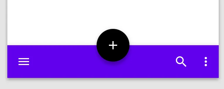
实现 Android 材料组件的团队表示,这种设计不是规范的一部分,但他们慷慨地提供了一个简单的解决方案,可以在下面的链接中看到。
是否可能使用菜单使 BottomAppBar 和 FloatingActionButton 均匀分布?#72
基本上,需要更改菜单按钮容器的布局参数:
if(bottomAppBar.childCount > 0) {
     val actionMenuView = bottomAppBar.getChildAt(0) as androidx.appcompat.widget.ActionMenuView
     actionMenuView.layoutParams.width = androidx.appcompat.widget.ActionMenuView.LayoutParams.MATCH_PARENT
}
这个和你的空菜单项结合起来就可以了,避免使用另一个Android组件。
1 - 在build.gradle文件中将Maven添加到您的存储库中
allprojects {
    repositories {
        jcenter()
        maven {
            url "https://maven.google.com"
        }
    }
}
2 - 在你的 build.gradle 文件中添加材料组件依赖。请记住,材料版本会定期更新。
implementation 'com.google.android.material:material:1.0.0-alpha1'
3 - 将compileSdkVersion和targetSdkVersion设置为最新的Android P API版本,即28。
4 - 确保您的应用程序继承Theme.MaterialComponents主题,以便使BottomAppBar使用最新的样式。或者,您可以在布局xml文件中的小部件声明中声明BottomAppBar的样式,如下所示。
style=”@style/Widget.MaterialComponents.BottomAppBar”
5 - 您可以按以下方式将BottomAppBar包含在您的布局中。 BottomAppBar必须是CoordinatorLayout的子级。
<com.google.android.material.bottomappbar.BottomAppBar
android:id="@+id/bottom_app_bar"
android:layout_width="match_parent"
android:layout_height="wrap_content"
android:layout_gravity="bottom"
app:backgroundTint="@color/colorPrimary"
app:fabAlignmentMode="center"
app:fabAttached="true"
app:navigationIcon="@drawable/baseline_menu_white_24"/>
6 - 您可以通过在FAB的app:layout_anchor属性中指定BottomAppBar的id,将浮动操作按钮(FAB)锚定到BottomAppBar上。 BottomAppBar可以使用形状背景来托底FAB,也可以让FAB重叠在BottomAppBar上。
<com.google.android.material.floatingactionbutton.FloatingActionButton
android:id="@+id/fab"
android:layout_width="wrap_content"
android:layout_height="wrap_content"
android:src="@drawable/baseline_add_white_24"
app:layout_anchor="@id/bottom_app_bar" />
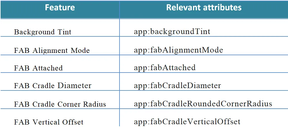
7 - 有许多属性可用于配置底部导航栏和Fab图标。
更新: 查看OP答案,获取他特定问题的最终解决方案。
3
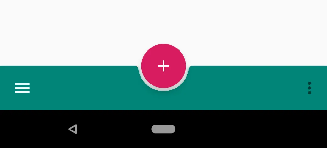
这可能会帮助某些人实现上述设计。添加空菜单项以调整fab按钮和间距。
<androidx.coordinatorlayout.widget.CoordinatorLayout
        android:layout_width="match_parent"
        android:layout_height="match_parent"
        android:background="@color/gray"
        app:layout_constraintBottom_toBottomOf="parent"
        app:layout_constraintEnd_toEndOf="parent"
        app:layout_constraintStart_toStartOf="parent"
        app:layout_constraintTop_toTopOf="parent">


     <com.google.android.material.bottomappbar.BottomAppBar
            android:id="@+id/bottom_bar"
            style="@style/AppTheme.BottomAppBar"
            android:layout_width="match_parent"
            android:layout_height="?android:attr/actionBarSize"
            android:layout_gravity="bottom"
            android:backgroundTint="@color/bottom_bar">

        <com.google.android.material.bottomnavigation.BottomNavigationView
                android:layout_width="match_parent"
                android:layout_height="wrap_content"
                android:background="@android:color/transparent"
                app:itemIconTint="@color/white"
                app:labelVisibilityMode="unlabeled"
                app:menu="@menu/bottom_menu">

        </com.google.android.material.bottomnavigation.BottomNavigationView>
    </com.google.android.material.bottomappbar.BottomAppBar>


    <com.google.android.material.floatingactionbutton.FloatingActionButton
            android:id="@+id/fab_button"
            android:layout_width="wrap_content"
            android:layout_height="wrap_content"
            android:backgroundTint="@color/bottom_bar"
            android:src="@drawable/ic_plus"
            android:visibility="visible"
            app:borderWidth="0dp"
            app:fabAlignmentMode="end"
            app:fabCradleMargin="20dp"
            app:fabSize="normal"
            app:layout_anchor="@id/bottom_bar"
            app:maxImageSize="38dp"
            app:tint="@color/white">

    </com.google.android.material.floatingactionbutton.FloatingActionButton>
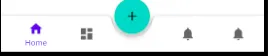
结果。
 <androidx.coordinatorlayout.widget.CoordinatorLayout xmlns:android="http://schemas.android.com/apk/res/android"
        xmlns:app="http://schemas.android.com/apk/res-auto"
        android:id="@+id/container"
        android:layout_width="match_parent"
        android:layout_height="match_parent"
        android:paddingTop="?attr/actionBarSize">

        <com.google.android.material.bottomappbar.BottomAppBar
            android:id="@+id/bottom_bar"
            style="@style/Widget.MaterialComponents.BottomAppBar"
            android:layout_width="match_parent"
            android:layout_gravity="bottom"
            android:layout_height="wrap_content" >

            <FrameLayout
                android:layout_width="match_parent"
                android:layout_height="wrap_content">

                <com.google.android.material.bottomnavigation.BottomNavigationView
                    android:id="@+id/nav_view"
                    android:layout_width="match_parent"
                    android:layout_height="match_parent"
                    android:layout_gravity="center_horizontal"
                    android:layout_margin="0dp"
                    android:background="@drawable/transparent"
                    android:padding="0dp"
                    app:menu="@menu/bottom_nav_menu" />
            </FrameLayout>


        </com.google.android.material.bottomappbar.BottomAppBar>

        <com.google.android.material.floatingactionbutton.FloatingActionButton
            android:id="@+id/fab"
            android:layout_width="wrap_content"
            android:layout_height="wrap_content"
            app:layout_anchor="@id/bottom_bar"/>
    </androidx.coordinatorlayout.widget.CoordinatorLayout>
原文链接
- 相关问题
- 7 如何将FusedLocationProviderClient实现为服务?
- 6 如何将Material Design应用到文件输入标签?
- 6 Material Design Lite和Angular Material Design有什么区别?
- 4 如何将Cast按钮实现为浮动操作按钮?
- 37 如何将Material Design库导入Android Studio?
- 6 如何在 Material Design 库(版本 1.1.0-alpha08)的 BottomNavigationView 的菜单项上显示徽章?
- 5 如何实现新的 Material Design 底部应用栏?
- 39 如何将BottomAppBar和FAB与BottomNavigationView结合使用
- 6 使用BottomAppBar或BottomNavigationView创建自定义底部视图
- 17 在透明背景的BottomAppBar中放置BottomNavigationView