我正在使用这个函数来快速、轻松地创建R中的小图表,但我似乎无法找到如何更改字体大小以避免y轴刻度标签重叠的方法。以下是我的代码(请参见下面的可复制示例):
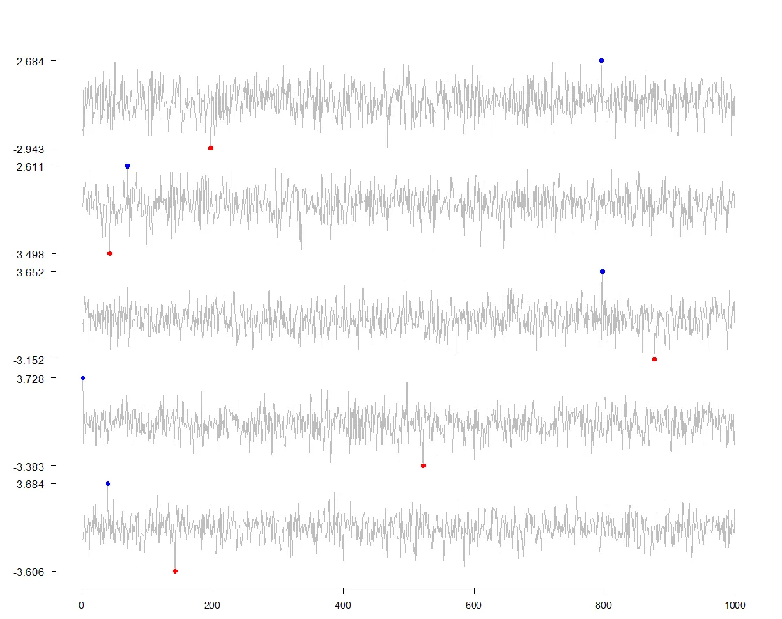
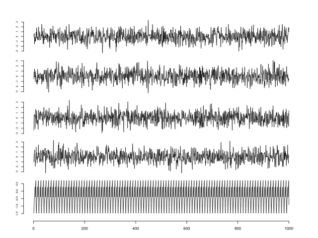
这是最终的图像,基本上解决了我的问题。y轴刻度尝试通过仅显示数据的最大值和最小值并且没有垂直线来展现优雅。再次感谢@geek-on-acid提供的提示,让我知道如何在所有图像底部获得单个x轴。
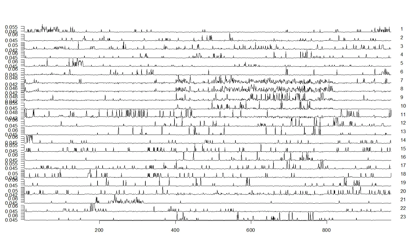
sparklines(gamma.df, sub=c(1:23),outer.margin = unit(c(2, 2, 2, 2), "cm"))
生成的图表如下:
我似乎可以使用
sparklines(gamma.df, sub=c(1:23),yaxis=FALSE,outer.margin = unit(c(2, 2, 2, 2), "cm"))
完全抑制y轴,但我真正想做的只是缩小刻度线上的数字(并在线下添加灰色填充,但看起来我必须在屏幕上绘制多边形,这可能会带来足够的麻烦,值得单独提问......以及一个不同的包)。
文档建议gpar可能是相关的:“在需要图形参数列表的所有情况下,有效的参数名称与在适当的调用中传递给gpar时有效的参数名称相同。”但是我需要一些帮助来理解这一点,因为我的尝试都没有成功(cex.axis和axis()也是如此)。 R的grid图形方面的专家有吗?欢迎链接到完全不同的方法(ggplot2?),该方法提供更好的质量的火花线式输出并进行充分记录。
这里有一些示例数据和代码,可以复制我的问题:
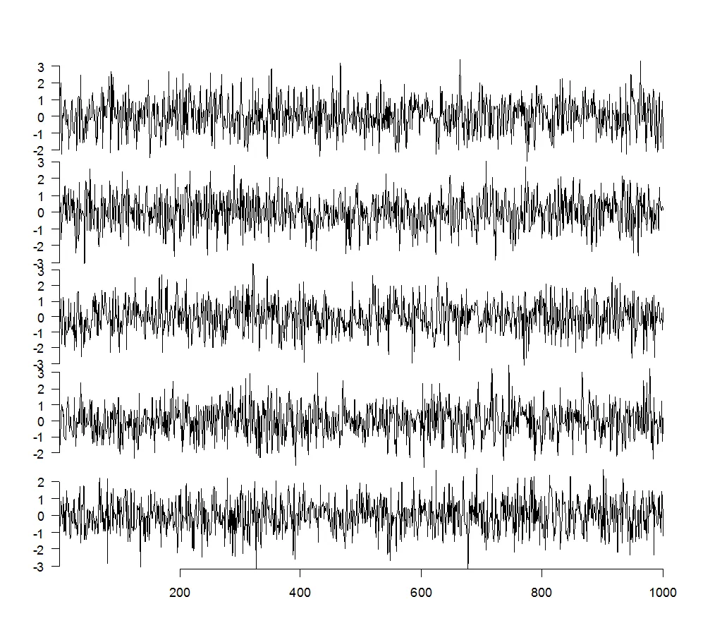
x <- data.frame(V = rnorm(1000), W = rnorm(1000), X = rnorm(1000), Y = rnorm(1000), Z = rnorm(10))
sparklines(x,outer.margin = unit(c(2, 2, 2, 2), "cm"))
这里是使用丑陋的重叠数字的 y 轴刻度标记生成的示例数据图:
更新:使用@geek-on-acid提供的非常有用的plot代码以及Tufte论坛上的一些代码(见下文),我想出了一种替代火花线图方法,它不使用YaleToolkit包并且看起来还不错...这里有一个可复制的示例(实际上只有两行,但在此进行了注释以便我学习):
     x <- data.frame(V = rnorm(1000), W = rnorm(1000), X = rnorm(1000), Y = rnorm(1000),
     Z = rnorm(1000)) # get a bit of data

    par(mfrow=c(ncol(x),1), #sets number of rows in space to number of cols in data frame x
    mar=c(1,0,0,0), #sets margin size for the figures
    oma=c(4,5,4,4)) #sets outer margin

    for (i in 1:ncol(x)){ # setup for statement to loops over all elements in a list or vector
        plot(x[,i], #use col data, not rows from data frame x
        col="grey",lwd=0.5, #make the line grey and thin
        axes=F,ylab="",xlab="",main="",type="l"); #suppress axes lines, set as line plot
        axis(2,yaxp=c(min(x[,i]),max(x[,i]),2), # y-axis: only show tickmarks for max and min values of col
        cex.axis=1.1,las=1, # shrink fontsize slightly, make text horizontal for easy reading
        at=c(round(min(x[,i]),3),round(max(x[,i]),3))); #specify where tickmark numbers go and round them to keep it tidy
        axis(2,yaxp=c(min(x[,i]),max(x[,i]),2),col="white",tcl=0,labels=FALSE)  #y-axis: put a 2nd white axis line over the 1st y-axis to make it invisible
        ymin<-min(x[,i]); tmin<-which.min(x[,i]);ymax<-max(x[,i]);tmax<-which.max(x[,i]); # see the code from Jason below for what these do
        points(x=c(tmin,tmax),y=c(ymin,ymax),pch=19,col=c("red","blue"),cex=1) # add coloured points at max and min
        }
        axis(1,pos=c(-5)) # places horizontal axis at the bottom of it all.
这是最终的图像,基本上解决了我的问题。y轴刻度尝试通过仅显示数据的最大值和最小值并且没有垂直线来展现优雅。再次感谢@geek-on-acid提供的提示,让我知道如何在所有图像底部获得单个x轴。
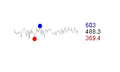
最后,为了完整起见,我包括了一些更接近Tufte风格的代码,这些代码是由Jason Dieterle在Tufte论坛上找到的。它们看起来比我的好得多,但这些代码一次只能绘制一个图。以下是原帖:
#Here is a simple R implementation of sparklines. Running sparkline() will generate a random sparkline; running sparkline(yourdata) will generate a sparkline using the data in yourdata. As an example, here is Google's stock price for the last year.

#R sparklines
sparkline<-function(ydata=rnorm(100,500,50),width=1.5,height=0.5,sigfigs=4) {

# ydata = vector of data to be plotted
# width = width of sparlkline in inches, including text
# height = height of sparkline in inches
# sigfigs = number of significant figures to round min, max, and last values to

    temppar<-par(no.readonly = TRUE) # store default graphics parameters
    par(mai=c(0.10,0.05,0.10,0.05),fin=c(width,height)) # adjust graphics parameters for sparklines
    len<-length(ydata) # determine the length of the data set
    ymin<-min(ydata) # determine the minimum
    tmin<-which.min(ydata) # and its index
    ymax<-max(ydata) # determine the maximum
    tmax<-which.max(ydata) # and its index
    yfin<-signif(ydata[len],sigfigs) #determine most recent data point
    plotrange=c(ymin-0.3*(ymax-ymin),ymax+0.3*(ymax-ymin)) # define plot range to leave enough room for min and max circles and text
    plot(x=1:len,y=ydata,type="l",xlim=c(1,len*1.5),ylim=plotrange,col="gray",lwd=0.5,ann=FALSE,axes=FALSE) # plot sparkline
    points(x=c(tmin,tmax),y=c(ymin,ymax),pch=19,col=c("red","blue"),cex=0.5) # plot min and max points
    text(x=len,y=ymin,labels=signif(ymin,sigfigs),cex=0.5,pos=4,col="red") # show minimum value
    text(x=len,y=ymax,labels=signif(ymax,sigfigs),cex=0.5,pos=4,col="blue") # show maximum value
    text(x=len,y=(ymin+ymax)/2,labels=yfin,cex=0.5,pos=4) # show most recent value
    par(temppar) # restore graphics defaults
}
#-- Jason Dieterle (email), January 28, 2008
这是他的输出结果(稍微放大了一点):
for循环后立即添加axis(1,pos=c(-4))即可。 - Geek On Acid