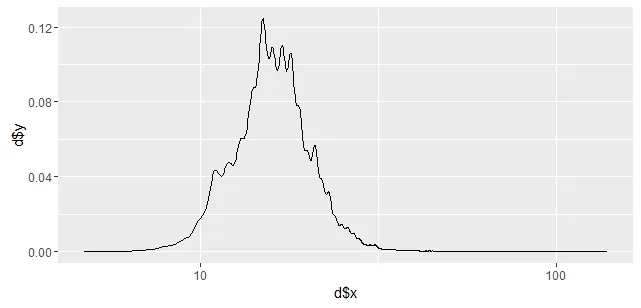
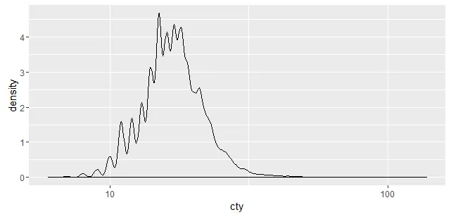
以下两个图形为何看起来不同?两种方法都使用高斯核。
ggplot2 如何计算密度?library(fueleconomy)
d <- density(vehicles$cty, n=2000)
ggplot(NULL, aes(x=d$x, y=d$y)) + geom_line() + scale_x_log10()
ggplot(vehicles, aes(x=cty)) + geom_density() + scale_x_log10()
更新:
此问题的解决方案已经在SO上出现,在这里,然而ggplot2传递给R stats density函数的具体参数仍不清楚。
另一种解决方案是直接从ggplot2图中提取密度数据,如此处所示。
d2 <- density(log10(vehicles$cty), from=min(log10(vehicles$cty)), to=max(log10(vehicles$cty))) ; ggplot(data.frame(x=d2$x, y=d2$y), aes(x=x, y=y)) + geom_line(): 但你需要调整轴标签。答案为ggplot(vehicles, aes(x=cty)) + stat_density(geom="line") + scale_x_log10()。 - user20650ggalt::geom_bkde()以获得更好的密度估计。 - hrbrmstr