可定制的扁平按钮小部件。
xflat_button.dart
import 'package:flutter/material.dart';
class XFlatButton extends StatelessWidget {
final String text;
final void Function()? onPressed;
final double width;
final double height;
final IconData? iconData;
final Color bgColor;
final Color fgColor;
const XFlatButton(
{required this.text,
this.onPressed,
this.width = 200,
this.height = 40,
super.key,
this.iconData,
this.bgColor = Colors.blue,
this.fgColor = Colors.white});
@override
Widget build(BuildContext context) {
final ButtonStyle flatButtonStyle = TextButton.styleFrom(
padding: EdgeInsets.symmetric(horizontal: 16.0),
shape: const RoundedRectangleBorder(
borderRadius: BorderRadius.all(Radius.circular(20.0)),
),
backgroundColor: bgColor,
foregroundColor: fgColor
);
return SizedBox(
width: width,
height: height,
child: TextButton(
onPressed: onPressed,
style: flatButtonStyle,
child: iconData == null
? Text(text, style: TextStyle(color: fgColor),)
: Row(mainAxisAlignment: MainAxisAlignment.center, children: [
Icon(iconData, color: fgColor,),
SizedBox(
width: 10,
),
Text(text, style: TextStyle(color: fgColor),),
])),
);
}
}
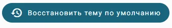
像这样调用:
XFlatButton(
            text: 'Восстановить тему по умолчанию',
            width: 350,
            iconData: Icons.restore,
            bgColor: Theme.of(context).colorScheme.primary,
            fgColor: Theme.of(context).colorScheme.onPrimary,
            onPressed: (){
              ref.read(themeProvider.notifier).setState(defaultTheme);
            },
          ),