我看到使用旧按钮时出现了警告:
'RaisedButton'已被弃用,不应再使用。
'FlatButton'已被弃用,不应再使用。
'OutlineButton'已被弃用,不应再使用。
那么,以下按钮之间有何区别:
RaisedButton和ElevatedButtonFlatButtonvsTextButtonOutlineButtonvsOutlinedButton
我看到使用旧按钮时出现了警告:
'RaisedButton'已被弃用,不应再使用。
'FlatButton'已被弃用,不应再使用。
'OutlineButton'已被弃用,不应再使用。
那么,以下按钮之间有何区别:
RaisedButton 和 ElevatedButtonFlatButton vs TextButtonOutlineButton vs OutlinedButton我找到了关于迁移到新材料按钮及其主题的文档。
下面的图片说明了它们之间的区别。
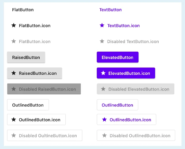
首先是过时的类。
引自Flutter 文档:
FlatButton、RaisedButton 和 OutlineButton 分别已被 TextButton、ElevatedButton 和 OutlinedButton 替换。
原始类很快将被弃用,请迁移使用这些类的代码。
import 'package:flutter/material.dart';

void main() => runApp(MyApp());

class MyApp extends StatelessWidget {
  @override
  Widget build(BuildContext context) {
    final bool disableButton = true; // <-- Change this to see buttons disabled
    return MaterialApp(
      title: 'Flutter Demo',
      debugShowCheckedModeBanner: false,
      theme: ThemeData(
        primarySwatch: Colors.blue,
      ),
      home: Scaffold(
        body: Center(
          child: Column(
            mainAxisAlignment: MainAxisAlignment.center,
            children: [
              FlatButton(
                  child: Text("FlatButton"),
                  onPressed: disableButton
                      ? null
                      : () {
                          print("FlatButton normal");
                        },
                  color: Colors.green,
                  shape: RoundedRectangleBorder(
                      borderRadius: BorderRadius.all(
                        Radius.circular(50),
                      ),
                      side: BorderSide(color: Colors.purple, width: 3.0)),
                  disabledColor: Colors.grey,
                  disabledTextColor: Colors.pink),
              SizedBox(height: 25),
              FlatButtonX(
                  childx: Text("TextButton"),
                  onPressedx: disableButton
                      ? null
                      : () {
                          print("FlatButtonX (TextButton)");
                        },
                  colorx: Colors.green,
                  textColorx: Colors.black,
                  shapex: RoundedRectangleBorder(
                      borderRadius: BorderRadius.all(
                        Radius.circular(50),
                      ),
                      side: BorderSide(color: Colors.purple, width: 3.0)),
                  disabledColorx: Colors.grey,
                  disabledTextColorx: Colors.pink),
              SizedBox(height: 100),
              RaisedButton(
                child: Text('RaisedButton'),
                color: Colors.green,
                textColor: Colors.black,
                onPressed: disableButton
                      ? null
                      : () {
                          print("RaisedButton normal");
                        },
                shape: RoundedRectangleBorder(
                      borderRadius: BorderRadius.all(
                        Radius.circular(50),
                      ),
                      side: BorderSide(color: Colors.purple, width: 3.0)),
                disabledColor: Colors.grey,
                  disabledTextColor: Colors.pink,
              ),
              SizedBox(height: 25),
              RaisedButtonX(
                childx: Text('ElevatedButton'),
                colorx: Colors.green,
                textColorx: Colors.black,
                onPressedx:disableButton
                      ? null
                      : () {
                          print("RaisedButtonX (ElevatedButton)");
                        },
                shapex: RoundedRectangleBorder(
                      borderRadius: BorderRadius.all(
                        Radius.circular(50),
                      ),
                      side: BorderSide(color: Colors.purple, width: 3.0)),
                                  disabledColorx: Colors.grey,
                  disabledTextColorx: Colors.pink,
              )
            ],
          ),
        ),
      ),
    );
  }
}

Widget FlatButtonX(
    {Color colorx,
    @required Widget childx,
    RoundedRectangleBorder shapex,
    @required Function onPressedx,
    Key keyx,
    Color disabledColorx,
    Color disabledTextColorx,
    Color textColorx}) {
  if (disabledTextColorx == null && textColorx == null) {
    disabledTextColorx = colorx;
  }
  if (textColorx == null) {
    textColorx = colorx;
  }
  return TextButton(
      key: keyx,
      style: ButtonStyle(
        foregroundColor: MaterialStateProperty.resolveWith<Color>(
          // text color
          (Set<MaterialState> states) => states.contains(MaterialState.disabled)
              ? disabledTextColorx
              : textColorx,
        ),
        backgroundColor: MaterialStateProperty.resolveWith<Color>(
          // background color    this is color:
          (Set<MaterialState> states) =>
              states.contains(MaterialState.disabled) ? disabledColorx : colorx,
        ),
        shape: MaterialStateProperty.all(shapex),
      ),
      onPressed: onPressedx as void Function(),
      child: Padding(
          padding: const EdgeInsets.symmetric(horizontal: 8.0), child: childx));
}

Widget RaisedButtonX(
    {Color colorx,
    @required Widget childx,
    RoundedRectangleBorder shapex,
    @required Function onPressedx,
    Key keyx,
    Color disabledColorx,
    Color disabledTextColorx,
    Color textColorx}) {
  if (disabledTextColorx == null && textColorx == null) {
    disabledTextColorx = colorx;
  }
  if (textColorx == null) {
    textColorx = colorx;
  }
  return ElevatedButton(
      key: keyx,
      style: ButtonStyle(
        foregroundColor: MaterialStateProperty.resolveWith<Color>(
          // text color
          (Set<MaterialState> states) => states.contains(MaterialState.disabled)
              ? disabledTextColorx
              : textColorx,
        ),
        backgroundColor: MaterialStateProperty.resolveWith<Color>(
          // background color    this is color:
          (Set<MaterialState> states) =>
              states.contains(MaterialState.disabled) ? disabledColorx : colorx,
        ),
        shape: MaterialStateProperty.all(shapex),
      ),
      onPressed: onPressedx as void Function(),
      child: childx);
}
ElevatedButton 相对于 RaisedButton 的优点之一是,默认情况下它会选择您的主题颜色。
因此,您甚至不需要添加自定义背景颜色。如果您想偏离主题或样式化按钮的其他方面,您只需要在 ElevatedButton 中引入自己的样式即可。
RaisedButton也可以实现这个功能。 - iDecodeRaisedButton 指定样式。而 ElevatedButton 将使用 primary Swatch(主题)的颜色。 - balu kFlatButton、RaisedButton 和 OutlineButton 小部件已分别被 TextButton、ElevatedButton 和 OutlinedButton 替换。
更改说明链接:
如何使用按钮:即使在 OutlineButton 上可以设置 borderSide 和 shape,但在 OutlinedButton 上却不能。
类似TextButton、ElevatedButton和OutlinedButton这样的备选按钮不再像以前那么容易使用。我们仍然可以使用legacy_buttons包来使用这些传统按钮。
RaisedButton.icon和ElevatedButton.icon,这也只是一种颜色变化。 - iDecode