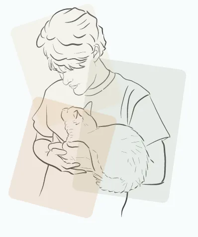
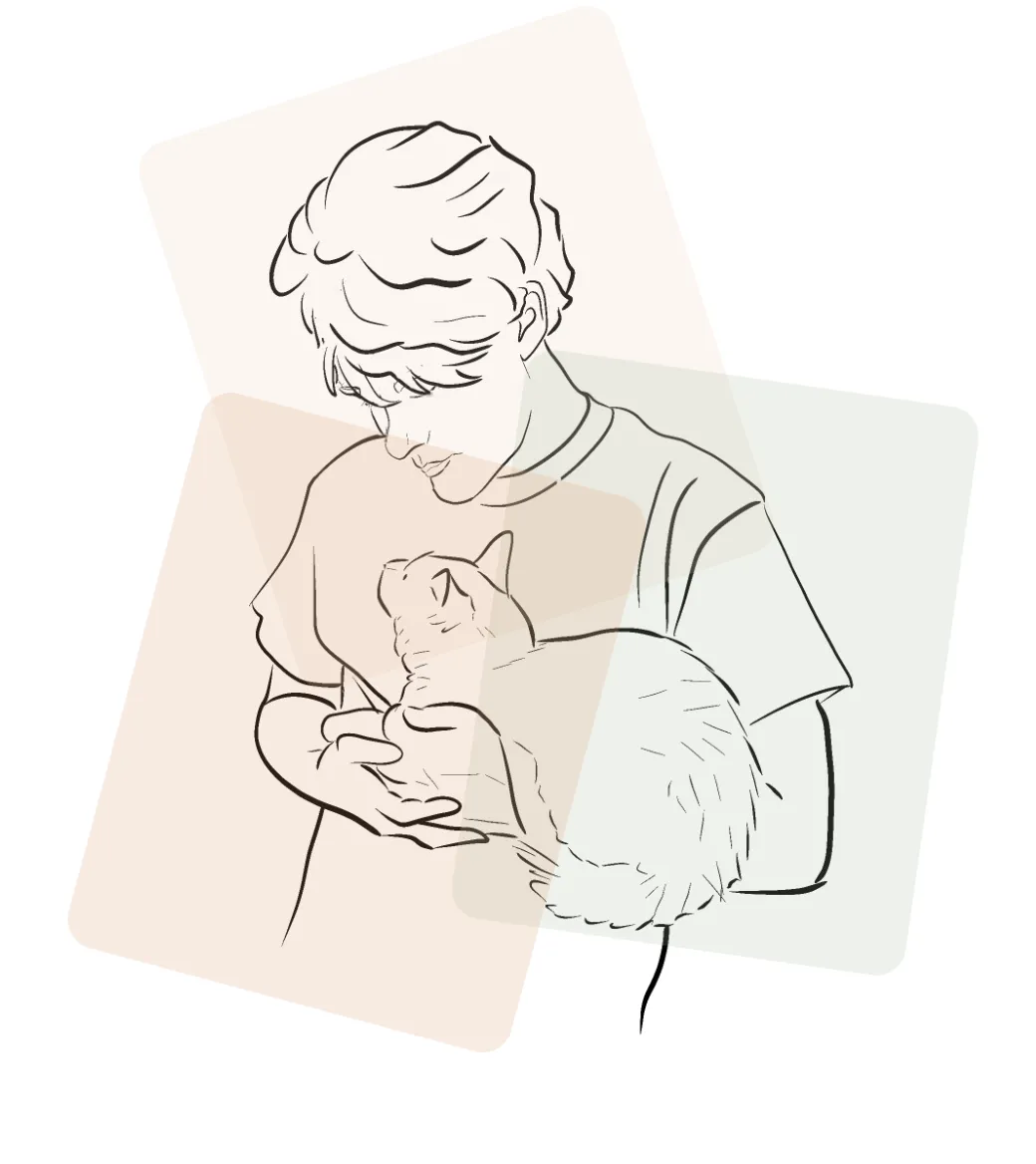
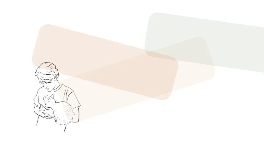
CSS中使形状位于图像后面的响应式方法?

4
我画了以下内容:

enter image description here

我用HTML/CSS复制了它,但它不具有响应性。

enter image description here

enter image description here

HTML

<!DOCTYPE html>
<html lang="en">
  <head>
    <meta charset="UTF-8" />
    <meta http-equiv="X-UA-Compatible" content="IE=edge" />
    <meta name="viewport" content="width=device-width, initial-scale=1.0" />
    <title>Document</title>
    <link rel="stylesheet" href="./cat.css" />
    <link rel="stylesheet" href="./reset.css" />
  </head>
  <body>
    <div class="person">
      <img src="cat.png" />
      <div class="r1"></div>
      <div class="r2"></div>
      <div class="r3"></div>
    </div>
  </body>
</html>

CSS

@import url("https://fonts.googleapis.com/css2?family=Roboto:wght@300&display=swap");
* {
    box-sizing: border-box;
    font-family: 'Roboto', sans-serif;
}

.person {
    position: relative;
    max-width: 25em;
    margin-left: 400px;
    margin-top: 100px;
}

img {
    object-fit: contain;
    width: 100%;
}

.r1 {
    position: absolute;
    height: 50%;
    max-width: 250px;
    width: 250px;
    background-color: #EFD2B4;
    border-radius: 15px;
    top: 0;
    left: 60px;
    opacity: .2;
    transform: rotate(-17.9deg);
    z-index: 1;
}

.r2 {
    position: absolute;
    height: 50%;
    max-width: 230px;
    width: 230px;
    background-color: #E69868;
    border-radius: 15px;
    bottom: 100px;
    opacity: .2;
    left: 20px;
    transform: rotate(15deg);
    z-index: 3;
}

.r3 {
    position: absolute;
    height: 50%;
    max-width: 230px;
    width: 230px;
    background-color: #A6BB9E;
    border-radius: 15px;
    bottom: 130px;
    opacity: .2;
    left: 200px;
    transform: rotate(8.12deg);
    z-index: 2;
}

我应该遵循哪些原则以确保所有内容都可以一起调整大小?我认为绝对不能使用硬编码的像素值来定义尺寸,但不太确定如何正确地调整大小以确保它尽可能地具有响应性。
1个回答

1

您最好为容器(.person)设置固定/缩放大小,然后使用百分比视口单位来缩放其中的所有内容。

.container{
  position: relative;
  border: 1px solid black;
  width: min(300px, 25vmin);
  height: min(300px, 25vmin);
}

.child{
  position: absolute;
  width: 50%;
  height: 50%;
}

.--1{
  top: 25%;
  left: 25%;
  background-color: red;
}

.--2{
  top: 10%;
  left: 10%;
  background-color: blue;
  transform: rotate(25deg);
  opacity: .5;
}

.--3{
  top: 50%;
  left: 50%;
  background-color: green;
  transform: rotate(-25deg);
  opacity: .5;
}
<div class="container">
  <div class="child  --1"></div>
  <div class="child  --2"></div>
  <div class="child  --3"></div>
</div>

这样做的主要好处是,一旦您找到所需的位置和比例,所有内容都将与其容器保持成比例,您无需考虑子元素的最大/最小尺寸。

将此原则应用于您的代码可能如下所示:

@import url("https://fonts.googleapis.com/css2?family=Roboto:wght@300&display=swap");
* {
    box-sizing: border-box;
    font-family: 'Roboto', sans-serif;
}

.person {
    position: relative;
    max-width: 25em;
    margin-left: 400px;
    margin-top: 100px;
}

img {
    object-fit: contain;
    width: 100%;
}

.r1 {
    position: absolute;
    height: 70%;
    width: 60%;
    background-color: #EFD2B4;
    border-radius: 15px;
    top: 5%;
    left: 5%;
    opacity: .2;
    transform: rotate(-17.9deg);
    z-index: 1;
}

.r2 {
    position: absolute;
    height: 60%;
    width: 40%;
    background-color: #E69868;
    border-radius: 15px;
    bottom: 5%;
    opacity: .2;
    left: 20px;
    transform: rotate(15deg);
    z-index: 3;
}

.r3 {
    position: absolute;
    height: 70%;
    width: 60%;
    background-color: #A6BB9E;
    border-radius: 15px;
    bottom: 130px;
    opacity: .2;
    right: 10%;
    bottom: 5%;
    transform: rotate(8.12deg);
    z-index: 2;
}
<div class="person">
      <img src="cat.png" />
      <div class="r1"></div>
      <div class="r2"></div>
      <div class="r3"></div>
    </div>

请注意,它们现在都按比例缩放,并与您的父元素成比例。

啊,好建议!因此绝对定位的 div 尺寸是相对于 person div 的百分比而言,它们的 margin 也是如此? - user38643

网页内容由stack overflow 提供, 点击上面的
可以查看英文原文,
原文链接