Pandas按组分组的结果在同一图中显示

8
我正在处理以下数据框(仅用于说明,实际数据框非常大):
   seq          x1         y1
0  2           0.7725      0.2105
1  2           0.8098      0.3456
2  2           0.7457      0.5436
3  2           0.4168      0.7610
4  2           0.3181      0.8790
5  3           0.2092      0.5498
6  3           0.0591      0.6357
7  5           0.9937      0.5364
8  5           0.3756      0.7635
9  5           0.1661      0.8364

尝试为上述坐标(x作为“x1”,y作为“y1”)绘制多条线图。
具有相同“seq”的行是一条路径,并且必须绘制为一个单独的线,例如所有对应于seq = 2的x,y坐标都属于一条线,依此类推。
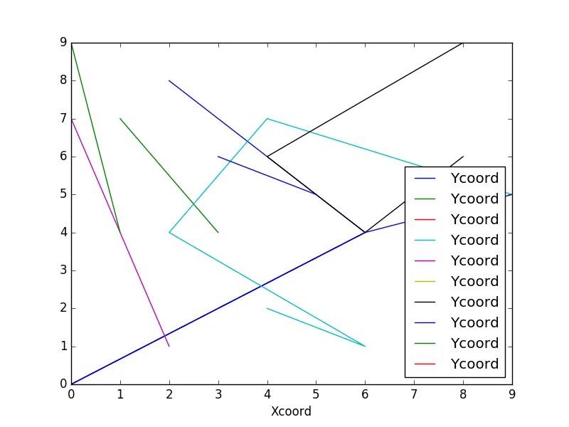
我能够将它们绘制出来,但是在单独的图表上,我想要所有的线都在同一个图表上,使用子图,但是没有得到正确的结果。
import matplotlib as mpl
import matplotlib.pyplot as plt

%matplotlib notebook

df.groupby("seq").plot(kind = "line", x = "x1", y = "y1")

这将创建数百个图表(与唯一序列的数量相同)。建议我找到一种方法将所有线条绘制在同一张图表上。
**更新**
为解决上述问题,我实现了以下代码:
     fig, ax = plt.subplots(figsize=(12,8))
     df.groupby('seq').plot(kind='line', x = "x1", y = "y1", ax = ax)
     plt.title("abc")
     plt.show()

现在,我想要一种以特定颜色绘制线条的方法。我正在将序列为2和5的路径聚类到群集1中;并将序列为3的路径聚类到另一个群集中。
因此,在群集1下有两条线,我希望它们是红色的,而在群集2下有1条线,可以是绿色的。
我该如何进行操作?

你看到了 https://dev59.com/mofca4cB1Zd3GeqPhlcr 吗? - Shawn Mehan
5个回答

9

在绘图前,您需要像这个例子中一样初始化轴。

import pandas as pd
import matplotlib.pylab as plt
import numpy as np

# random df
df = pd.DataFrame(np.random.randint(0,10,size=(25, 3)), columns=['ProjID','Xcoord','Ycoord'])

# plot groupby results on the same canvas 
fig, ax = plt.subplots(figsize=(8,6))
df.groupby('ProjID').plot(kind='line', x = "Xcoord", y = "Ycoord", ax=ax)
plt.show()

enter image description here


非常感谢,这正是我想要的。 - Liza
请查看此处的答案:https://dev59.com/N18e5IYBdhLWcg3wEG_A - Serenity
1
这很不错,但如果我想要图例列出ProjID列的值而不是“Ycoord”,该怎么办? - autonomy
1
@autonomy,您需要在循环中绘制groupby的结果,并使用plot函数的label参数为每条线分别设置图例文本。您可以在bernie的下一个答案中找到循环的示例。 - Serenity
2
@Serenity 谢谢,这就是我最终做的,看来需要两行代码而不是一行:fig, ax = plt.subplots(figsize=(18,16)) for id, group in seq_data.groupby('id'): group.plot(y='timestamp', x='xpos', title='X-position vs. time', ax=ax, label=id) - autonomy
这是我尝试的第6个方法,它完美地起作用了。谢谢分享! - muammar

7
考虑数据框 df
df = pd.DataFrame(dict(
        ProjID=np.repeat(range(10), 10),
        Xcoord=np.random.rand(100),
        Ycoord=np.random.rand(100),
    ))

然后,我们创造出这样的抽象艺术。
df.set_index('Xcoord').groupby('ProjID').Ycoord.plot()

enter image description here


5

另一种方法:

for k,g in df.groupby('ProjID'):
  plt.plot(g['Xcoord'],g['Ycoord'])

plt.show()

1

基于Serenity的回答,我让图例更好了。

import pandas as pd
import matplotlib.pylab as plt
import numpy as np

# random df
df = pd.DataFrame(np.random.randint(0,10,size=(25, 3)), columns=['ProjID','Xcoord','Ycoord'])

# plot groupby results on the same canvas 
grouped = df.groupby('ProjID')
fig, ax = plt.subplots(figsize=(8,6))
grouped.plot(kind='line', x = "Xcoord", y = "Ycoord", ax=ax)
ax.legend(labels=grouped.groups.keys()) ## better legend
plt.show()

你也可以这样做:

grouped = df.groupby('ProjID')
fig, ax = plt.subplots(figsize=(8,6))
g_plot = lambda x:x.plot(x = "Xcoord", y = "Ycoord", ax=ax, label=x.name)
grouped.apply(g_plot)
plt.show()

看起来是这样的: 在此输入图片描述


0

这里有一个工作示例,包括调整图例名称的功能。

grp = df.groupby('groupCol')

legendNames = grp.apply(lambda x: x.name)  #Get group names using the name attribute.
#legendNames = list(grp.groups.keys())  #Alternative way to get group names. Someone else might be able to speak on speed. This might iterate through the grouper and find keys which could be slower? Not sure

plots = grp.plot('x1','y1',legend=True, ax=ax)

for txt, name in zip(ax.legend_.texts, legendNames):
    txt.set_text(name)

解释: 图例值存储在参数ax.legend_中,该参数包含一个Text()对象列表,每个组有一个项目,其中Text类在matplotlib.text api中找到。要设置文本对象值,可以使用setter方法set_text(self, s)。
另外,Text类有许多set_X()方法,允许您更改字体大小、字体、颜色等。我没有使用过它们,所以我不确定它们是否有效,但我看不出为什么不行。

网页内容由stack overflow 提供, 点击上面的
可以查看英文原文,
原文链接