我正在尝试用R plotly生成热力图。以下是可复制的示例:
test <- structure(list(s1 = c(0L, 0L, 1L, 0L, 1L, 1L), s2 = c(1L, 1L,
0L, 1L, 0L, 0L), s3 = c(0L, 0L, 0L, 0L, 0L, 0L), s4 = c(0L, 0L,
0L, 0L, 0L, 0L), s5 = c(0L, 0L, 0L, 0L, 0L, 0L), s6 = c(0L, 0L,
0L, 0L, 0L, 0L)), .Names = c("s1", "s2", "s3", "s4", "s5", "s6"
), row.names = c("5HT2 type receptor mediated signaling pathway",
"5HT3 type receptor mediated signaling pathway", "5-Hydroxytryptamine degredation",
"Alpha adrenergic receptor signaling pathway", "Alzheimer disease-amyloid secretase pathway",
"Angiogenesis"), class = "data.frame")
以下是使用plotly生成热力图的代码:
f1 <- list(
    family = "Arial, sans-serif",
    size = 5,
    color = "lightgrey")

f2 <- list(
    family = "Old Standard TT, serif",
    size = 10,
    color = "black")

a <- list(
  title = "",
  titlefont = f1,
  showticklabels = TRUE,
  tickangle = 45,
  tickfont = f2,
  exponentformat = "E")

plot_ly(z = as.matrix(test),
        zmin=0,
        zmax=1,
        x = colnames(test),
        xgap = 2,
        y = rownames(test),
        ygap =2,
        type = "heatmap",
        colorbar=list(ypad = 30, tickmode="array", tickvals = c(0,1), color = 2, autocolorscale = F )) %>%
  layout(xaxis = a,
         margin = list(l =500, r = 10, b = 200, t = 10))
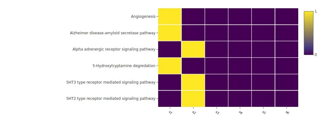
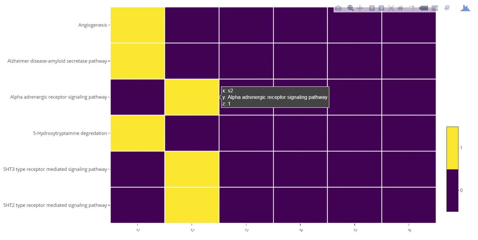
正如您所看到的,生成的图表具有连续的比例尺。我发现这个StackOverflow问题,其中作者提出了类似的问题。我尝试复制答案中提供的解决方案,但是我无法找到解决方法。请问怎样将颜色比例尺设置为离散的而不是连续的?
谢谢
编辑1:添加了“a”变量定义
layout(xaxis = a, ...中定义变量a。 - Marco Sandri