在vline左侧绘制阴影密度图?

5
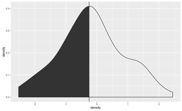
可以使用垂线作为截断点来着色密度图吗?例如:
df.plot <- data.frame(density=rnorm(100))
library(ggplot2)
ggplot(df.plot, aes(density)) + geom_density() + 
  geom_vline(xintercept = -0.25)

我尝试创建一个新变量,但它并没有按照我的期望工作。

df.plot <- df.plot %>% mutate(color=ifelse(density<(-0.25),"red","NULL"))


ggplot(df.plot, aes(density, fill = color, colour = color)) + geom_density() + 
  geom_vline(xintercept = -0.25)
1个回答

6

我不知道直接使用ggplot的方法来实现这个。但是你可以在所需范围之外计算密度:

set.seed(4132)
df.plot <- data.frame(density=rnorm(100))
ds <- density(df.plot$density, from = min(df.plot$density), to = -0.25)
ds_data <- data.frame(x = ds$x, y = ds$y)

density() 函数用于对其第一个参数中给出的点进行密度估计。结果将包含 xy 值。您可以使用 fromto 指定感兴趣的 x 范围。为了使密度与由 ggplot() 绘制的一致,将范围设置为 df.plot$density 中最小和最大值时需要注意。在此示例中,将 to 设置为 -0.25,因为只想要 vline 左侧的密度曲线部分。然后,您可以使用 ds$xds$y 提取 xy 值。

然后,通过使用相同的代码来创建图表,但是添加一个使用上述计算出的密度数据的额外的 geom_area()

library(ggplot2)
ggplot(df.plot, aes(density)) + geom_density() + 
  geom_vline(xintercept = -0.25) +
  geom_area(data = ds_data, aes(x = x, y = y))

enter image description here


网页内容由stack overflow 提供, 点击上面的
可以查看英文原文,
原文链接