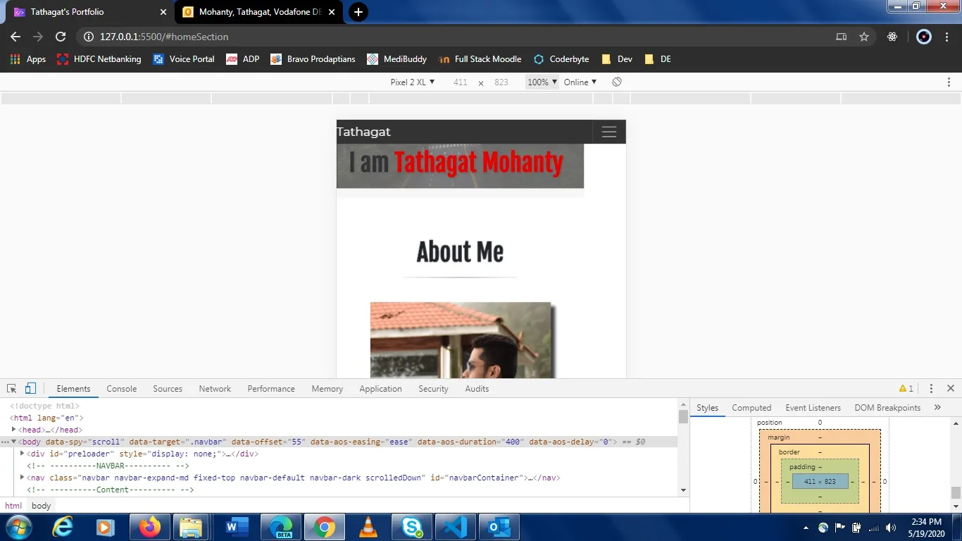
在我的作品集网站上,移动视图(仅在Chrome中)的右侧出现了一片白色空白区域,在桌面和Mozilla移动视图中则没有这个问题。我在此附上截图。
html {
  scroll-behavior: smooth;
  margin: 0px !important;
  padding: 0px !important;
  width: 100%;
  height: 100%;
}

body {
  width: 100%;
  height: 100%;
  margin: 0px !important;
  padding: 0px !important;
  font-family: 'Montserrat', sans-serif;
  position: relative;
}

#preloader {
  height: 100%;
  width: 100%;
  position: fixed;
  top: 0;
  left: 0;
  background: rgba(51, 51, 51, 1);
  z-index: 999;
}

.spinner {
  width: 80px;
  height: 80px;

  border: 2px solid #f3f3f3;
  border-top: 3px solid #f25a41;
  border-radius: 100%;

  position: absolute;
  top: 0;
  bottom: 0;
  left: 0;
  right: 0;
  margin: auto;

  animation: spin 1s infinite linear;
}

@keyframes spin {
  from {
    transform: rotate(0deg);
  }
  to {
    transform: rotate(360deg);
  }
}

.navbar-default {
  transition: 500ms ease;
  background-color: transparent;
}

.navbar-default.scrolledDown {
  background: #333333;
}

#navbarContainer {
  margin: 0px !important;
  padding: 0px !important;
  width: 100%;
  left: 0;
  z-index: 100;
}

.active {
  color: #f73c56 !important;
  border-bottom: 3px solid #f73c56 !important;
}

video {
  width: 100%;
  object-fit: contain;
  right: 0;
  bottom: 0;
  min-width: 100%;
  min-height: 100%;
  display: inline-block;
  vertical-align: baseline;
}

/* @media (min-aspect-ratio: 16/9) {
  .video {
    width: 100%;
    height: auto;
  }
}

@media (max-aspect-ratio: 16/9) {
  .video {
    width: auto;
    height: 100%;
  }
} */

h1 {
  font-family: 'Fjalla One', sans-serif;
  font-weight: bold;
}

.banner {
  position: absolute;
  top: 50%;
  left: 50%;
  transform: translate(-50%, -50%);
  width: 50%;
  height: 50%;
  text-align: center;
  color: #333;
  background-image: url(data:image/png;base64,iVBORw0KGgoAAAANSUhEUgAAAAIAAAACCAYAAABytg0kAAAAGXRFWHRTb2Z0d2FyZQBBZG9iZSBJbWFnZVJlYWR5ccllPAAAABZJREFUeNpi2r9//38gYGAEESAAEGAAasgJOgzOKCoAAAAASUVORK5CYII=);
  text-shadow: 2px 2px 4px #666;
}

.actualText {
  position: absolute;
  top: 50%;
  left: 50%;
  transform: translate(-50%, -50%);
  width: 100% !important;
  z-index: 5;
  margin: 0px !important;
  padding: 0px !important;
}

.typedText {
  color: #e60000;
}

@media screen and (max-width: 552px) {
  .banner {
    position: absolute;
    top: 20%;
    width: 100%;
    height: 20%;
    background-image: none;
    background-color: rgba(235, 235, 235, 0.4);
    padding: 0%;
  }
}

@media screen and (max-width: 375px) {
  .banner {
    position: absolute;
    top: 15%;
    font-size: 10px !important;
    width: 100%;
    height: 20%;
    background-image: none;
    background-color: rgba(235, 235, 235, 0.4);
    padding: 0%;
  }
}

hr {
  height: 1px;
  display: block;
  width: 50%;
  background-image: -webkit-linear-gradient(left, #fff, #ccc, #fff);
}<body data-spy="scroll" data-target=".navbar" data-offset="55">
<div id="preloader">
<div class="spinner"></div>
</div>
<!-- ----------NAVBAR---------- -->
<nav
class="navbar navbar-expand-md fixed-top navbar-default navbar-dark"
id="navbarContainer"
>
<a class="navbar-brand" href="#top">Tathagat</a>
<button
class="navbar-toggler"
type="button"
data-toggle="collapse"
data-target="#navbarContent"
aria-label="Toggle Navigation"
aria-controls="navbar supported content"
aria-expanded="false"
>
<span class="navbar-toggler-icon"></span>
</button>
<div
class="collapse navbar-collapse justify-content-end"
id="navbarContent"
>
<ul class="navbar-nav navbar-right">
<li class="nav-item">
<a class="nav-link active" href="#homeSection">Home</a>
</li>
<li class="nav-item">
<a class="nav-link" href="#aboutSection">About</a>
</li>
<li class="nav-item">
<a class="nav-link" href="#workSection">Work</a>
</li>
<li class="nav-item">
<a class="nav-link" href="#skillsSection">Skills</a>
</li>
<li class="nav-item">
<a class="nav-link" href="#timeLineSection">Timeline</a>
</li>
<li class="nav-item">
<a class="nav-link" href="#resumeSection">Resume</a>
</li>
<li class="nav-item">
<a class="nav-link" href="#contactMe">Contact</a>
</li>
<li>
<button class="btn btn-dark" id="myBtn" onclick="myFunction()">
Pause
</button>
</li>
</ul>
</div>
</nav>
<!-- ----------Content---------- -->
<div class="homeSection" id="homeSection">
<div class="video-container">
<video autoplay loop id="bgVideo" poster="./media/bgVideoPoster.png">
<source src="./media/bgVideo.mp4" type="video/mp4" />
</video>
<div class="banner">
<div class="actualText">
<h1>Hi There !</h1>
<h1>I am <span class="typedText"></span></h1>
</div>
</div>
</div>
</div>
<div class="aboutSection mb-4" id="aboutSection">
<div class="container p-3">
<div class="row text-center">
<div class="col mb-3 spacerClass">
<h1
data-aos="fade-down"
data-aos-delay="50"
data-aos-duration="2000"
>
About Me
</h1>
<hr />
</div>
</div>
<div class="row">
<div
class="col-sm-6 p-2 text-center"
data-aos="fade-right"
data-aos-delay="50"
data-aos-duration="2000"
>
<img
src="./media/img/myPhoto.jpg"
height="300"
width="300"
alt="Tathagat Mohanty"
style="
-webkit-box-shadow: 7px 7px 5px 0px rgba(0, 0, 0, 0.75);
-moz-box-shadow: 7px 7px 5px 0px rgba(0, 0, 0, 0.75);
box-shadow: 7px 7px 5px 0px rgba(0, 0, 0, 0.75);
"
/>
</div>
<div
class="col-sm-6 text-center"
data-aos="fade-left"
data-aos-delay="50"
data-aos-duration="2000"
>
<h4 class="mt-3">
Hello this is Tathagat Mohanty. I am a Web Developer by profession
with 2+ years of experience in this fast paced IT Industry.
</h4>
<h5 class="text-muted mt-3">
I am an astute learner skilled in FrontEnd Technologies. I believe
Design is something which is very personal and individual. With
that in mind I try to develop websites for multiple types of end
users with an approachable and clean design.
</h5>
</div>
</div>
</div>
</div>我在代码片段中发布了 HTML Body 和 CSS 的起始部分以供参考。 有谁能帮我猜测是什么原因导致了这个问题。我已经尝试过鬼影 CSS 方法来检查是否有任何元素超出了视口宽度,但没有找到。提前致谢。