我正在使用Collapsing Toolbar实现可展开和折叠的工具栏,但当我的工具栏折叠时,我想显示不同的工具栏。我已经看过一些代码,但找不到解决方案。
我还看过一个神奇开发者的解决方案 https://github.com/saulmm/CoordinatorLayoutExample,但无法正确找到我的解决方案
这是我已经实现的代码:
activity_collapsing_toolbar.xml
<?xml version="1.0" encoding="utf-8"?>
<android.support.design.widget.CoordinatorLayout xmlns:android="http://schemas.android.com/apk/res/android"
xmlns:app="http://schemas.android.com/apk/res-auto"
android:layout_width="match_parent"
android:layout_height="match_parent">
<android.support.design.widget.AppBarLayout
android:id="@+id/app_bar_layout"
android:layout_width="match_parent"
android:layout_height="176dp"
android:theme="@style/ThemeOverlay.AppCompat.Dark.ActionBar">
<android.support.design.widget.CollapsingToolbarLayout
android:id="@+id/collapsing_toolbar"
android:layout_width="match_parent"
android:layout_height="match_parent"
app:contentScrim="?attr/colorPrimary"
app:layout_scrollFlags="scroll|exitUntilCollapsed">
<RelativeLayout
android:layout_width="match_parent"
android:layout_height="match_parent"
android:layout_gravity="center"
android:background="@color/base_color_theme_new"
android:gravity="center_horizontal"
app:layout_collapseMode="parallax">
<RelativeLayout
android:id="@+id/rl_class_image"
android:layout_width="match_parent"
android:layout_height="wrap_content"
android:layout_marginTop="26dp"
android:gravity="center">
<LinearLayout
android:id="@+id/ll_class"
android:layout_width="60dp"
android:layout_height="60dp"
android:background="@drawable/rounded_white_circle"
android:gravity="center">
<ImageView
android:id="@+id/iv_class_image"
android:layout_width="60dp"
android:layout_height="60dp"
android:layout_gravity="center"
android:padding="8dp"
android:src="@drawable/class_4" />
</LinearLayout>
</RelativeLayout>
<TextView
android:id="@+id/tv_class_name"
android:layout_width="match_parent"
android:layout_height="wrap_content"
android:layout_below="@id/rl_class_image"
android:layout_marginTop="15dp"
android:gravity="center"
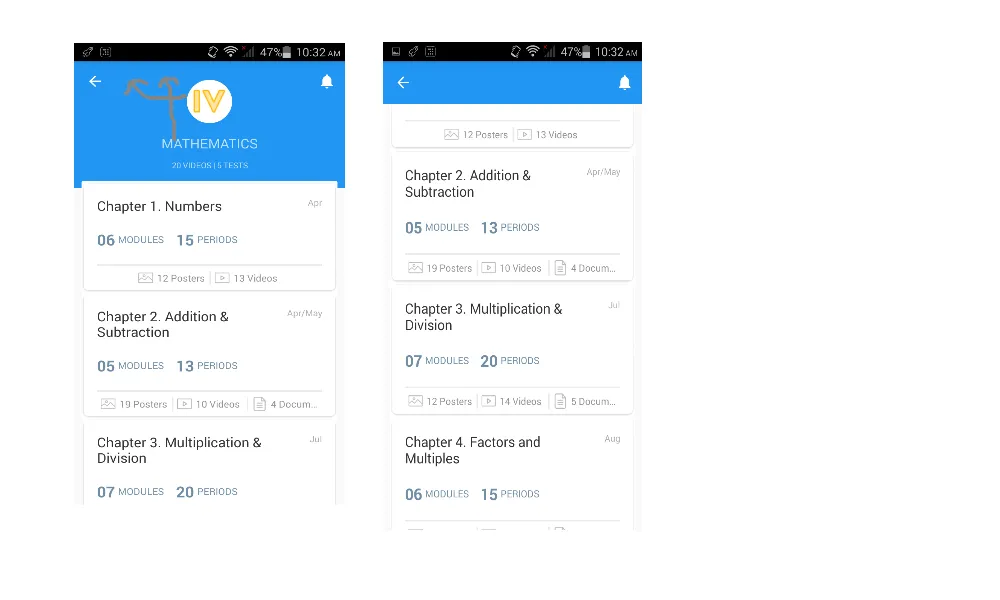
android:text="MATHEMATICS"
android:textSize="17sp" />
<TextView
android:id="@+id/tv_videos_test"
android:layout_width="match_parent"
android:layout_height="wrap_content"
android:layout_below="@id/tv_class_name"
android:layout_marginTop="10dp"
android:gravity="center"
android:text="20 VIDEOS | 5 TESTS"
android:textSize="10sp" />
</RelativeLayout>
<android.support.v7.widget.Toolbar
android:id="@+id/toolbar"
android:layout_width="match_parent"
android:layout_height="?attr/actionBarSize"
app:layout_collapseMode="pin" />
</android.support.design.widget.CollapsingToolbarLayout>
</android.support.design.widget.AppBarLayout>
<android.support.v4.widget.NestedScrollView
android:layout_width="match_parent"
android:layout_height="match_parent"
android:layout_marginLeft="10dp"
android:layout_marginRight="10dp"
android:background="@drawable/rounded_corners_for_list"
android:fillViewport="true"
app:behavior_overlapTop="10dp"
app:layout_behavior="@string/appbar_scrolling_view_behavior">
<!--<include layout="@layout/activity_chapters" />-->
<com.chalklit.widget.NonScrollListView
android:id="@+id/lv_modules_list"
android:layout_width="match_parent"
android:layout_height="match_parent"
android:background="@android:color/white"
android:divider="@null"
android:scrollbars="none"></com.chalklit.widget.NonScrollListView>
</android.support.v4.widget.NestedScrollView>
</android.support.design.widget.CoordinatorLayout>
CollapsingToolbarActivity.java
private CollapsingToolbarLayout collapsingToolbarLayout = null;
protected void onCreate(Bundle savedInstanceState) {
    // TODO Auto-generated method stub
    super.onCreate(savedInstanceState);
    requestWindowFeature(Window.FEATURE_NO_TITLE);


    setContentView(R.layout.activity_collapsing_toolbar);

    final Toolbar toolbar = (Toolbar) findViewById(R.id.toolbar);
    toolbar.inflateMenu(R.menu.menu_main);

    setSupportActionBar(toolbar);
    ActionBar actionBar = getSupportActionBar();
    actionBar.setDisplayHomeAsUpEnabled(true);

    collapsingToolbarLayout = (CollapsingToolbarLayout) findViewById(R.id.collapsing_toolbar);
    collapsingToolbarLayout.setTitle(" ");
    collapsingToolbarLayout.setContentScrimColor(getResources().getColor(R.color.base_color_theme_new));
    collapsingToolbarLayout.setStatusBarScrimColor(getResources().getColor(R.color.base_color_theme_new));
}


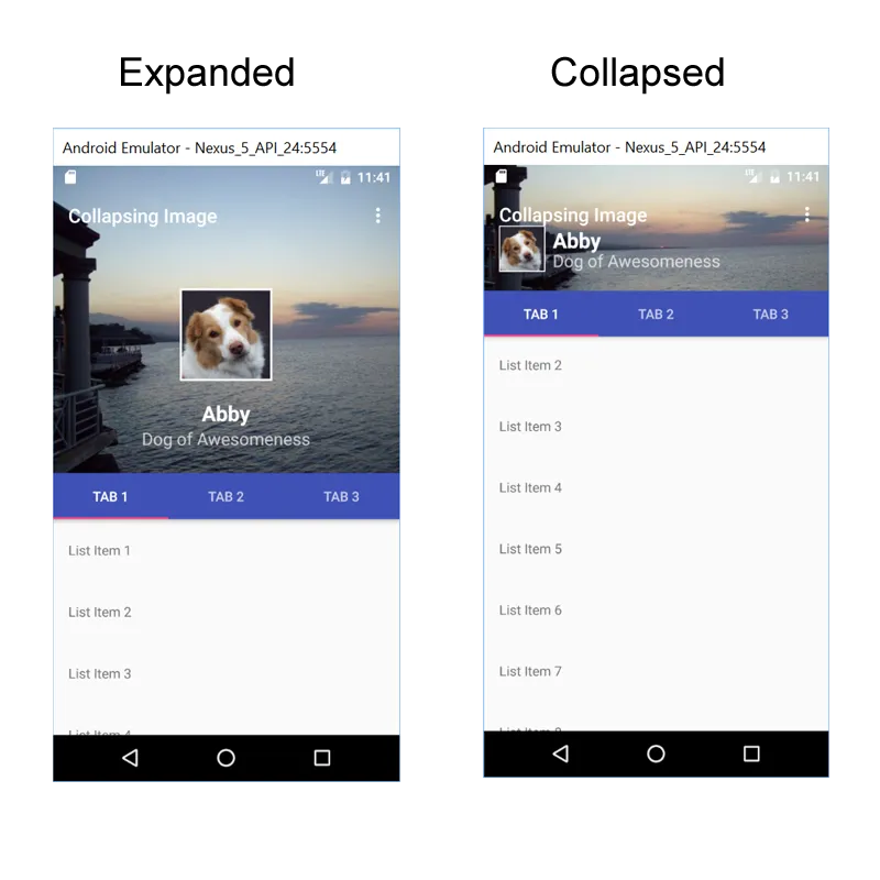
.setTitle(" ");。我猜你想要的是.setTitle("Mathematics")?否则,是的,你的工具栏是空白的 - 这是你的问题吗?你链接的那个示例代码还处理了圆形图像... - OneCricketeer