让我们描述我的问题。
我从数据库中获取了很多数据。例如:
d = [
{'Tag': 'Weight', 'Value': 15, 'Product': 'Apple', 'Year': 2019 },
{'Tag': 'Weight', 'Value': 14, 'Product': 'Apple', 'Year': 2020 },
{'Tag': 'Weight', 'Value': 16, 'Product': 'Apple', 'Year': 2021 },
{'Tag': 'Weight', 'Value': 30, 'Product': 'Banana', 'Year': 2019 },
{'Tag': 'Weight', 'Value': 32, 'Product': 'Banana', 'Year': 2020 },
{'Tag': 'Weight', 'Value': 31, 'Product': 'Banana', 'Year': 2021 },
{'Tag': 'Weight', 'Value': 120, 'Product': 'Papaya', 'Year': 2019 },
{'Tag': 'Weight', 'Value': 140, 'Product': 'Papaya', 'Year': 2020 },
{'Tag': 'Weight', 'Value': 130, 'Product': 'Papaya', 'Year': 2021 },
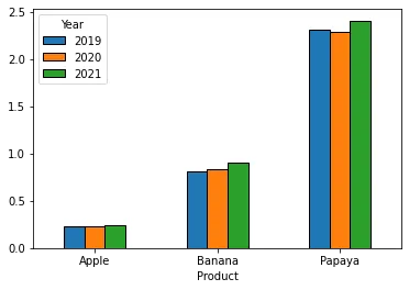
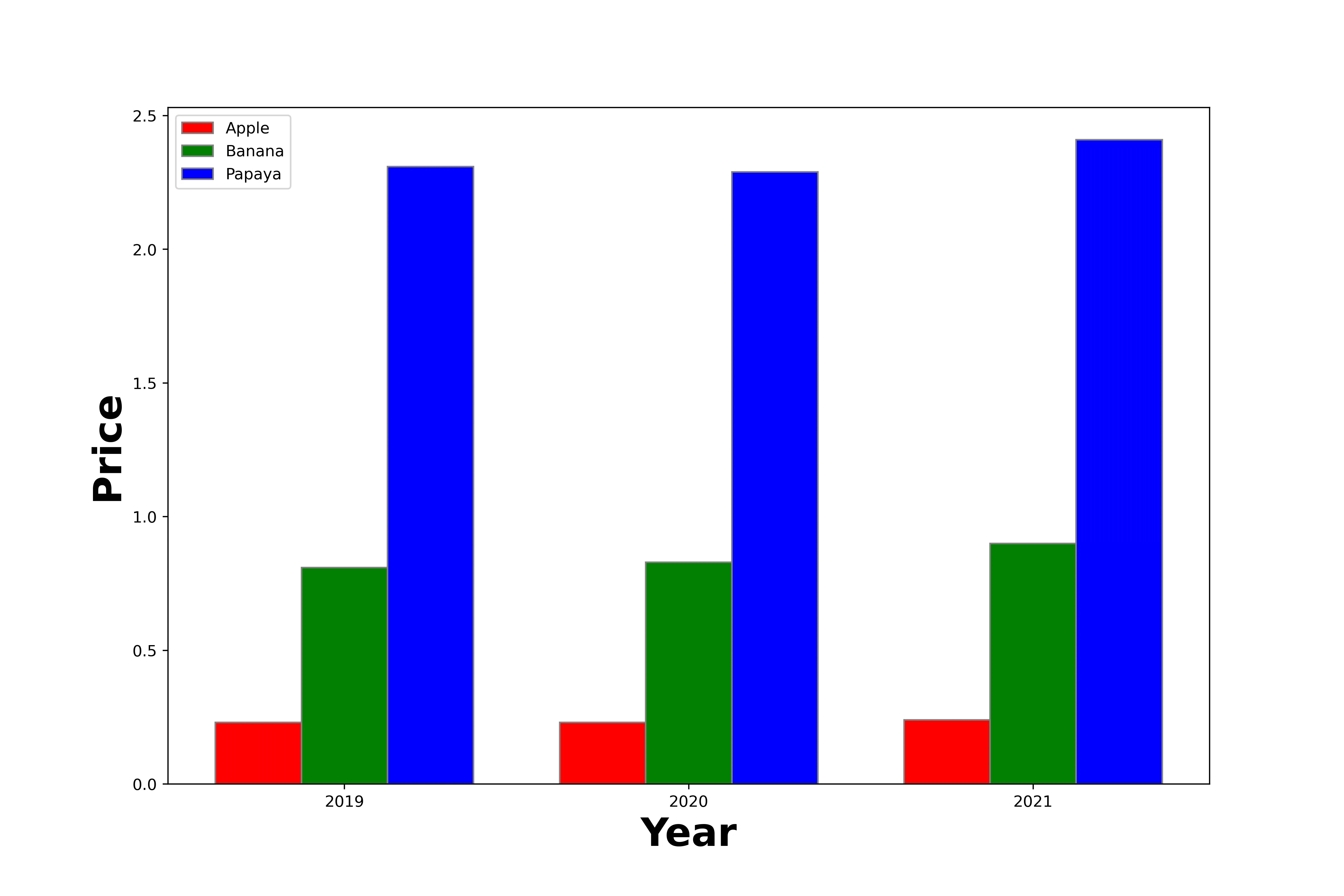
{'Tag': 'Price', 'Value': 0.23, 'Product': 'Apple', 'Year': 2019 },
{'Tag': 'Price', 'Value': 0.23, 'Product': 'Apple', 'Year': 2020 },
{'Tag': 'Price', 'Value': 0.24, 'Product': 'Apple', 'Year': 2021 },
{'Tag': 'Price', 'Value': 0.81, 'Product': 'Banana', 'Year': 2019 },
{'Tag': 'Price', 'Value': 0.83, 'Product': 'Banana', 'Year': 2020 },
{'Tag': 'Price', 'Value': 0.9, 'Product': 'Banana', 'Year': 2021 },
{'Tag': 'Price', 'Value': 2.31, 'Product': 'Papaya', 'Year': 2019 },
{'Tag': 'Price', 'Value': 2.29, 'Product': 'Papaya', 'Year': 2020 },
{'Tag': 'Price', 'Value': 2.41, 'Product': 'Papaya', 'Year': 2021 }
]
我使用以下命令创建一个数据框:
df = pd.DataFrame(data = d)
然后数据看起来像这样:
     Tag    Value   Product Year
0   Weight  15.00   Apple   2019
1   Weight  14.00   Apple   2020
2   Weight  16.00   Apple   2021
3   Weight  30.00   Banana  2019
4   Weight  32.00   Banana  2020
5   Weight  31.00   Banana  2021
6   Weight  120.00  Papaya  2019
...
到目前为止还不错。现在我想对这个数据框进行排序和过滤,以制作漂亮的图表。例如,我想显示最近一年的价格(Tag ==“Price”)。这意味着在我的X轴上,我希望有所有产品,在y轴上,我有相应的价格。我想为每个年份都有一个单独的数据集,并用该年份标记。在这个例子中,在条形图中,我为每个产品得到3个条,每个代表一年的价格。
使用pandas,最好的方法是什么?
目前,我正在遍历所有数据,查找正确的数据并填充新数组,然后将新创建的数组放入我的图表中。但这似乎并不是理想的方式。
因此,问题是如何获取我的绘图轴?您如何以最优雅的方式解决这个问题?只用pandas吗?可能吗?
我很兴奋,非常感谢。