按字母顺序排序 R 中 plotly 图例的条目。

3

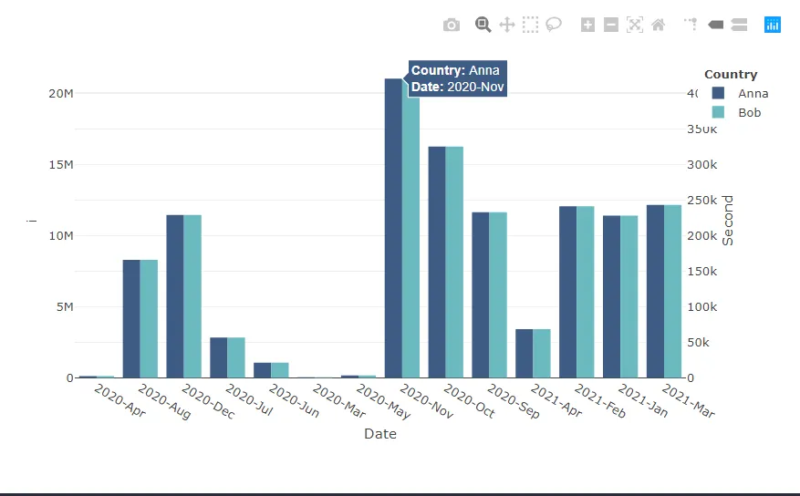
我创建了下面的Plotly图表,通常它在一个shiny应用程序中,因此y变量的选择是动态的。 在这种情况下,我有BobAnna。 我想修改图例。 色彩顺序正确,因为我希望深蓝色位于顶部,但我想稳定名称的显示顺序,可能是按字母顺序进行排序,因此在图例中应始终先显示Anna,且颜色要深一些。 请记住,选择在shiny应用程序中是动态的。

Week<-structure(c(18323, 18330, 18337, 18344, 18351, 18358, 18365, 
                  18372, 18379, 18386, 18393, 18400, 18407, 18414, 18421, 18428, 
                  18435, 18442, 18449, 18456, 18463, 18470, 18477, 18484, 18491, 
                  18498, 18505, 18512, 18519, 18526, 18533, 18540, 18547, 18554, 
                  18561, 18568, 18575, 18582, 18589, 18596, 18603, 18610, 18617, 
                  18624, 18631, 18638, 18645, 18652, 18659, 18666, 18673, 18680, 
                  18687, 18694, 18701, 18708, 18715, 18722, NA), class = "Date")

Bob<-c(NA, 12, 28, 89, 205, 311, 367, 419, 536, 673, 787, 996, 1501, 
       2091, 2836, 3971, 5429, 7422, 9653, 12205, 15096, 19962, 23567, 
       28432, 33051, 37347, 43390, 49897, 54851, 60913, 67073, 72769, 
       79629, 84063, 88398, 89579, 88464, 85595, 81697, 74943, 67632, 
       58226, 53371, 49759, 51508, 55515, 58813, 62240, 62627, 62646, 
       61285, 54438, 49614, 46721, 44554, 48151, 54014, 68891, 47176
)
Anna<-c(NA, 12, 28, 89, 205, 311, 367, 419, 536, 673, 787, 996, 1501, 
        2091, 2836, 3971, 5429, 7422, 9653, 12205, 15096, 19962, 23567, 
        28432, 33051, 37347, 43390, 49897, 54851, 60913, 67073, 72769, 
        79629, 84063, 88398, 89579, 88464, 85595, 81697, 74943, 67632, 
        58226, 53371, 49759, 51508, 55515, 58813, 62240, 62627, 62646, 
        61285, 54438, 49614, 46721, 44554, 48151, 54014, 68891, 47176
)*50


re<-data.frame(Week,Bob,Anna)

re<-re %>%   group_by(month_year = format(Week, '%Y-%b')) %>%   summarise(across(c(Bob,Anna), sum, na.rm  =TRUE))


colnames(re)[1]<-"Week"

ay <- list(
  overlaying = "y",
  side = "right",
  title = "Second",
)
tempNames <- c("Bob", "Anna")
tempNamesV2 <- tempNames[order(tempNames)]
# plotlyObjList <-
p <- plot_ly(re)
for(i in seq_along(tempNamesV2)){
  if(i == 1){
    p <- add_bars(p,  x = ~Week, y = re[[tempNamesV2[i]]], name = tempNamesV2[i], 
                  marker = list(color = "#3E5B84"), yaxis = "y", offsetgroup = i,
                  text = ~ paste("<b>Country:</b>", tempNamesV2[i], "<br><b>Date:</b>",Week ),
                  hovertemplate = paste('%{text}<extra></extra>'))
  } else if (i == 2){
    p <- add_bars(p,  x = ~Week, y = re[[tempNamesV2[i]]], name = tempNamesV2[i], 
                  marker = list(color = "#6BBABF"), yaxis = "y2", offsetgroup = i,
                  text = ~ paste("<b>Country:</b>", tempNamesV2[i], "<br><b>Date:</b>",Week ),
                  hovertemplate = paste('%{text}<extra></extra>'))
  }
}
p <- p %>% layout(yaxis2 = ay,
                  xaxis = list(title = "Date"),
                  yaxis = list(title = "i"),
                  margin = list(l=50,b = 100, t=50),
                  barmode = 'group',
                  legend=list(x = 1.05, y = 1,title=list(text='<b> Country </b>')))
p
1个回答

2
您可以使用循环来在排序后加载对象。我喜欢使用order(),这样我就可以提取排序位置以供其他用途,但是简单的sort()也不错。对于plotly的图例,它基于您添加trace/bars到plotly的时间顺序,较早添加的将位于顶部位置。
由于您只使用了2个y值,我假设用户一次只能选择最多2个“名称”,并且您正在确保国家已排序:
Week<-structure(c(18323, 18330, 18337, 18344, 18351, 18358, 18365, 
                      18372, 18379, 18386, 18393, 18400, 18407, 18414, 18421, 18428, 
                      18435, 18442, 18449, 18456, 18463, 18470, 18477, 18484, 18491, 
                      18498, 18505, 18512, 18519, 18526, 18533, 18540, 18547, 18554, 
                      18561, 18568, 18575, 18582, 18589, 18596, 18603, 18610, 18617, 
                      18624, 18631, 18638, 18645, 18652, 18659, 18666, 18673, 18680, 
                      18687, 18694, 18701, 18708, 18715, 18722, NA), class = "Date")
    
Bob<-c(NA, 12, 28, 89, 205, 311, 367, 419, 536, 673, 787, 996, 1501, 
         2091, 2836, 3971, 5429, 7422, 9653, 12205, 15096, 19962, 23567, 
         28432, 33051, 37347, 43390, 49897, 54851, 60913, 67073, 72769, 
         79629, 84063, 88398, 89579, 88464, 85595, 81697, 74943, 67632, 
         58226, 53371, 49759, 51508, 55515, 58813, 62240, 62627, 62646, 
         61285, 54438, 49614, 46721, 44554, 48151, 54014, 68891, 47176
)
Anna<-c(NA, 12, 28, 89, 205, 311, 367, 419, 536, 673, 787, 996, 1501, 
          2091, 2836, 3971, 5429, 7422, 9653, 12205, 15096, 19962, 23567, 
          28432, 33051, 37347, 43390, 49897, 54851, 60913, 67073, 72769, 
          79629, 84063, 88398, 89579, 88464, 85595, 81697, 74943, 67632, 
          58226, 53371, 49759, 51508, 55515, 58813, 62240, 62627, 62646, 
          61285, 54438, 49614, 46721, 44554, 48151, 54014, 68891, 47176
)*50


re<-data.frame(Week,Bob,Anna)

re<-re %>%   group_by(month_year = format(Week, '%Y-%b')) %>%   summarise(across(c(Bob,Anna), sum, na.rm  =TRUE))


colnames(re)[1]<-"Week"

ay <- list(
  overlaying = "y",
  side = "right",
  title = "Second"
)
tempNames <- c("Bob", "Anna")
tempNamesV2 <- tempNames[order(tempNames)]
p <- plot_ly(re)
for(i in seq_along(tempNamesV2)){
  if(i == 1){
      p <- add_bars(p,  x = ~Week, y = re[[tempNamesV2[i]]], name = tempNamesV2[i], 
                marker = list(color = "#3E5B84"), yaxis = "y", offsetgroup = i,
                text = ~ paste("<b>Country:</b>", tempNames[i], "<br><b>Date:</b>",Week ),
                hovertemplate = paste('%{text}<extra></extra>'))
  } else if (i == 2){
      p <- add_bars(p,  x = ~Week, y = re[[tempNamesV2[i]]], name = tempNamesV2[i], 
                marker = list(color = "#6BBABF"), yaxis = "y2", offsetgroup = i,
                text = ~ paste("<b>Country:</b>", tempNames[i], "<br><b>Date:</b>",Week ),
                hovertemplate = paste('%{text}<extra></extra>'))
  }
}
p

已更新的正确悬停图

我还发现您在布局中有两个边距,我将它们合并了。


我认为你的回答有问题。它在图表中显示了Bob在深蓝色条形图中,而Anna在天蓝色中。根据你的回答,我编辑了我的问题。 - firmo23
感谢指出错误。我已更新图表以显示正确的国家名称。按字母顺序排列后,第一个国家将是深蓝色,第二个国家将是青绿色。 - KC Song

网页内容由stack overflow 提供, 点击上面的
可以查看英文原文,
原文链接