如何使用CSS将一个div滑动到一张图片上方?

6
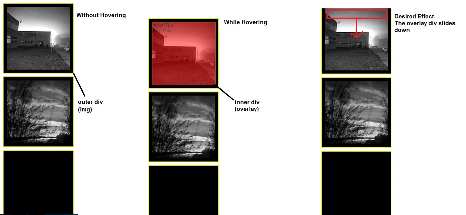
在我正在处理的网页上,有一个包含图像和另一个div的div。内部的div最初被设置为
opacity: 0;

使得它不可见。当鼠标悬停时,内部 div 应该出现在我的图像上方。我已经实现了这一点,但现在我希望进一步改进它,通过让 '覆盖' div(以 0.5 的不透明度出现)���渐向下滑动到图像上。理论上我可以用 JavaScript 实现,但这次必须是纯 CSS 解决方案。到目前为止,我的解决方案只是让覆盖 div 逐渐出现(淡入),但没有像我从未在单独的 CSS 中做过的那样向下滑动。

请参见下面的图片以进一步了解:

Image

HTML 代码:

<div class="img"> <img class="squareImg" src="img1.jpg"/><div class="overlay"> tweet This <br> Buy This</div></div>
    <div class="img"> <img class="squareImg" src="img3.jpg"/></div>
    <div class="img"> </img></div>

CSS(层叠样式表)
    .overlay{
    position: absolute;
    width: 200px;
    overflow-y: hidden;
    transition-property: all;
    transition-duration: .5s;
    transition-timing-function: cubic-bezier(0, 1, 0.5, 1);
    height: 200px;
    background-color: red;
    border: 1px solid white;
    top: 10px;
    left: 10px;
    opacity: 0;
} .overlay:hover{
    cursor:pointer;
    opacity: 0.5;
    z-index: 1;
}


.img{
position: relative;
margin-bottom: 10px;
border: 2px solid yellow;
background-color: black;
width: 200px;
height: 200px;
left: 50%;
margin-left: -110px;
padding: 10px;
}

请告诉我这是否是您想要的。请检查我的答案。谢谢 :) - Alessandro Incarnati
5个回答

6

使用高度过渡可以实现滑动效果。

改进内容:

  • 使用 background: rgba(255,0,0,0.5) 代替 opacity,以使遮罩层内容完全不透明。

  • 将过渡属性简化为 transition: all .5s

  • 通过 box-shadow 创建外部边框,并使用 border 属性创建黑色边框,而非填充。

  • .overlay 的高度为 0,在悬停时给予 100% 的高度。通过 left: 0right: 0 的结合,可以将其延伸到整个图像上。

  • 没有设置图片大小,现在 <img> 的大小控制边框和遮罩层的大小,从而允许使用不同的图片大小。

完整示例

.img {
  position: relative;
  border: 10px solid black;
  box-shadow: 0 0 0 2px yellow;
  display: inline-block;
  vertical-align: top;
  cursor: pointer;
  margin: 10px;
}
.overlay {
  position: absolute;
  top: 0;
  left: 0;
  right: 0;
  transition: all .5s;
  overflow: hidden;
  height: 0;
  background: rgba(255, 0, 0, 0);
}
.img:hover .overlay,
.overlay:hover {
  height: 100%;
  background: rgba(255, 0, 0, 0.5);
}
.img > img {
  display: block;/* Prevent inline gap under image*/
}
<div class="img">
  <img src="http://www.placehold.it/200" />
  <div class="overlay">tweet This <br>Buy This</div>
</div>

<div class="img">
  <img src="http://www.placehold.it/300" />
  <div class="overlay">tweet This <br>Buy This</div>
</div>


1

您可以只使用简单的过渡效果来实现这一点,而不是使用关键帧动画。

Example: http://jsfiddle.net/realseanp/c4e08hy7/9/

HTML:

<div class="holder">
    <div class="info">
       <span>All your info</span>
       <div class="overlay"></div>
    </div>      
</div>  

CSS:
.holder{
    position:relative;
    height:200px;
    width: 200px;
    overflow: hidden;
    border:1px solid #000;
    z-index:3;
}

.info {
    box-sizing: border-box;
    height: 100%;
    padding: 20px;
    position: absolute;
    top: -100%;
    transition: top 0.5s ease 0s;
    width: 100%;
    z-index: 4;

}

.overlay {
    background: none repeat scroll 0 0 #000;
    height: 100%;
    left: 0;
    opacity: 0;
    position: absolute;
    top: 0;
    width: 100%;
    z-index: -1;
    transition: 1s all;
}

.holder:hover .info{
    top:0;
}

.holder:hover .overlay{
    opacity: .85
}

这个效果非常完美,但我无法将其调整到我的代码中。抱歉,我没有使用纯CSS移动图形的经验。 - omusanon
@omusanon,我不确定你的意思。 - pizzarob
我已经更新了这个fiddle,加入了一个图片http://jsfiddle.net/realseanp/c4e08hy7/9/。你不应该把图片放在info div中,而是应该放在holder div中。 - pizzarob
我的网站:www.pagesbyz.com/n4n/index.php,在小屏幕(iPhone 5s)上,叠加层显示不正确。有什么解决方法吗? - SearchForKnowledge
我应该完全删除max-height和height吗?因为我将其设置为top:0; - SearchForKnowledge
显示剩余3条评论

1

只需简单地使用图像作为背景的方法:

.img{
  position:    relative;
  background:  none 50% / cover;
  width:       200px;
  height:      200px;
  margin:      0 auto;
  border:      10px solid #000;
  box-shadow:  0 0 0 2px yellow;
}

.overlay{
  position:   absolute;
  width:      100%;
  height:     0%;
  overflow:   hidden;
  transition: all .5s cubic-bezier(0, 1, 0.5, 1);
  box-shadow: inset 0 0 0 1px white;
  background: rgba(255,0,0,0.4); /* Don't use opacity but rgba on bg */
}

.img:hover .overlay{ 
  height:     100%;
}
<div class="img" style="background-image:url(//placehold.it/300x300/aba)">
  <div class="overlay">Tweet This <br> Buy This</div>
</div>


0

如果你需要向下滑动,你应该使用@keyframes:

.overlay:hover{
-webkit-animation: slide 5s; /* Chrome, Safari, Opera */ 
animation: slide 5s;
}
@keyframes slide {
    from {height: 0px;}
    to {height: 200px;}
}
/* Chrome, Safari, Opera */
@-webkit-keyframes slide {
    from {height: 0px;}
    to {height: 200px;}
} 

谢谢回复,这个解决方案不太适用,因为叠加层会变得可见并向下滑动,直到叠加层div的顶部位于图像容器的底部。而我希望实现类似于:http://davidwalsh.name/demo/css-slide.php 的东西。 - omusanon
@omusanon 然后使用高度作为变化的元素,从0到任何你想要的值。你可以切换它,或者进行更复杂的动画。我编辑了我的代码。 - Claudiu Creanga
@realseanp 我觉得这正是他想要的。 - Claudiu Creanga

0

您可以通过将 .overlay 设置为负的顶部位置来实现此目的,然后可以使用 + 选择器针对兄弟元素进行定位并将其顶部位置更改为正数。 此外,您还可以通过将 transition-duration: 2s; 设置为 2 秒来更改过渡时间。

     .overlay{
    position: absolute;
    width: 200px;
    overflow-y: hidden;
    transition-property: all;
    transition-duration: 2s;
    transition-timing-function: cubic-bezier(0, 1, 0.5, 1);
    height: 200px;
    background-color: red;
    border: 1px solid white;
    top: -200px;
    left: 10px;
    opacity: 0;
    z-index:-1;
} 
.squareImg:hover + .overlay, .overlay:hover {
    cursor:pointer;
    top:10px;
    opacity: 0.5;
    z-index: 1;
}


.img{
    position:relative;
    height:200px;
    width: 200px;
    overflow: hidden;
    border:1px solid #000;
    z-index:3;
    margin-bottom: 10px;
    border: 2px solid yellow;
    background-color: black;    
    left: 50%;
    margin-left: -110px;
    padding: 10px;
}

演示 http://jsfiddle.net/a_incarnati/c4e08hy7/8/


唯一的问题是它从上面滑落。 它应该像这样运作:http://jsfiddle.net/realseanp/c4e08hy7/4/ - omusanon
然而我仍然在实现它方面遇到了困难。 - omusanon
1
@AlexIncarnati - 将 .overlay:hover 的悬停设置为 .squareImg:hover + .overlay, .overlay:hover,这样当悬停在覆盖层上时它不会停止工作。 - misterManSam

网页内容由stack overflow 提供, 点击上面的
可以查看英文原文,
原文链接