WPF - 如何为菜单控件设置样式以去除左边距?

14

我已经在我的用户控件中添加了默认菜单控件。我需要为菜单设置样式,以移除包含图标或复选框空间的左边距。我该如何做到这一点?

XAML:

<Menu>
    <MenuItem Header="MyMenu" FontSize="10">
        <MenuItem Header="Options..." />
        <MenuItem Header="About" />
    </MenuItem>
</Menu>  

它目前默认显示为任何其他菜单控件:

alt text

我不想要菜单项左侧的边距或列。这通常用于图标等。


你能提供一些你的XAML吗? - jsmith
请详细解释您的问题并提供XAML代码。 - user354583
我已经添加了XAML和默认渲染的屏幕截图。菜单的使用在很大程度上是无关紧要的,我已经从问题中删除了该文本。 - Brian Lyttle
1
可能是重复的问题 System.Windows.Controls.MenuItem without icon area - StayOnTarget
9个回答

5

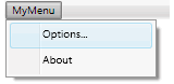
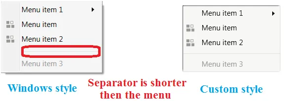
我认为这就是你想要的(再次使用Expression Blend解决了它,但在显示方面,它是最简单的...并且需要大量尝试调整)...你可以将以下内容作为示例放入空白的WPF应用程序中:

<Window x:Class="MenuItemWithNoIcon.MainWindow"
        xmlns="http://schemas.microsoft.com/winfx/2006/xaml/presentation"
        xmlns:x="http://schemas.microsoft.com/winfx/2006/xaml"
        Title="MainWindow" Height="350" Width="525">
    <Window.Resources>
        <SolidColorBrush x:Key="MenuItem.Highlight.Background" Color="#3D26A0DA"/>
        <SolidColorBrush x:Key="MenuItem.Highlight.Border" Color="#FF26A0DA"/>
        <SolidColorBrush x:Key="Menu.Disabled.Foreground" Color="#FF707070"/>
        <SolidColorBrush x:Key="MenuItem.Highlight.Disabled.Background" Color="#0A000000"/>
        <SolidColorBrush x:Key="MenuItem.Highlight.Disabled.Border" Color="#21000000"/>
        <SolidColorBrush x:Key="MenuItem.Selected.Border" Color="#FF26A0DA"/>
        <SolidColorBrush x:Key="MenuItem.Selected.Background" Color="#3D26A0DA"/>
        <Geometry x:Key="Checkmark">F1 M 10.0,1.2 L 4.7,9.1 L 4.5,9.1 L 0,5.2 L 1.3,3.5 L 4.3,6.1L 8.3,0 L 10.0,1.2 Z</Geometry>
        <SolidColorBrush x:Key="Menu.Static.Foreground" Color="#FF212121"/>
        <ControlTemplate x:Key="{ComponentResourceKey ResourceId=SubmenuItemTemplateKey, TypeInTargetAssembly={x:Type MenuItem}}" TargetType="{x:Type MenuItem}">
            <Border x:Name="templateRoot" BorderBrush="{TemplateBinding BorderBrush}" BorderThickness="{TemplateBinding BorderThickness}" Background="{TemplateBinding Background}" Height="22" SnapsToDevicePixels="true">
                <Grid Margin="0">
                    <Grid.ColumnDefinitions>
                        <ColumnDefinition Width="*"/>
                    </Grid.ColumnDefinitions>
                    <ContentPresenter x:Name="menuHeaderContainer" ContentSource="Header" HorizontalAlignment="Stretch" Margin="{TemplateBinding Padding}" RecognizesAccessKey="True" SnapsToDevicePixels="{TemplateBinding SnapsToDevicePixels}" VerticalAlignment="Stretch"/>
                </Grid>
            </Border>
            <ControlTemplate.Triggers>
                <Trigger Property="Icon" Value="{x:Null}"/>
                <Trigger Property="IsChecked" Value="True"/>
                <Trigger Property="IsHighlighted" Value="True">
                    <Setter Property="Background" TargetName="templateRoot" Value="{StaticResource MenuItem.Highlight.Background}"/>
                    <Setter Property="BorderBrush" TargetName="templateRoot" Value="{StaticResource MenuItem.Highlight.Border}"/>
                </Trigger>
                <Trigger Property="IsEnabled" Value="False">
                    <Setter Property="TextElement.Foreground" TargetName="templateRoot" Value="{StaticResource Menu.Disabled.Foreground}"/>
                </Trigger>
                <MultiTrigger>
                    <MultiTrigger.Conditions>
                        <Condition Property="IsHighlighted" Value="True"/>
                        <Condition Property="IsEnabled" Value="False"/>
                    </MultiTrigger.Conditions>
                    <Setter Property="Background" TargetName="templateRoot" Value="{StaticResource MenuItem.Highlight.Disabled.Background}"/>
                    <Setter Property="BorderBrush" TargetName="templateRoot" Value="{StaticResource MenuItem.Highlight.Disabled.Border}"/>
                </MultiTrigger>
            </ControlTemplate.Triggers>
        </ControlTemplate>
        <SolidColorBrush x:Key="Menu.Static.Border" Color="#FF999999"/>
        <SolidColorBrush x:Key="Menu.Static.Background" Color="#FFF0F0F0"/>
        <SolidColorBrush x:Key="Menu.Static.Separator" Color="#FFD7D7D7"/>
        <Geometry x:Key="UpArrow">M 0,4 L 3.5,0 L 7,4 Z</Geometry>
        <Style x:Key="MenuScrollButton" BasedOn="{x:Null}" TargetType="{x:Type RepeatButton}">
            <Setter Property="ClickMode" Value="Hover"/>
            <Setter Property="Template">
                <Setter.Value>
                    <ControlTemplate TargetType="{x:Type RepeatButton}">
                        <Border x:Name="templateRoot" BorderBrush="Transparent" BorderThickness="1" Background="Transparent" SnapsToDevicePixels="true">
                            <ContentPresenter HorizontalAlignment="Center" Margin="6" VerticalAlignment="Center"/>
                        </Border>
                    </ControlTemplate>
                </Setter.Value>
            </Setter>
        </Style>
        <MenuScrollingVisibilityConverter x:Key="MenuScrollingVisibilityConverter"/>
        <Geometry x:Key="DownArrow">M 0,0 L 3.5,4 L 7,0 Z</Geometry>
        <Style x:Key="{ComponentResourceKey ResourceId=MenuScrollViewer, TypeInTargetAssembly={x:Type FrameworkElement}}" BasedOn="{x:Null}" TargetType="{x:Type ScrollViewer}">
            <Setter Property="HorizontalScrollBarVisibility" Value="Hidden"/>
            <Setter Property="VerticalScrollBarVisibility" Value="Auto"/>
            <Setter Property="Template">
                <Setter.Value>
                    <ControlTemplate TargetType="{x:Type ScrollViewer}">
                        <Grid SnapsToDevicePixels="true">
                            <Grid.ColumnDefinitions>
                                <ColumnDefinition Width="*"/>
                            </Grid.ColumnDefinitions>
                            <Grid.RowDefinitions>
                                <RowDefinition Height="Auto"/>
                                <RowDefinition Height="*"/>
                                <RowDefinition Height="Auto"/>
                            </Grid.RowDefinitions>
                            <Border Grid.Column="0" Grid.Row="1">
                                <ScrollContentPresenter CanContentScroll="{TemplateBinding CanContentScroll}" Margin="{TemplateBinding Padding}"/>
                            </Border>
                            <RepeatButton Grid.Column="0" CommandTarget="{Binding RelativeSource={RelativeSource TemplatedParent}}" Command="{x:Static ScrollBar.LineUpCommand}" Focusable="false" Grid.Row="0" Style="{StaticResource MenuScrollButton}">
                                <RepeatButton.Visibility>
                                    <MultiBinding ConverterParameter="0" Converter="{StaticResource MenuScrollingVisibilityConverter}" FallbackValue="Visibility.Collapsed">
                                        <Binding Path="ComputedVerticalScrollBarVisibility" RelativeSource="{RelativeSource TemplatedParent}"/>
                                        <Binding Path="VerticalOffset" RelativeSource="{RelativeSource TemplatedParent}"/>
                                        <Binding Path="ExtentHeight" RelativeSource="{RelativeSource TemplatedParent}"/>
                                        <Binding Path="ViewportHeight" RelativeSource="{RelativeSource TemplatedParent}"/>
                                    </MultiBinding>
                                </RepeatButton.Visibility>
                                <Path Data="{StaticResource UpArrow}" Fill="{StaticResource Menu.Static.Foreground}"/>
                            </RepeatButton>
                            <RepeatButton Grid.Column="0" CommandTarget="{Binding RelativeSource={RelativeSource TemplatedParent}}" Command="{x:Static ScrollBar.LineDownCommand}" Focusable="false" Grid.Row="2" Style="{StaticResource MenuScrollButton}">
                                <RepeatButton.Visibility>
                                    <MultiBinding ConverterParameter="100" Converter="{StaticResource MenuScrollingVisibilityConverter}" FallbackValue="Visibility.Collapsed">
                                        <Binding Path="ComputedVerticalScrollBarVisibility" RelativeSource="{RelativeSource TemplatedParent}"/>
                                        <Binding Path="VerticalOffset" RelativeSource="{RelativeSource TemplatedParent}"/>
                                        <Binding Path="ExtentHeight" RelativeSource="{RelativeSource TemplatedParent}"/>
                                        <Binding Path="ViewportHeight" RelativeSource="{RelativeSource TemplatedParent}"/>
                                    </MultiBinding>
                                </RepeatButton.Visibility>
                                <Path Data="{StaticResource DownArrow}" Fill="{StaticResource Menu.Static.Foreground}"/>
                            </RepeatButton>
                        </Grid>
                    </ControlTemplate>
                </Setter.Value>
            </Setter>
        </Style>
        <ControlTemplate x:Key="{ComponentResourceKey ResourceId=TopLevelHeaderTemplateKey, TypeInTargetAssembly={x:Type MenuItem}}" TargetType="{x:Type MenuItem}">
            <Border x:Name="templateRoot" BorderBrush="{TemplateBinding BorderBrush}" BorderThickness="{TemplateBinding BorderThickness}" Background="{TemplateBinding Background}" SnapsToDevicePixels="true">
                <Grid VerticalAlignment="Center">
                    <Grid.ColumnDefinitions>
                        <ColumnDefinition Width="Auto"/>
                        <ColumnDefinition Width="Auto"/>
                    </Grid.ColumnDefinitions>
                    <Path x:Name="GlyphPanel" Data="{StaticResource Checkmark}" Fill="{TemplateBinding Foreground}" FlowDirection="LeftToRight" Margin="3" Visibility="Collapsed" VerticalAlignment="Center"/>
                    <ContentPresenter Grid.Column="1" ContentSource="Header" Margin="{TemplateBinding Padding}" RecognizesAccessKey="True" SnapsToDevicePixels="{TemplateBinding SnapsToDevicePixels}"/>
                    <Popup x:Name="PART_Popup" AllowsTransparency="true" Focusable="false" IsOpen="{Binding IsSubmenuOpen, RelativeSource={RelativeSource TemplatedParent}}" PopupAnimation="{DynamicResource {x:Static SystemParameters.MenuPopupAnimationKey}}" Placement="Bottom" PlacementTarget="{Binding ElementName=templateRoot}">
                        <Border x:Name="SubMenuBorder" BorderBrush="{StaticResource Menu.Static.Border}" BorderThickness="1" Background="{StaticResource Menu.Static.Background}" Padding="0">
                            <ScrollViewer x:Name="SubMenuScrollViewer" Style="{DynamicResource {ComponentResourceKey ResourceId=MenuScrollViewer, TypeInTargetAssembly={x:Type FrameworkElement}}}">
                                <Grid RenderOptions.ClearTypeHint="Enabled">
                                    <Canvas HorizontalAlignment="Left" Height="0" VerticalAlignment="Top" Width="0">
                                        <Rectangle x:Name="OpaqueRect" Fill="{Binding Background, ElementName=SubMenuBorder}" Height="{Binding ActualHeight, ElementName=SubMenuBorder}" Width="{Binding ActualWidth, ElementName=SubMenuBorder}"/>
                                    </Canvas>
                                    <Rectangle Fill="{StaticResource Menu.Static.Separator}" HorizontalAlignment="Left" Margin="0" Width="1"/>
                                    <ItemsPresenter x:Name="ItemsPresenter" KeyboardNavigation.DirectionalNavigation="Cycle" Grid.IsSharedSizeScope="true" SnapsToDevicePixels="{TemplateBinding SnapsToDevicePixels}" KeyboardNavigation.TabNavigation="Cycle"/>
                                </Grid>
                            </ScrollViewer>
                        </Border>
                    </Popup>
                </Grid>
            </Border>
            <ControlTemplate.Triggers>
                <Trigger Property="IsSuspendingPopupAnimation" Value="true">
                    <Setter Property="PopupAnimation" TargetName="PART_Popup" Value="None"/>
                </Trigger>
                <Trigger Property="Icon" Value="{x:Null}"/>
                <Trigger Property="IsChecked" Value="true">
                    <Setter Property="Visibility" TargetName="GlyphPanel" Value="Visible"/>
                </Trigger>
                <Trigger Property="IsHighlighted" Value="True">
                    <Setter Property="Background" TargetName="templateRoot" Value="{StaticResource MenuItem.Highlight.Background}"/>
                    <Setter Property="BorderBrush" TargetName="templateRoot" Value="{StaticResource MenuItem.Highlight.Border}"/>
                </Trigger>
                <Trigger Property="IsEnabled" Value="False">
                    <Setter Property="TextElement.Foreground" TargetName="templateRoot" Value="{StaticResource Menu.Disabled.Foreground}"/>
                    <Setter Property="Fill" TargetName="GlyphPanel" Value="{StaticResource Menu.Disabled.Foreground}"/>
                </Trigger>
                <Trigger Property="ScrollViewer.CanContentScroll" SourceName="SubMenuScrollViewer" Value="false">
                    <Setter Property="Canvas.Top" TargetName="OpaqueRect" Value="{Binding VerticalOffset, ElementName=SubMenuScrollViewer}"/>
                    <Setter Property="Canvas.Left" TargetName="OpaqueRect" Value="{Binding HorizontalOffset, ElementName=SubMenuScrollViewer}"/>
                </Trigger>
            </ControlTemplate.Triggers>
        </ControlTemplate>
        <ControlTemplate x:Key="{ComponentResourceKey ResourceId=TopLevelItemTemplateKey, TypeInTargetAssembly={x:Type MenuItem}}" TargetType="{x:Type MenuItem}">
            <Border x:Name="templateRoot" BorderBrush="{TemplateBinding BorderBrush}" BorderThickness="{TemplateBinding BorderThickness}" Background="{TemplateBinding Background}" SnapsToDevicePixels="true">
                <Grid VerticalAlignment="Center">
                    <Grid.ColumnDefinitions>
                        <ColumnDefinition Width="Auto"/>
                        <ColumnDefinition Width="Auto"/>
                    </Grid.ColumnDefinitions>
                    <ContentPresenter x:Name="Icon" ContentSource="Icon" HorizontalAlignment="Center" Height="16" Margin="3" SnapsToDevicePixels="{TemplateBinding SnapsToDevicePixels}" VerticalAlignment="Center" Width="16"/>
                    <Path x:Name="GlyphPanel" Data="{StaticResource Checkmark}" Fill="{StaticResource Menu.Static.Foreground}" FlowDirection="LeftToRight" Margin="3" Visibility="Collapsed" VerticalAlignment="Center"/>
                    <ContentPresenter Grid.Column="1" ContentSource="Header" Margin="{TemplateBinding Padding}" RecognizesAccessKey="True" SnapsToDevicePixels="{TemplateBinding SnapsToDevicePixels}"/>
                </Grid>
            </Border>
            <ControlTemplate.Triggers>
                <Trigger Property="Icon" Value="{x:Null}">
                    <Setter Property="Visibility" TargetName="Icon" Value="Collapsed"/>
                </Trigger>
                <Trigger Property="IsChecked" Value="true">
                    <Setter Property="Visibility" TargetName="GlyphPanel" Value="Visible"/>
                    <Setter Property="Visibility" TargetName="Icon" Value="Collapsed"/>
                </Trigger>
                <Trigger Property="IsHighlighted" Value="True">
                    <Setter Property="Background" TargetName="templateRoot" Value="{StaticResource MenuItem.Highlight.Background}"/>
                    <Setter Property="BorderBrush" TargetName="templateRoot" Value="{StaticResource MenuItem.Highlight.Border}"/>
                </Trigger>
                <Trigger Property="IsEnabled" Value="False">
                    <Setter Property="TextElement.Foreground" TargetName="templateRoot" Value="{StaticResource Menu.Disabled.Foreground}"/>
                    <Setter Property="Fill" TargetName="GlyphPanel" Value="{StaticResource Menu.Disabled.Foreground}"/>
                </Trigger>
                <MultiTrigger>
                    <MultiTrigger.Conditions>
                        <Condition Property="IsHighlighted" Value="True"/>
                        <Condition Property="IsEnabled" Value="False"/>
                    </MultiTrigger.Conditions>
                    <Setter Property="Background" TargetName="templateRoot" Value="{StaticResource MenuItem.Highlight.Disabled.Background}"/>
                    <Setter Property="BorderBrush" TargetName="templateRoot" Value="{StaticResource MenuItem.Highlight.Disabled.Border}"/>
                </MultiTrigger>
            </ControlTemplate.Triggers>
        </ControlTemplate>
        <Geometry x:Key="RightArrow">M 0,0 L 4,3.5 L 0,7 Z</Geometry>
        <ControlTemplate x:Key="{ComponentResourceKey ResourceId=SubmenuHeaderTemplateKey, TypeInTargetAssembly={x:Type MenuItem}}" TargetType="{x:Type MenuItem}">
            <Border x:Name="templateRoot" BorderBrush="{TemplateBinding BorderBrush}" BorderThickness="{TemplateBinding BorderThickness}" Background="{TemplateBinding Background}" Height="22" SnapsToDevicePixels="true">
                <Grid Margin="-1">
                    <Grid.ColumnDefinitions>
                        <ColumnDefinition MinWidth="22" SharedSizeGroup="MenuItemIconColumnGroup" Width="Auto"/>
                        <ColumnDefinition Width="13"/>
                        <ColumnDefinition Width="*"/>
                        <ColumnDefinition Width="30"/>
                        <ColumnDefinition SharedSizeGroup="MenuItemIGTColumnGroup" Width="Auto"/>
                        <ColumnDefinition Width="20"/>
                    </Grid.ColumnDefinitions>
                    <ContentPresenter x:Name="Icon" ContentSource="Icon" HorizontalAlignment="Center" Height="16" Margin="3" SnapsToDevicePixels="{TemplateBinding SnapsToDevicePixels}" VerticalAlignment="Center" Width="16"/>
                    <Border x:Name="GlyphPanel" BorderBrush="{StaticResource MenuItem.Highlight.Border}" BorderThickness="1" Background="{StaticResource MenuItem.Highlight.Background}" Height="22" Margin="-1,0,0,0" Visibility="Hidden" VerticalAlignment="Center" Width="22">
                        <Path x:Name="Glyph" Data="{DynamicResource Checkmark}" Fill="{StaticResource Menu.Static.Foreground}" FlowDirection="LeftToRight" Height="11" Width="9"/>
                    </Border>
                    <ContentPresenter Grid.Column="2" ContentSource="Header" HorizontalAlignment="Left" Margin="{TemplateBinding Padding}" RecognizesAccessKey="True" SnapsToDevicePixels="{TemplateBinding SnapsToDevicePixels}" VerticalAlignment="Center"/>
                    <TextBlock Grid.Column="4" Margin="{TemplateBinding Padding}" Opacity="0.7" Text="{TemplateBinding InputGestureText}" VerticalAlignment="Center"/>
                    <Path x:Name="RightArrow" Grid.Column="5" Data="{StaticResource RightArrow}" Fill="{StaticResource Menu.Static.Foreground}" HorizontalAlignment="Left" Margin="10,0,0,0" VerticalAlignment="Center"/>
                    <Popup x:Name="PART_Popup" AllowsTransparency="true" Focusable="false" HorizontalOffset="-2" IsOpen="{Binding IsSubmenuOpen, RelativeSource={RelativeSource TemplatedParent}}" PopupAnimation="{DynamicResource {x:Static SystemParameters.MenuPopupAnimationKey}}" Placement="Right" VerticalOffset="-3">
                        <Border x:Name="SubMenuBorder" BorderBrush="{StaticResource Menu.Static.Border}" BorderThickness="1" Background="{StaticResource Menu.Static.Background}" Padding="2">
                            <ScrollViewer x:Name="SubMenuScrollViewer" Style="{DynamicResource {ComponentResourceKey ResourceId=MenuScrollViewer, TypeInTargetAssembly={x:Type FrameworkElement}}}">
                                <Grid RenderOptions.ClearTypeHint="Enabled">
                                    <Canvas HorizontalAlignment="Left" Height="0" VerticalAlignment="Top" Width="0">
                                        <Rectangle x:Name="OpaqueRect" Fill="{Binding Background, ElementName=SubMenuBorder}" Height="{Binding ActualHeight, ElementName=SubMenuBorder}" Width="{Binding ActualWidth, ElementName=SubMenuBorder}"/>
                                    </Canvas>
                                    <Rectangle Fill="{DynamicResource {x:Static SystemColors.ControlDarkBrushKey}}" HorizontalAlignment="Left" Margin="29,2,0,2" Width="1"/>
                                    <ItemsPresenter x:Name="ItemsPresenter" KeyboardNavigation.DirectionalNavigation="Cycle" Grid.IsSharedSizeScope="true" SnapsToDevicePixels="{TemplateBinding SnapsToDevicePixels}" KeyboardNavigation.TabNavigation="Cycle"/>
                                </Grid>
                            </ScrollViewer>
                        </Border>
                    </Popup>
                </Grid>
            </Border>
            <ControlTemplate.Triggers>
                <Trigger Property="IsSuspendingPopupAnimation" Value="true">
                    <Setter Property="PopupAnimation" TargetName="PART_Popup" Value="None"/>
                </Trigger>
                <Trigger Property="Icon" Value="{x:Null}">
                    <Setter Property="Visibility" TargetName="Icon" Value="Collapsed"/>
                </Trigger>
                <Trigger Property="IsChecked" Value="True">
                    <Setter Property="Visibility" TargetName="GlyphPanel" Value="Visible"/>
                    <Setter Property="Visibility" TargetName="Icon" Value="Collapsed"/>
                </Trigger>
                <Trigger Property="IsHighlighted" Value="True">
                    <Setter Property="Background" TargetName="templateRoot" Value="Transparent"/>
                    <Setter Property="BorderBrush" TargetName="templateRoot" Value="{StaticResource MenuItem.Highlight.Border}"/>
                </Trigger>
                <Trigger Property="IsEnabled" Value="False">
                    <Setter Property="TextElement.Foreground" TargetName="templateRoot" Value="{StaticResource Menu.Disabled.Foreground}"/>
                    <Setter Property="Fill" TargetName="Glyph" Value="{StaticResource Menu.Disabled.Foreground}"/>
                    <Setter Property="Fill" TargetName="RightArrow" Value="{StaticResource Menu.Disabled.Foreground}"/>
                </Trigger>
                <Trigger Property="ScrollViewer.CanContentScroll" SourceName="SubMenuScrollViewer" Value="false">
                    <Setter Property="Canvas.Top" TargetName="OpaqueRect" Value="{Binding VerticalOffset, ElementName=SubMenuScrollViewer}"/>
                    <Setter Property="Canvas.Left" TargetName="OpaqueRect" Value="{Binding HorizontalOffset, ElementName=SubMenuScrollViewer}"/>
                </Trigger>
            </ControlTemplate.Triggers>
        </ControlTemplate>
        <Style x:Key="MenuItemStyle1" TargetType="{x:Type MenuItem}">
            <Setter Property="HorizontalContentAlignment" Value="{Binding HorizontalContentAlignment, RelativeSource={RelativeSource AncestorType={x:Type ItemsControl}}}"/>
            <Setter Property="VerticalContentAlignment" Value="{Binding VerticalContentAlignment, RelativeSource={RelativeSource AncestorType={x:Type ItemsControl}}}"/>
            <Setter Property="Background" Value="Transparent"/>
            <Setter Property="BorderBrush" Value="Transparent"/>
            <Setter Property="BorderThickness" Value="1"/>
            <Setter Property="ScrollViewer.PanningMode" Value="Both"/>
            <Setter Property="Stylus.IsFlicksEnabled" Value="False"/>
            <Setter Property="Template" Value="{DynamicResource {ComponentResourceKey ResourceId=SubmenuItemTemplateKey, TypeInTargetAssembly={x:Type MenuItem}}}"/>
            <Style.Triggers>
                <Trigger Property="Role" Value="TopLevelHeader">
                    <Setter Property="Background" Value="Transparent"/>
                    <Setter Property="BorderBrush" Value="Transparent"/>
                    <Setter Property="Foreground" Value="{StaticResource Menu.Static.Foreground}"/>
                    <Setter Property="Template" Value="{DynamicResource {ComponentResourceKey ResourceId=TopLevelHeaderTemplateKey, TypeInTargetAssembly={x:Type MenuItem}}}"/>
                    <Setter Property="Padding" Value="6,0"/>
                </Trigger>
                <Trigger Property="Role" Value="TopLevelItem">
                    <Setter Property="Background" Value="{StaticResource Menu.Static.Background}"/>
                    <Setter Property="BorderBrush" Value="{StaticResource Menu.Static.Border}"/>
                    <Setter Property="Foreground" Value="{StaticResource Menu.Static.Foreground}"/>
                    <Setter Property="Template" Value="{DynamicResource {ComponentResourceKey ResourceId=TopLevelItemTemplateKey, TypeInTargetAssembly={x:Type MenuItem}}}"/>
                    <Setter Property="Padding" Value="6,0"/>
                </Trigger>
                <Trigger Property="Role" Value="SubmenuHeader">
                    <Setter Property="Template" Value="{DynamicResource {ComponentResourceKey ResourceId=SubmenuHeaderTemplateKey, TypeInTargetAssembly={x:Type MenuItem}}}"/>
                </Trigger>
            </Style.Triggers>
        </Style>
    </Window.Resources>
    <Grid>
        <Menu>
            <MenuItem Header="File" Style="{DynamicResource MenuItemStyle1}">
                <MenuItem Header="Exit" Style="{DynamicResource MenuItemStyle1}"/>
            </MenuItem>
        </Menu>
    </Grid>
</Window>

什么定义了 IsHighlighted 属性? - Adam L. S.
@AdamL.S. 尝试使用Expression Blend来找出。 - Alexandru

4
简单易懂的方法如下: 创建一个ItemsPanelTemplate资源。
<ItemsPanelTemplate x:Key="MenuItemPanelTemplate">
    <StackPanel  Background="White"/>
</ItemsPanelTemplate>

将以下 MenuItem 样式添加到资源中,即可完成。
<Style TargetType="{x:Type MenuItem}">
   <Setter Property="ItemsPanel" Value="{StaticResource MenuItemPanelTemplate}"/>
</Style>

要将相同的样式应用于ContextMenu,您需要创建一个以下样式-
<Style TargetType="{x:Type ContextMenu}">
   <Setter Property="ItemsPanel" Value="{StaticResource MenuItemPanelTemplate}"/>
</Style>

此外,对于上下文菜单,您需要添加
<ContextMenu ItemsSource="{Binding MyItems}" >
    <ContextMenu.ItemTemplate>
        <DataTemplate>
                <TextBlock Margin="-20,0,-40,0" Text="{Binding Name}"/>
        </DataTemplate>
    </ContextMenu.ItemTemplate>
</ContextMenu>

因此,它将覆盖图标空间并显示文本块。这是简单且最易于实现的解决方案。


3

这不是很直观,但你需要创建一个MenuItemStyle,最简单的方法是通过Expression Blend:

<Menu>
    <MenuItem Header="MyMenu" Style="{DynamicResource MenuItemStyle1}">
        <MenuItem Header="Options..." />
        <MenuItem Header="About" />
    </MenuItem>
</Menu> 

它创建了一组非常冗长的模板和样式,您需要编辑菜单项以删除网格的固定宽度第一列,然后在SubMenuBorder ContentControl模板中,删除形成背景阴影的矩形。我附上了一个已去除边距的示例项目。 在此下载示例项目。

谢谢。我会在几天内查看这个。 - Brian Lyttle
4
它适用于普通菜单,但不适用于上下文菜单。仍然有一条垂直线分隔图标和菜单标题。:( - Alex Klaus
3
修复了五年前的链接 :) - felixthehat
15
不应该有必要“修复5年前的链接”。这里的答案应该包含完成目标所需的一切内容。如果有的话,对外部资源的链接仅应用于对答案进行补充说明,而不是没有这些内容就无法使用答案。 - Peter Duniho
如果我添加另一个“级别”的子项,似乎会失败:http://i.imgur.com/MzQZATX.png - derekantrican
这对我来说只是删除了左侧的整个部分。怎么回事? - user2529011

3

这里有两个选项:

  1. 简单明了。为 MenuItemContextMenu 设置 ItemsPanelTemplate,具体取决于您使用的菜单类型(请参阅详情)。

  2. 彻底重写。从头开始重写 Menu 样式。有两种现成的样式:


链接已经失效。 - Josh Noe

2

我正在使用 WPF Notifyicon(hardcodet)工作,通过以下代码删除了菜单中的图标部分:

<Window ...>
   <Window.Resources>
      <ItemsPanelTemplate x:Key="MenuTPL">
         <StackPanel Margin="-30,0,0,0" Background="White"/>
      </ItemsPanelTemplate>
   </Window.Resources>
   <Grid>
      ...
      <ContextMenu>
         <ContextMenu.Style>
            <Style TargetType="{x:Type ContextMenu}">
               <Setter Property="ItemsPanel" Value="{StaticResource MenuTPL}"/>
            </Style>
         </ContextMenu.Style>
         <MenuItem Header="Exit" Click="Exit_MenuItemClick"/>
      </ContextMenu>
      ...
   </Grid>
</Window>

2
要移除空格并且不使用图标,您需要更改MenuItem.SubmenuItemTemplateKey的模板或MenuItem的模板。 如果您只需要去掉垂直线并继续使用图标空间,请按照这个答案操作。
带有网格的Windows具有我的CustomContextMenu.xaml作为网格资源:
<Window ...>
    <Grid>
        <Grid.Resources>
            <ResourceDictionary Source="CustomContextMenu.xaml"/>
        </Grid.Resources>
        <Grid.ContextMenu>
            <ContextMenu>
                <MenuItem Header="Menu item 1" >
                    <MenuItem Header="Menu item 2" >
                        <MenuItem.Icon>
                            <Image Source="icon.jpg"/>
                        </MenuItem.Icon>
                    </MenuItem>
                </MenuItem>
                <Separator Style="{StaticResource MySeparatorStyle}" />
                <MenuItem IsEnabled="False" Header="Menu item 3" />
            </ContextMenu>
        </Grid.ContextMenu>
        <TextBlock>test</TextBlock>
    </Grid>
</Window>

这是我的CustomContextMenu.xaml,其中包含一个CustomSeparatorStyle模板,用于将分隔线扩展到上下文菜单的左边缘。还有一个ContextMenu模板,用于隐藏垂直线。
<ResourceDictionary xmlns="http://schemas.microsoft.com/winfx/2006/xaml/presentation" xmlns:x="http://schemas.microsoft.com/winfx/2006/xaml">
    <!--  Outer menu  -->
    <Style TargetType="{x:Type ContextMenu}">
        <Setter Property="OverridesDefaultStyle" Value="True" />
        <Setter Property="MaxWidth" Value="295" />
        <Setter Property="SnapsToDevicePixels" Value="True" />
        <Setter Property="Template">
            <Setter.Value>
                <ControlTemplate TargetType="{x:Type ContextMenu}">
                    <!--  Here is where you change the border thickness to zero on the menu  -->
                    <Border
                        x:Name="Border"
                        Background="#CCCCC7"
                        BorderBrush="{TemplateBinding BorderBrush}"
                        BorderThickness="1"
                        CornerRadius="0">
                        <Border.Effect>
                            <DropShadowEffect
                                Direction="135"
                                Opacity=".8"
                                ShadowDepth="2"
                                Color="Black" />
                        </Border.Effect>
                        <StackPanel
                            ClipToBounds="True"
                            IsItemsHost="True"
                            Orientation="Vertical" />
                    </Border>
                    <ControlTemplate.Triggers>
                        <Trigger Property="IsMouseOver" Value="true">
                            <Setter TargetName="Border" Property="Background" Value="#F7F7F4" />
                        </Trigger>
                    </ControlTemplate.Triggers>
                </ControlTemplate>
            </Setter.Value>
        </Setter>
    </Style>
    <!--  Separator  -->
    <Style x:Key="CustomSeparatorStyle" TargetType="{x:Type Separator}">
        <Setter Property="Height" Value="1" />
        <Setter Property="Margin" Value="-30,5,0,5" />
        <Setter Property="Background" Value="#F7F7F4" />
        <Setter Property="Template">
            <Setter.Value>
                <ControlTemplate TargetType="{x:Type Separator}">
                    <Border BorderBrush="#DADAD6" BorderThickness="1" />
                </ControlTemplate>
            </Setter.Value>
        </Setter>
    </Style>
</ResourceDictionary>

右侧菜单是使用上述代码创建的。您可以注意到大小和阴影之间的差异。为了保持原始菜单的阴影,您必须排除Border.Effect。

enter image description here


2

我的简单方法是在ItemTemplate中为Grid使用负边距

<ContextMenu.ItemTemplate>
    <DataTemplate>
        <Grid Margin="-20,0,-40,0"><!--this part is important-->
            <Grid.ColumnDefinitions>
                <ColumnDefinition Width="20"/>
                <ColumnDefinition Width="1*"/>
            </Grid.ColumnDefinitions>
            <TextBlock Grid.Column="0" Text="{Binding Ident}"/>
            <TextBlock Grid.Column="1" Text="{Binding Description}"/>
        </Grid>
    </DataTemplate>
</ContextMenu.ItemTemplate>

查看完整答案在这里


0
使用RadMenuGroupItem。

RadMenuGroupItem继承自RadMenuItem类,用作RadMenuItem下拉菜单的容器。换句话说,任何UI元素都可以放置在RadMenuGroupItem内。默认情况下,RadMenuGroupItem的背景颜色为白色,与RadMenuItem不同,没有不同颜色的图标区域,因此您可以轻松地在下拉菜单中使用不同大小的图标。除此之外,RadMenuGroupItem还具有一个Header属性,该属性显示在所有组项的顶部。

<telerik:RadMenu VerticalAlignment="Top">
<telerik:RadMenuItem Header="Shapes" />
<telerik:RadMenuItem Header="Sizes">
    <telerik:RadMenuGroupItem Header="Header">
        <telerik:RadMenuItem Header="Small" IconTemplate="{StaticResource IconTemplate}" IconColumnWidth="35" Height="35" />
        <telerik:RadMenuItem Header="Medium" IconTemplate="{StaticResource IconTemplate}" IconColumnWidth="45" Height="45" />
        <telerik:RadMenuItem Header="Large" IconTemplate="{StaticResource IconTemplate}" IconColumnWidth="55" Height="55" />
    </telerik:RadMenuGroupItem>
</telerik:RadMenuItem>

而这是结果:

enter image description here


2
Telerik UI for WPF是一款付费库。并非所有人都有钱购买收费库。 - kv1dr

-1

感谢成功的想法。针对 .net Framework 4.5 和 VS 2012,我相应地编写了 ContextMenu 和 MenuItem:

        private const double ICON_SIZE = 32;

    void ContextMenu_Loaded(object sender, System.Windows.RoutedEventArgs e)
    {
        if (_pointerControl.ContextMenu.Template != null)
        {
            System.Windows.Shapes.Rectangle r1 = _pointerControl.ContextMenu.Template.FindName("3_T", _pointerControl.ContextMenu) as System.Windows.Shapes.Rectangle;
            System.Windows.Shapes.Rectangle r2 = _pointerControl.ContextMenu.Template.FindName("4_T", _pointerControl.ContextMenu) as System.Windows.Shapes.Rectangle;
            System.Windows.Shapes.Rectangle r3 = _pointerControl.ContextMenu.Template.FindName("5_T", _pointerControl.ContextMenu) as System.Windows.Shapes.Rectangle;
            double width = Math.Max(28, ICON_SIZE+14);
            r1.Width = width;
            r2.Margin = new System.Windows.Thickness(width + 1, 2, 0, 2);
            r3.Margin = new System.Windows.Thickness(width + 2, 2, 0, 2);

        }
    }

    void mi_Loaded(object sender, System.Windows.RoutedEventArgs e)
    {
        System.Windows.Controls.MenuItem mi = sender as System.Windows.Controls.MenuItem;
        if (mi != null && mi.Template != null)
        {
            System.Windows.Controls.ContentPresenter cp = mi.Template.FindName("Icon", mi) as System.Windows.Controls.ContentPresenter;
            cp.Height = ICON_SIZE + 6;
            cp.Width = ICON_SIZE + 6;
        }

    }

网页内容由stack overflow 提供, 点击上面的
可以查看英文原文,
原文链接