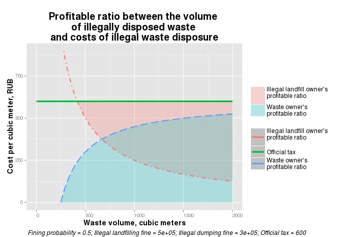
我对以下图例有几个问题:
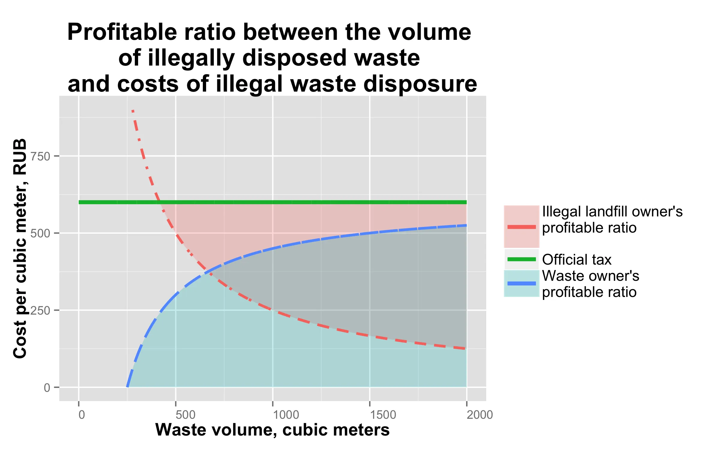
以下是创建此图表所需的代码。`plotDumping` 是绘制图表的函数,`updateData` 生成图表的数据框,'updateLabels' 为图表生成脚注。
- 彩带和线分别放在两个图例中,但我想合并它们: 图例中的线应该有背景填充,填充颜色与同名的彩带相同 (对于"official tax"项应该是透明的)。
- 图例中的线看起来只有颜色不同,但它们应该通过颜色和线条类型来区分。
以下是创建此图表所需的代码。`plotDumping` 是绘制图表的函数,`updateData` 生成图表的数据框,'updateLabels' 为图表生成脚注。
library(ggplot2)
library(grid)
library(gridExtra)
library(scales)

max_waste_volume <- 2000
Illegal_dumping_fine_P <- 300000
Illigal_landfilling_fine_P1 <- 500000
Fine_probability_k <- 0.5
Official_tax_Ta <- 600

# mwv = max_waste_volume
# P = Illegal_dumping_fine_P
# P1 = Illigal_landfilling_fine_P1
# k = Fine_probability_k
# Ta = Official_tax_Ta


updateData <- function(mwv, k, P1, P, Ta){

    # creates and(or) updates global data frame to provide data for the plot

    new_data <<- NULL
    new_data <<- as.data.frame(0:mwv)
    names(new_data) <<- 'V'
    new_data$IlD <<- k*P1/new_data$V
    new_data$IlD_fill <<- new_data$IlD
    new_data$IlD_fill[new_data$IlD_fill > Ta] <<- NA # we don't want ribbon to
    new_data$IlL <<- Ta-k*P/new_data$V
}

updateLabels <- function(k, P1, P, Ta){

    ### creates footnote caption for the plot

    prob <- paste('Fining probability = ', k, sep = '')
    landfilling_fine <- paste('Illegal landfilling fine = ', P1, sep = '')
    dumping_fine <- paste('Illegal dumping fine = ', P, sep = '')
    tax <- paste('Official tax = ', Ta, sep = '')
    note <<- paste(prob, landfilling_fine, sep = '; ')
    note <<- paste(note, dumping_fine, sep = '; ')
    note <<- paste(note, tax, sep = '; ')
    note
}


plotDumping <- function(mwv,
                        P,
                        P1,
                        k,
                        Ta){

  ### this function draws the plot

  # initialise plot data
  updateData(mwv, k, P1, P, Ta)
  updateLabels(k, P1, P, Ta)

  # draw the plot
  profit <- ggplot(data=new_data, aes(x = new_data$V)) +
    geom_ribbon(show_guide = T, alpha = 0.25, ymax = Ta,
                aes(ymin = new_data$IlD_fill,
                    fill = "Illegal landfill owner's\nprofitable ratio\n")) +
    geom_ribbon(show_guide = F, alpha = 0.25, ymin = 0,
                aes(ymax = new_data$IlL,
                    fill = "Waste owner's\nprofitable ratio")) +
    geom_line(data=new_data,
              aes(y = new_data$IlD, col = "Illegal landfill owner's\nprofitable ratio\n"),
              size = 1,
              linetype = 4) +
    geom_line(data=new_data,
              aes(y = new_data$IlL, col = "Waste owner's\nprofitable ratio"),
              size = 1,
              linetype = 5) +
    geom_line(y = Ta,
              aes(col = "Official tax"),
              size = 1.5,
              linetype = 1)+
    xlim(c(0, max(new_data$V)))+
    ylim(c(0, Ta*1.5))+
    theme(axis.text.x = element_text(angle=0, hjust = 0),
          axis.title = element_text(face = 'bold', size = 14),
          title = element_text(face = 'bold', size = 16),
          legend.position = 'right',
          legend.title = element_blank(),
          legend.text = element_text(size = 12),
          legend.key.width = unit(1, 'cm'))+
    labs(title="Profitable ratio between the volume \nof illegally disposed waste \nand costs of illegal waste disposure",
         x="Waste volume, cubic meters",
         y="Cost per cubic meter, RUB")

   # add a footnote about paramaters used for the current plot
   profit <- arrangeGrob(profit, sub = textGrob(note,
                                           x = 0,
                                           hjust = -0.1,
                                           vjust=0.1,
                                           gp = gpar(fontface = "italic", fontsize = 12)))

 # show plot
 print(profit)
}

# draw the plot
plotDumping(max_waste_volume,
                         Illegal_dumping_fine_P,
                         Illigal_landfilling_fine_P1,
                         Fine_probability_k,
                         Official_tax_Ta)
aes内部使用$,否则我的函数将无法与manipulation库正确地工作。 - SS_Rebelious