CSS缩放而不重叠

3
我需要使用transform scale(1.3)来缩放中间的div。当然可以实现,但问题是在缩放后它会与相邻的div重叠。是否可能只使用CSS来消除重叠?现在它看起来像这样:
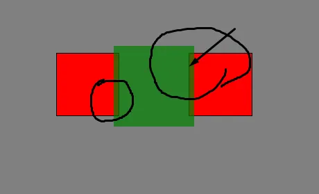
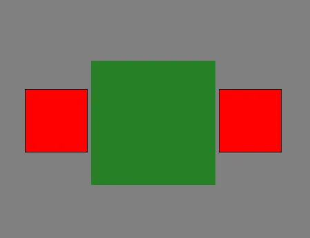
enter image description here

但我希望以这种方式

enter image description here

.main {
  width: 100%;
  height: 500px;
  background-color: gray;
  padding: 100px;
}

.box {
  width: 100px;
  height: 100px;
  background-color: red;
  margin: 2px;
  display: inline-block;
  border: 2px;
  border-style: solid;
  border-color: black;
}

.scaled-box {
  width: 100px;
  height: 100px;
  -webkit-transform: scale(1.3);
  -moz-transform: scale(1.3);
  transform: scale(1.3);
  display: inline-block;
  background-color: green;
  opacity: 0.7;
}
<div class="main">
  <div class="box"></div>
  <div class="scaled-box"></div>
  <div class="box"></div>
</div>


这个回答解决了你的问题吗?https://dev59.com/qFkT5IYBdhLWcg3wALDw - Dan Mullin
3个回答

2

.main {
    width: 100%;
    height: 500px;
    background-color: gray;
    padding: 100px;
    --scale-rate:1.5; /* You can change scale from this line */
}

.box {
    width: 100px;
    height: 100px;
    background-color: red;
    display: inline-block;
    border: 2px;
    border-style: solid;
    border-color: black;
}

.box:first-child{
  margin-right: calc(((100px * var(--scale-rate)) - 100px) / 2); /* 100px is scaled-box width*/
}

.box:last-child{
  margin-left: calc(((100px * var(--scale-rate)) - 100px) / 2); /* 100px is scaled-box width*/
}

.scaled-box {
    width: 100px;
    height: 100px;
    -webkit-transform: scale(var(--scale-rate));
    -moz-transform: scale(var(--scale-rate));
    transform: scale(var(--scale-rate));
    display: inline-block;
    background-color: green;
    opacity: 0.7;
}
<div class="main">
    <div class="box"></div>
    <div class="scaled-box"></div>
    <div class="box"></div>
</div>

编辑:

边距率固定


2

1
你可以为缩放后的盒子添加边距以防止重叠。
.scaled-box {
margin: 20px;
width: 100px;
height: 100px;
-webkit-transform: scale(1.3);
-moz-transform: scale(1.3);
transform: scale(1.3);
display: inline-block;
background-color: green;
opacity: 0.7;
}

在您的预览中,div也是垂直对齐的,这不可能只用简单的margin实现,因为它们是行内元素。在主容器中使用flex来使它们垂直对齐。
.main {
display: flex;
align-items: center;
width: 100%;
height: 500px;
background-color: gray;
padding: 100px;
}

网页内容由stack overflow 提供, 点击上面的
可以查看英文原文,
原文链接