我非常喜欢“RdBu_r”这种颜色地图,但是我想去掉蓝色和红色之间的白色部分。 有没有简单的方法可以做到这一点?
1个回答
9
是的,但在你的情况下,可能更容易制作一个在蓝色和红色之间插值的颜色映射。
例如:
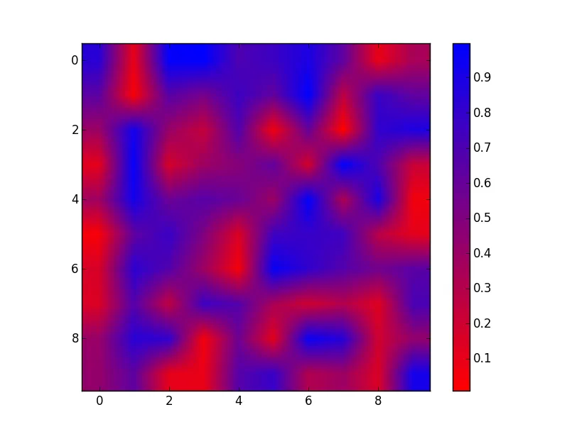
import numpy as np
import matplotlib.pyplot as plt
from matplotlib.colors import LinearSegmentedColormap

cmap = LinearSegmentedColormap.from_list('name', ['red', 'blue'])

fig, ax = plt.subplots()
im = ax.imshow(np.random.random((10, 10)), cmap=cmap)
fig.colorbar(im)
plt.show()
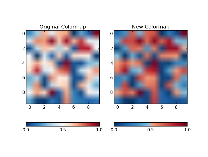
但是,如果您想要“剪切”另一个色图的中间部分,您需要在不包括中间部分的范围内进行评估并创建一个新的色图。
import numpy as np
import matplotlib.pyplot as plt
from matplotlib.colors import LinearSegmentedColormap

# Remove the middle 40% of the RdBu_r colormap
interval = np.hstack([np.linspace(0, 0.3), np.linspace(0.7, 1)])
colors = plt.cm.RdBu_r(interval)
cmap = LinearSegmentedColormap.from_list('name', colors)

# Plot a comparison of the two colormaps
fig, axes = plt.subplots(ncols=2)
data = np.random.random((10, 10))

im = axes[0].imshow(data, cmap=plt.cm.RdBu_r, vmin=0, vmax=1)
fig.colorbar(im, ax=axes[0], orientation='horizontal', ticks=[0, 0.5, 1])
axes[0].set(title='Original Colormap')

im = axes[1].imshow(data, cmap=cmap, vmin=0, vmax=1)
fig.colorbar(im, ax=axes[1], orientation='horizontal', ticks=[0, 0.5, 1])
axes[1].set(title='New Colormap')

plt.show()
- Joe Kington
网页内容由stack overflow 提供, 点击上面的可以查看英文原文,
原文链接
原文链接