我正在开发一个小型社交网络应用,但是在显示用户的个人资料图片和他/她的帖子时遇到了困难。
这是我目前的代码: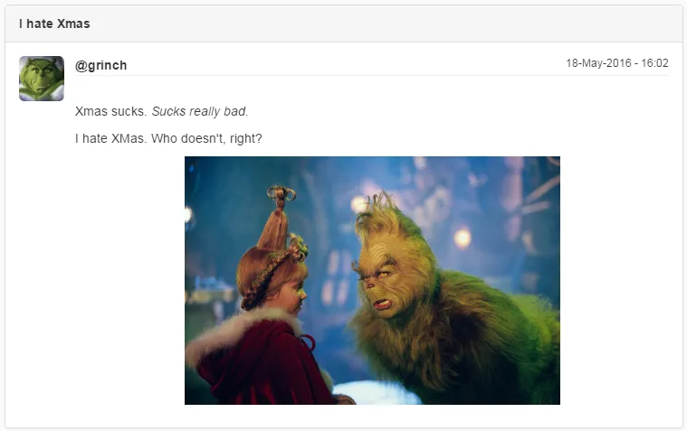 问题在于左侧的个人资料图片。首先,“Xmas sucks…”文本被图像顶下去了(我猜测需要修复clearfix类 - 但是我无法让它正常工作)。其次,如果屏幕尺寸改变,图片将超出列宽(我认为这是术语):
 你可以看到上面的屏幕截图 (iPhone6 Plus),“@grinch…”一行已经被顶下去了。
以下是我的代码:
这是我目前的代码:
问题在于左侧的个人资料图片。首先,“Xmas sucks…”文本被图像顶下去了(我猜测需要修复clearfix类 - 但是我无法让它正常工作)。其次,如果屏幕尺寸改变,图片将超出列宽(我认为这是术语):
你可以看到上面的屏幕截图 (iPhone6 Plus),“@grinch…”一行已经被顶下去了。以下是我的代码:
<div ng-repeat="post in posts | orderBy:'+':true">
  <div class="row">
    <div class="col-md-12">
      <div class="panel panel-default">
        <div class="panel-heading line-break" ng-if="post.title">
          <strong>{{post.title}}</strong>
        </div>
        <div class="panel-body line-break">
          <div class="row small-gap-row-below">
            <div class="col-md-1">
              <img src='http://localhost:50003/image/{{user.profilePicKey}}'
                   alt="Profile Picture" class="img-responsive img-rounded"
                   style="max-height: 50px; max-width: 50px;">
            </div>
            <div class="col-md-11">
                <span><strong>@{{post.username}}</strong></span>
                <small class="pull-right">18-May-2016 - 16:02</small>
              <hr class="small-margin-top"></hr>
            </div>
          </div>
          <div class="row">
            <div class="col-md-offset-1 col-md-11">
              <p froala-view="post.content"></p>
            </div>
          </div>
        </div>
      </div>
    </div>
  </div>
</div>
我正在使用 img-responsive 类,那么图片不应该自动调整大小以适应父元素吗?在这种情况下,它不应该溢出吗?
我设置了 style="max-height: 50px; max-width: 50px;",因为否则显示的图片非常小。由于它说 'max-*',我认为这不会破坏响应性,因为它仍然是一种“灵活”的度量。
我怀疑让这个工作起来并不难,但由于我没有CSS/Bootstrap/Frontend-in-general方面的经验,所以我很难做到。
更新:
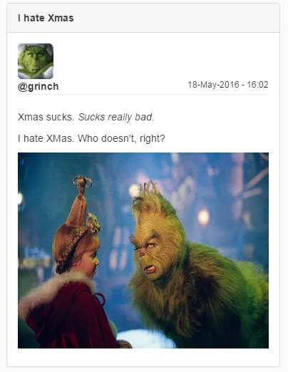
我已经按建议将 col-md-* 改为 col-xs,但它没有起作用:
用户名放在了图片上面。
更新 II
Img CSS:
element.style {
    max-height: 50px;
    max-width: 50px;
}
.img-rounded {
    border-radius: 6px;
}
.carousel-inner>.item>a>img, .carousel-inner>.item>img, .img-responsive, .thumbnail a>img, .thumbnail>img {
    display: block;
    max-width: 100%; (not applied!)
    height: auto;
}

img {
    vertical-align: middle;
}
img {
    border: 0;
}
* {
    -webkit-box-sizing: border-box; (not applied!)
    -moz-box-sizing: border-box; (not applied!)
    box-sizing: border-box;
}
Inherited from body.ng-scope
body {
    font-family: "Helvetica Neue",Helvetica,Arial,sans-serif;
    font-size: 14px;
    line-height: 1.42857143;
    color: #333;
    background-color: #fff;
}
Inherited from html
html {
    font-size: 10px; (not applied!)
    -webkit-tap-highlight-color: rgba(0,0,0,0);
}
html {
    font-family: sans-serif; (not applied!)
    -webkit-text-size-adjust: 100%; (not applied!)
    -ms-text-size-adjust: 100%;
}
Pseudo ::before element
:after, :before {
    -webkit-box-sizing: border-box; (not applied!)
    -moz-box-sizing: border-box; (not applied!)
    box-sizing: border-box;
}
Pseudo ::after element
:after, :before {
    -webkit-box-sizing: border-box; (not applied!)
    -moz-box-sizing: border-box; (not applied!)
    box-sizing: border-box;
}
更新 III
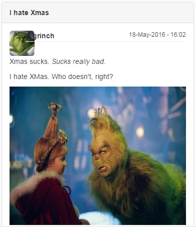
建议同时使用 col-xs-* 和 col-sm-*:
头像和用户名 (@grinch) 之间出现了间隙。同时,帖子内容也被推向左侧。