我希望在Bokeh中制作等高线图。目前我在网上还没有找到相关资料。
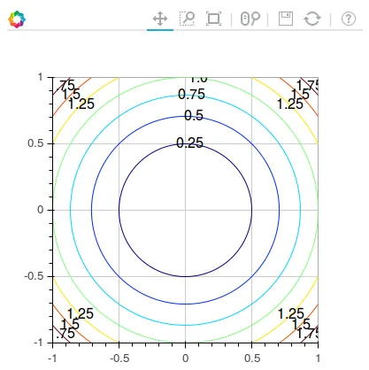
提醒一下,这是等高线图:
import numpy as np
import matplotlib.pyplot as plt
from bokeh.models import ColumnDataSource
from bokeh.io import output_file
from bokeh.plotting import gridplot,figure, show

def get_contour_data(X, Y, Z):
    cs = plt.contour(X, Y, Z)
    xs = []
    ys = []
    xt = []
    yt = []
    col = []
    text = []
    isolevelid = 0
    for isolevel in cs.collections:
        isocol = isolevel.get_color()[0]
        thecol = 3 * [None]
        theiso = str(cs.get_array()[isolevelid])
        isolevelid += 1
        for i in range(3):
            thecol[i] = int(255 * isocol[i])
        thecol = '#%02x%02x%02x' % (thecol[0], thecol[1], thecol[2])

        for path in isolevel.get_paths():
            v = path.vertices
            x = v[:, 0]
            y = v[:, 1]
            xs.append(x.tolist())
            ys.append(y.tolist())
            xt.append(x[len(x) / 2])
            yt.append(y[len(y) / 2])
            text.append(theiso)
            col.append(thecol)

    source = ColumnDataSource(data={'xs': xs, 'ys': ys, 'line_color': col,'xt':xt,'yt':yt,'text':text})
    return source


output_file("contour.html")

N = 400
x = np.linspace(-1, 1, N)
y = np.linspace(-1, 1, N)
X, Y = np.meshgrid(x, y)
Z = X**2 + Y**2

source = get_contour_data(X,Y,Z)
plot = figure(plot_width=400,plot_height=400,x_range=[-1,1], y_range=[-1,1])
plot.multi_line(xs='xs', ys='ys', line_color='line_color', source=source)
plot.text(x='xt',y='yt',text='text',source=source,text_baseline='middle',text_align='center')
show(plot)
这是输出结果:
https://plot.ly/python/contour-plots/
https://plot.ly/pandas/contour-plots/
密度图(带有相邻直方图的等高线图):https://plot.ly/python/2d-density-plots/
https://plot.ly/pandas/2d-density-plots/
Plotly Python库可以在pip上获取,它是100%免费和开源的。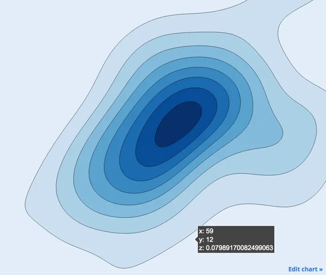
感谢Pablo的回答,对我非常有帮助。
我使用了你的示例制作了类似的图形,并使用skimage库添加了等高线。同时,我打开了悬停工具,就像你参考的Bokeh图像示例那样。希望其他人能够加入线标签。
请注意,以下代码是在Jupyter Notebook中运行的。
from skimage import measure
import numpy as np

from bokeh.plotting import figure, show, output_notebook
from bokeh.models import (ColorBar,
                          FixedTicker,
                          LinearColorMapper,
                          PrintfTickFormatter)

output_notebook()

N = 500
x = np.linspace(0, 10, N)
y = np.linspace(0, 10, N)
xx, yy = np.meshgrid(x, y)
d = np.sin(xx)*np.cos(yy)

mapper = LinearColorMapper(palette='Spectral11', low=-1, high=1)

p = figure(x_range=(0, 10), y_range=(0, 10),
           tooltips=[("x", "$x"), ("y", "$y"), ("value", "@image")])

# must give a vector of image data for image parameter
p.image(image=[d], x=0, y=0, dw=10, dh=10, palette='Spectral11')

levels = np.linspace(-1, 1, 12)
color_bar = ColorBar(color_mapper=mapper,
                     major_label_text_font_size="8pt",
                     ticker=FixedTicker(ticks=levels),
                     formatter=PrintfTickFormatter(format='%.2f'),
                     label_standoff=6,
                     border_line_color=None,
                     location=(0, 0))

p.add_layout(color_bar, 'right')

for level in levels:
  contours = measure.find_contours(d, level)
  for contour in contours:
    x = contour[:,1]/50
    y = contour[:,0]/50
    p.line(x, y, color='grey', line_width=2)

show(p)
skimage 中的 measure 是个好主意。是的,在 Bokeh 中添加行标签仍然缺失,我认为。 - Pablo Reyesfrom bokeh.io import output_file
from bokeh.plotting import gridplot,figure, show
from bokeh.models import ColumnDataSource,FixedTicker
import numpy as np
from matplotlib import cm,colors
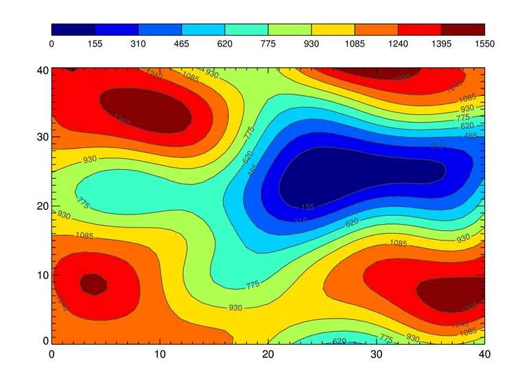
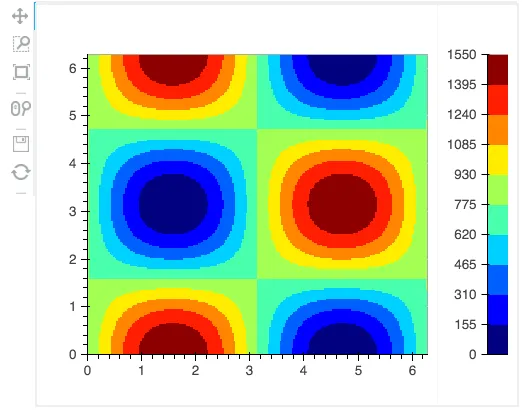
output_file("contour.html")
cmap = cm.get_cmap("jet") #choose any matplotlib colormap here
num_slabs = 10 # number of color steps
jet_10 = [colors.rgb2hex(m) for m in cmap(np.arange(0,cmap.N,cmap.N/(num_slabs-1)))]
vmin = 0
vmax = 1550
N = 200
x = np.linspace(0, 10, N)
y = np.linspace(0, 10, N)
xx, yy = np.meshgrid(x, y)
d = vmax * (1. + np.sin(xx)*np.cos(yy))
source = ColumnDataSource(data={'d': [d], 'xx': [x], 'yy': [y]})
p = figure(plot_width=400,plot_height=400,x_range=[0, 10], y_range=[0, 10],min_border_right=10)
p.image(image="d", x=[0], y=[0], dw=[10], dh=[10], palette=jet_10,source=source)
# The following code is for the colorbar:
pcb = figure(plot_width=80,plot_height=400,x_range=[0, 1], y_range=[0, vmax],min_border_right=10)
pcb.image(image=[np.linspace(vmin,vmax,100).reshape(100,1)],x=[0],y=[0],dw=[1],dh=[vmax-vmin], palette=jet_10)
pcb.xaxis.major_label_text_color = None
pcb.xaxis.major_tick_line_color = None
pcb.xaxis.minor_tick_line_color = None
pcb.yaxis[0].ticker=FixedTicker(ticks=np.linspace(vmin,vmax,num_slabs+1)) # 11 ticks
pgrid = gridplot([[p,pcb]]) # this places the colorbar next to the image
show(pgrid)
matplotlib进行编程示例,请参见http://matplotlib.org/examples/pylab_examples/contour_demo.html和http://matplotlib.org/examples/pylab_examples/contour_image.html。 - Azadbokeh.charts.Contour仍然是 Bokeh 0.10 的一个未完成功能请求,但希望它能在接下来的几个版本中实现。如果您有兴趣帮助,这将是一个新贡献者的好项目,请访问 Bokeh 邮件列表或 GH 追踪器。 - bigreddot