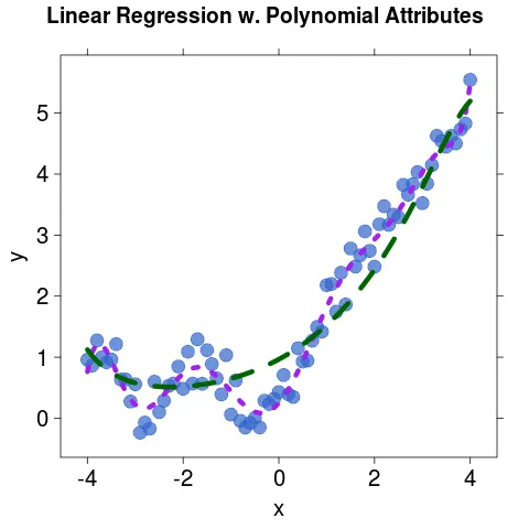
我正在使用lattice包,想要在我的图形中添加一个图例。但是auto.key和legend的文档非常混乱,我无法找出正确的语法来添加图例。这是我的代码:
xyplot(y ~ x, df, pch=19, col=rgb(0.2, 0.4, 0.8, 0.7), cex=2,
       scales=list(cex=1.7),
       xlab=list("x", cex=1.ales=list(cex=1.7),
       xlab=list("x", cex=1.7), ylab=list("y", cex=1.7),
       main=list("Linear Regression w. Polynomial Attributes", cex=1.6),
       auto.key=T,
       panel = function(x, y, ...) {
            panel.xyplot(x, y, ...)
            llines(x, predict(lm.xtend), col="purple", lwd=6, lty=3)
            llines(x, predict(ridge.lin), col="darkgreen", lwd=6, lty=2)
       })
下图显示了数据曲线,我只想为这些曲线添加图例。
legend函数不属于 grid/lattice/ggplot 绘图系统。您正在尝试混合使用基础绘图和网格绘图。在 lattice 中,它需要是legend=list('inside' = someGrobMakingFunction)。您应该学习使用key=list...)机制。 - IRTFMxyplot调用中没有组或条件变量,因此不清楚应该如何构建具有两个文本值的图例。也许您只想添加一个文本框? - IRTFM