钟形曲线/正态分布曲线在NVD3离散条形图上的表现

3
我正在尝试找到一种方法将分布曲线/钟形曲线放入NVD3图表中。我在网上搜索了很多,但没有找到适合我的内容。也许这实际上是不可能的,但我认为值得问一下,对于任何寻找类似内容的人来说也是好的了解。

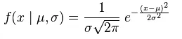
这是我需要的图表样例(在Google图片中找到)

enter image description here

从示例中可以看出,该线不需要第二个轴,因此不需要“条形和线状图组合”。我知道你可以直接用D3绘制到画布上,但我对此有点经验不足。

以下是我的代码和jsfiddle链接,如果有人想看的话。

var json = [{ "values": [{"label":"450-456", "value":0, "color":"#D62728"},{"label":"456-462", "value":0, "color":"#D62728"},{"label":"462-468", "value":0, "color":"#D62728"},{"label":"468-474", "value":0, "color":"#D62728"},{"label":"474-480", "value":0, "color":"#D62728"},{"label":"480-486", "value":1, "color":"#D62728"},{"label":"486-492", "value":5, "color":"#D62728"},{"label":"492-498", "value":3, "color":"#D62728"},{"label":"498-504", "value":5, "color":"#D62728"},{"label":"504-510", "value":6, "color":"#D62728"},{"label":"510-516", "value":9, "color":"#D62728"},{"label":"516-522", "value":6, "color":"#D62728"},{"label":"522-528", "value":1, "color":"#D62728"},{"label":"528-534", "value":0, "color":"#D62728"},{"label":"534-540", "value":0, "color":"#D62728"},{"label":"540-546", "value":0, "color":"#D62728"},{"label":"546-552", "value":0, "color":"#D62728"},{"label":"552-558", "value":0, "color":"#D62728"},{"label":"558-564", "value":0, "color":"#D62728"},{"label":"564-570", "value":0, "color":"#D62728"}]}];


                nv.addGraph(function() {
                var chart = nv.models.discreteBarChart()
                .x(function(d) {
                return d.label
                })
                .y(function(d) {
                return d.value
                })  
                .staggerLabels(true)

                .tooltips(true)
                .showValues(true)
                .transitionDuration(250)
                ;

                chart.yAxis
                .tickFormat(d3.format('.0f'))
                chart.valueFormat(d3.format('d'));
               // REMOVE DECIMAL PLACES FROM Y AXIS
                chart.forceY([0,10]);

                d3.select('#chartDisribution svg')
                .datum(json)
                .call(chart);

                d3.select('#chartDisribution svg')
                .append("text")
                .attr("x", '50%')             
                .attr("y", 10)
                .attr("text-anchor", "middle")
                .style("font-size", "14px") 
                .style("text-decoration", "underline")
                .style("font-weight", "bold")
                .style("height", "20px")     
                .text("DISRIBUTION");

                nv.utils.windowResize(chart.update);
                return chart;
                });    

分布前的原始数据 -

[518, 514, 512, 514, 518, 498, 510, 516, 520, 508, 504, 504, 517, 494, 492, 491, 515, 507, 492, 527, 509, 500, 491, 506, 517, 516, 518, 505, 514, 486, 516, 504, 503, 490, 515, 498]

如果需要更多信息,请询问。

谢谢


如果您想坚持使用nvd3-only解决方案,为什么不使用Line Plus Bar Chart删除y2轴呢? - altocumulus
是的,但仍需要数据源来创建该行,而我也不知道如何做到这一点。 - SK2017
你是否拥有包含明确数值的原始数据集?你需要这个数据集来使用均值和标准差计算正常线。 - Stacey Burns
@StaceyBurns 编辑后添加原始数据 - SK2017
@Dan,我之前用JavaScript做过这个,虽然不是很简单,但明天我会把我的代码发布出来,今天没时间啦 :-) - Stacey Burns
@StaceyBurns 很好,谢谢! - SK2017
1个回答

6

正如@Altocumulus所说,您可以使用LinePlusBarChart。

有很多关于如何做到这一点的信息,因此我只解释如何生成正态分布的数据。

以下公式用于创建数据:维基百科来源

enter image description here

我们需要的是整个数据集和直方图使用的分组的标准差和平均值。 我不会详细介绍如何从数据集计算平均值和标准差,但下面的代码包含了这个过程。 我们首先声明数据集和分组:
var values = [518, 514, 512, 514, 518, 498, 510, 516, 520, 508, 504, 504, 517, 494, 492, 491, 515, 507, 492, 527, 509, 500, 491, 506, 517, 516, 518, 505, 514, 486, 516, 504, 503, 490, 515, 498];

var bins=[450, 456, 462, 468, 474, 480, 486, 492, 498, 504, 510, 516, 522, 528, 534, 540, 546, 552, 558, 564]

这个数据集的均值和标准差如下:
var average = 507.1944444
var std = 10.43022927

有了这些数据,我们可以计算出公式的第一部分:

var ni1 = 1 / (std * Math.sqrt(2 * Math.PI));

公式的第二部分使用了区间,因此我们需要循环遍历每个区间来计算正态曲线的值。
为了将正态值缩放到图表上,我们需要知道每个区间之间的大小以及总值的数量。
(我还添加了一个名为norm的变量,但我们只是用它来输出结果到屏幕上)
var norm ="norm data"
var length = bins.length;
var bin_distance = 6;
var num_records = 36;

for(var i=0;i<length;i++){
    // This is the second part of the formula 
    var ni2 = Math.exp(-1*((bins[i]-average)*(bins[i]-average))/(2* (std*std))) 

    // this is the final calculation for the norm values. I also rounded the value but thats up to you if you want, you can remove this for unrounded values.   
    var normdata = Math.round(ni1*ni2*bin_distance*num_records);

    //append value to norm to output to screen
    norm = norm +"<p>"+ bins[i]+" - "+normdata+"</p>"
}

//output results to screen: 
document.getElementById('chartDisribution').innerHTML = norm;   

这里有一个工作的代码片段

对于您的图表,您需要将normdata值推入您为线条声明的对象中。


var bin_distance = 6; 这个变量从哪里来的? - SK2017
这实际上是二进制范围。你的第一个范围是450,第二个是456,所以它们之间有6个,其他范围也是如此。 - Stacey Burns
嗨,@dan,这有帮助吗? - Stacey Burns
今天打算试一下,过后会告诉你。 - SK2017

网页内容由stack overflow 提供, 点击上面的
可以查看英文原文,
原文链接