在开始之前,我需要提醒一下,matplotlib要求错误相对于数据而非绝对边界。因此,我们需要修改数据框以考虑这一点,通过减去相应的列来实现。
u = u"""grp1 grp2 variables lb m ub
A A1 V1 1.00 1.50 2.5
A A2 V2 1.50 2.50 3.5
B A1 V1 7.50 14.50 20.5
B A2 V2 0.25 0.75 1.0
A A2 V1 1.00 6.50 8.5
A A1 V2 1.50 3.50 6.5
B A2 V1 3.50 4.50 15.5
B A1 V2 8.25 12.75 13.9"""
import io
import pandas as pd
df = pd.read_csv(io.StringIO(u), delim_whitespace=True)
df["lb"] = df["m"]-df["lb"]
df["ub"] = df["ub"]-df["m"]
现在有两种解决方案,本质上是相同的。让我们从不使用 seaborn 的解决方案开始(原因稍后会变得清晰)。
不使用 Seaborn
Pandas 可以通过使用每列属于或构成一个组的数据框来绘制分组条形图。需要执行以下步骤:
- 根据不同的
variables 创建多个子图。
- 通过
variables 对数据框进行分组。
- 对于每个组,创建一个透视数据框,其中包含
grp1 的值作为列,m 作为值。对于两个误差列也做同样处理。
- 应用 How add asymmetric errorbars to Pandas grouped barplot? 中的解决方案。
代码如下:
import io
import numpy as np
import pandas as pd
import matplotlib.pyplot as plt
df = pd.read_csv(io.StringIO(u), delim_whitespace=True)
df["lb"] = df["m"]-df["lb"]
df["ub"] = df["ub"]-df["m"]
def func(x,y,h,lb,ub, **kwargs):
data = kwargs.pop("data")
errLo = data.pivot(index=x, columns=h, values=lb)
errHi = data.pivot(index=x, columns=h, values=ub)
err = []
for col in errLo:
err.append([errLo[col].values, errHi[col].values])
err = np.abs(err)
p = data.pivot(index=x, columns=h, values=y)
p.plot(kind='bar',yerr=err,ax=plt.gca(), **kwargs)
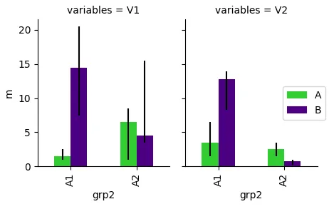
fig, axes = plt.subplots(ncols=len(df.variables.unique()))
for ax, (name, group) in zip(axes,df.groupby("variables")):
plt.sca(ax)
func("grp2", "m", "grp1", "lb", "ub", data=group, color=["limegreen", "indigo"])
plt.title(name)
plt.show()
使用Seaborn
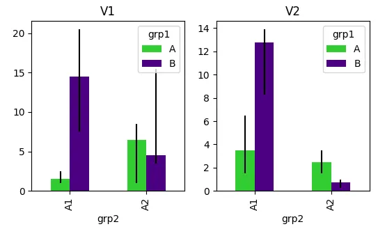
Seaborn的factorplot不允许自定义误差条。因此,需要使用FaceGrid方法。为了避免条形图叠加,需要将hue参数放在map调用中。因此,以下代码等效于问题中的sns.factorplot调用。
g = sns.FacetGrid(data=df, col="variables", size=4, aspect=.7 )
g.map(sns.barplot, "grp2", "m", "grp1", order=["A1","A2"] )
现在的问题是,我们无法从外部获取误差条,更重要的是,我们无法为分组条形图提供误差给
seaborn.barplot。对于非分组条形图,可以通过
yerr参数提供误差,该参数传递给matplotlib的
plt.bar绘图函数。这个概念在
this question中展示。然而,由于
seaborn.barplot多次调用
plt.bar,每次调用都会有相同的误差(或它们的维度不匹配)。
因此,我唯一看到的选择是使用
FacetGrid,并将与上面使用的完全相同的函数映射到它上面。这种方法使得使用seaborn变得过时,但为了完整起见,这里是
FacetGrid的解决方案。
import io
import numpy as np
import pandas as pd
import seaborn as sns
import matplotlib.pyplot as plt
df = pd.read_csv(io.StringIO(u), delim_whitespace=True)
df["lb"] = df["m"]-df["lb"]
df["ub"] = df["ub"]-df["m"]
def func(x,y,h,lb,ub, **kwargs):
data = kwargs.pop("data")
errLo = data.pivot(index=x, columns=h, values=lb)
errHi = data.pivot(index=x, columns=h, values=ub)
err = []
for col in errLo:
err.append([errLo[col].values, errHi[col].values])
err = np.abs(err)
p = data.pivot(index=x, columns=h, values=y)
p.plot(kind='bar',yerr=err,ax=plt.gca(), **kwargs)
g = sns.FacetGrid(df, col="variables", size=4, aspect=.7, )
g.map_dataframe(func, "grp2", "m", "grp1", "lb", "ub" , color=["limegreen", "indigo"])
g.add_legend()
plt.show()