如何将溢出文本对齐到 div 盒子中心?

4

以下是我的问题:

我的标题词溢出了div框。原因是该词的大小超过了div的宽度,而我设置了“nowrap”规则。显示效果如下:

Image

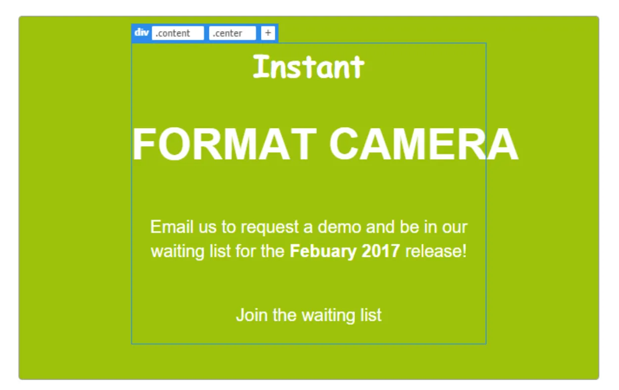
我想让“FORMAT CAMERA”这几个词在div框的中心轴线上对齐,这样F的一部分会溢出到左边,A的一部分会溢出到右边。我该怎么做呢? 以下是我的简单CSS代码:

.content {
  text-align: center;
}

h1(FORMAT CAMERA) {
  color: white;
  font-size: 50px;
  font-family: "Rubik", sans-serif;
  line-height: 1.4;
  white-space: nowrap;
}

2
欢迎来到StackOverflow!感谢您提供CSS,但是能否也提供相关的HTML呢?没有HTML很难复现这个问题。如果您能更新您的问题并列出所有相关代码,那将会非常有帮助,最好是一个最小化、完整且可验证的示例。如果您的HTML是由服务器端生成的,请发布输出结果。如需更多信息,请参阅关于如何提问良好问题的帮助文章,并参观一下我们的网站导览 :) - Obsidian Age
2个回答

11

只需将 .content 添加 display:flexjustify-content:center 即可。
了解更多关于令人惊叹的 flex box

.content {
  text-align: center;
  border: solid 1px #333;
  width: 300px;
  margin: 0 auto;
  display: flex;
  justify-content: center;
}

h1 {
  color: black;
  font-size: 50px;
  font-family: "Rubik", sans-serif;
  line-height: 1.4;
  white-space: nowrap;
}
<div class="content">
  <h1>FORMAT CAMERA</h1>
</div>


4
这种方法有点hacky,但是它可以实现。它通过为h1标签添加margin-left和margin-right 100%来实现。这基本上是相对于窗口大小在两侧以相等的数量“拉”元素,强制其溢出内容div。
我添加了一个具有overflow:hidden属性的.outerspace包装器,以防止出现水平滚动条。

.outerspace {
  overflow: hidden;
}
.content {
  text-align: center;
  width: 400px;
  margin: 0 auto;
  background: pink;
}
h1 {
  color: red;
  font-size: 55px;
  font-family: "Rubik", sans-serif;
  white-space: nowrap;
  margin-left: -100%;
  margin-right: -100%;
}
<div class="outerspace">
  <div class="content">
    <p>Lorem ipsum dolor</p>
    <h1>FORMAT CAMERA</h1>
    <p>Lorem ipsum dolor sit amet, consectetur adipisicing elit, sed do eiusmod tempor incididunt ut labore et dolore magna aliqua. Ut enim ad minim veniam, quis nostrud exercitation ullamco laboris nisi ut aliquip ex ea commodo consequat. Duis aute irure dolor in reprehenderit in voluptate velit esse cillum dolore eu fugiat nulla pariatur. Excepteur sint occaecat cupidatat non proident, sunt in culpa qui officia deserunt mollit anim id est laborum.</p>
  </div>
</div>


网页内容由stack overflow 提供, 点击上面的
可以查看英文原文,
原文链接