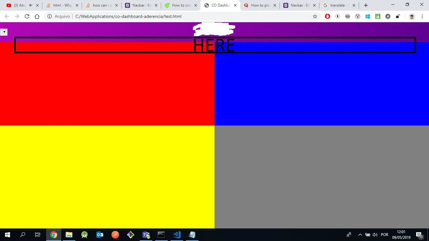
我有一个包含导航栏和4个div的布局。第一个div被导航栏遮挡了。有谁知道我该怎么做吗?
<body>
  <div id="app" class="flex-container">
    <nav class="navbar default-layout p-0 fixed-top d-flex flex-row" style="height: 63px;">
      <select id="region" onchange="initProcess();" style="position:absolute;background:#eaeaea;">
      </select>
      <div style="width: calc(100% - 74px); padding-left: 74px; left: 0; text-align: center; color: #fff">
        <img src="images/co-logo.png" style="width: 100px; margin-top: -6px">
        <h4>Dashboards</h4>
      </div>
      <div class="navbar-menu-wrapper d-flex align-items-right">
        <button class="navbar-toggler navbar-toggler-right d-lg-none align-self-right" type="button" data-toggle="offcanvas">
                    <span class="mdi mdi-menu"></span>
                </button>
      </div>
    </nav>
    <div class="flex-item" style="background-color:red"></div>
    <div class="flex-item" style="background-color:blue"></div>
    <div class="flex-item" style="background-color:yellow"></div>
    <div class="flex-item" style="background-color:grey"></div>
  </div>
</body>