R-Shiny-Plotly第二个轴标签与y轴值重叠

3

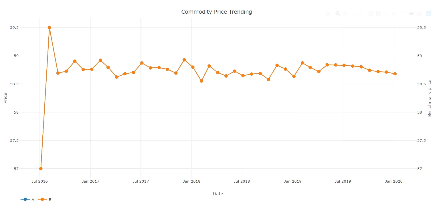
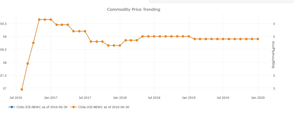
我正在使用R、shiny和plotly尝试构建交互式用户界面。基本上,我有一个数据集dest,它有两列Dateprice。这是一个基本的折线图:

ay <- list(
showticklabels = TRUE,
overlaying = "y",
side = "right",
title = "Benchmark price")

p<-plot_ly(dset, x = ~Date,y= ~Price,type = 'scatter',mode ='lines',marker=list(size = 10),name=paste0(input$select_bench," as of ",input$benchdate)) %>% layout(xaxis = ax, yaxis2 =ay)

p<-add_trace(p,x=~bDate,y=~bPrice,type = 'scatter',mode = 'lines',marker=list(size = 10),name=paste0(input$select_bench," as of ",input$benchdate),textposition = 'middle right',yaxis="y2")}

layout(p,legend = list(orientation = 'h'),title = 'Commodity Price Trending')

我正在使用
legend = list(orientation = 'h')

我希望把图例放在底部,但是这样做会导致右边的第二个轴数值与标签重叠,只显示数字的一部分,例如它只显示5而不是59。

我认为应该有一个参数来调整显示区域的默认边距 - 但我尝试了很多谷歌搜索都没有找到任何东西。


2
也许可以调整边距来玩一下:https://plot.ly/r/setting-graph-size/ - MLavoie
运行完美!有一个名为“margin”的参数,用户可以自定义。 - user3833612
1个回答

6
你可以在yaxis2中使用automargin=T,尝试以下内容:
# Dummy data

set.seed(123)

dset = data.frame(Date = seq.Date(from = as.Date("2016-07-05"),to = as.Date("2020-01-05"), by = "month"),
                  Price = c(57,59.5,rnorm(n = 41, mean = 58.75, sd = .1))
                  )

# layout of yaxis2
ay <- list( showticklabels = TRUE,
            overlaying = "y",
            side = "right",
            title = "Benchmark price",
            automargin = T # This do the trick
            )

# Example of your plot
dset %>%
  plot_ly(x = ~Date,y= ~Price,type = 'scatter',mode ='marker+lines',marker=list(size = 10), name = "A") %>%
  add_trace(x = ~Date, y = ~Price , name = "B", yaxis = "y2") %>%
  layout(legend = list(orientation = 'h'),
         title = 'Commodity Price Trending',
         yaxis2 = ay
         )

这里是输出图: plot


网页内容由stack overflow 提供, 点击上面的
可以查看英文原文,
原文链接