100%可调整大小的div浮动在容器div内的左侧

6

有一个包含X个子div的容器div,每个子div都可以在浏览器中100%自适应大小是否可能?我知道可以用单个背景来实现,但无法使用一排div...
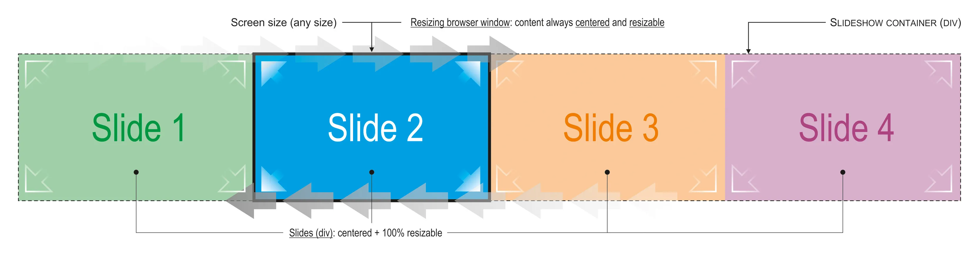
这是我的意图(从左到右滑动的幻灯片):

enter image description here

HTML代码如下:

<div id="slideshowContent">
  <div id="slideshowImage_01" class="slideshowImage_container"></div>
  <div id="slideshowImage_02" class="slideshowImage_container"></div>
  <div id="slideshowImage_03" class="slideshowImage_container"></div>
  <div id="slideshowImage_04" class="slideshowImage_container"></div>
</div> <!-- End of id="slideshowContent" -->

...以及CSS:

#slideshowContainer {
  z-index: 0;
  width: 11520px; height: 1080px;
  position: relative;
}

.slideshowImage {
  width: 1920px; height: 1080px;
  float: left;
}

谢谢。

Pedro

编辑1:我忘记提到每个div都包含一张图片。

编辑2:添加了我的更新版FIDDLE


+1 你的图片。不管怎样,这个链接有帮助吗?http://viralpatel.net/blogs/jquery-resizable-draggable-resize-drag-tutorial-example/ - Kees Sonnema
你尝试过使用 % 这样的东西吗? - A. Wolff
是的,但问题并不简单... - Pedro
@Pedro,确实是这样。我正在创建一个fiddle。 - Broxzier
4个回答

3

这是完全工作的版本:http://jsfiddle.net/y9zcf/7/

居中是使用CSS完成的,javascript只是用来运行幻灯片。

HTML:

<div id="slideshowWrapper">
    <div id="slideshowContent">
        <div id="slideshowImage_01" class="slideshowImage_container active"></div>
        <div id="slideshowImage_02" class="slideshowImage_container"></div>
        <div id="slideshowImage_03" class="slideshowImage_container"></div>
        <div id="slideshowImage_04" class="slideshowImage_container"></div>
    </div>
</div>

CSS:

body, html {
    height: 100%;
    margin: 0;
}
#slideshowWrapper {
    overflow: hidden;
    width: 100%;
    height: 100%;
}
#slideshowContent {
    width: 400%; // 100% * number of slides
    height: 100%;
    position: relative;
}
#slideshowContent .slideshowImage_container {
    width: 25%; // 100% / number of slides
    height: 100%;
    float: left;
}

JS:

function slide() {
    var container = $('#slideshowContent'),
        nextDiv = container.find('.active').next('div'),
        slides = container.find('div'),
        next = nextDiv.length ? nextDiv : slides.first();

    slides.removeClass('active');
    next.addClass('active');
    $('#slideshowContent').animate({
        'left': '-' + next.index() * next.width() + 'px'
    }, 2000, function () {
        $(this).css({
            'left': '-' + next.index() * 100 + '%'
        });
    });

}

setInterval(function () {
    slide();
}, 5000);

这是100%可调整大小的,#slideshowWrapper可以设置为任何宽度/高度,内部的div将正常工作。在动画后将CSS设置为百分比值意味着转换后div仍然可调整大小。


谢谢你的 JSFiddle。我认为 div 中的任何图像都没有自适应大小 - 你的 JSFiddle - Pedro
@Pedro - 我刚刚更新了你的代码片段,现在可以正常工作了 - http://jsfiddle.net/eEgnQ/1/ - 如果你只是想制作一个图像幻灯片,我建议你看一下这个:http://srobbin.com/jquery-plugins/backstretch/ - Joe
@Pedro - 这是一个快速的 backstretch 插件示例:http://jsfiddle.net/y9zcf/10/ - Joe
width: 400%; // 100% * 幻灯片数量 使其非常静态而不具有动态性。 - Si8
@Si8 - 这可以通过使用内联样式动态定义js来实现。 答案的CSS仅是一个示例。 - Joe

0

我能想到的唯一方法是使用JavaScript

CSS

#SlideShow {
    width:100%;
    overflow-x:hidden;
    position: relative;
}

#slideshowContent {
  z-index: 0;
  width: 11520px; 
  height: 1080px;
  position:absolute;
  left:0px;
  top:0px;
}

.slideshowImage_container img {
  max-width:100%;
}

JS

window.slideWidth = 0;
jQuery(document).ready(function(){
    window.onresize = funciton() {
        var window.slideWidth = jQUery("#SlideShow").width();
        jQuery("#slideshowContent slideshowImage_container").css("width",window.slideWidth+"px");
        jQuery("#slideshowContent").css("left","0px"); //or adjust the left to the current slide show image since they are now different lengths and the slideshow will be off.
    }
    window.resize();
});

设置您的幻灯片技术,使用window.slideWidth作为滑动量,然后只需将#slideshowContent向左或向右滑动。

HTML

<div id="SlideShow">
  <div id="slideshowContent">
    <div id="slideshowImage_01" class="slideshowImage_container"></div>
    <div id="slideshowImage_02" class="slideshowImage_container"></div>
    <div id="slideshowImage_03" class="slideshowImage_container"></div>
    <div id="slideshowImage_04" class="slideshowImage_container"></div>
  </div>
</div>

0

看起来您已经定义了想要使用的宽度,因此我建议同时使用 max-width 和 100% 宽度来查看是否可以解决问题。

#slideshowContainer {
  z-index: 0;
  width: 100%;
  max-width: 1520px; 
  position: relative;
}

.slideshowImage {
  width: 100%;
  max-width: 1920px; 
  float: left;
}

如果您省略高度,它应该会自动计算。如果您不舒服省略高度,您可以像设置宽度一样设置高度...

height: auto;
max-height: 1080px;

希望这可以帮到你!


0
也许对你有兴趣的是一种没有定位或浮动的水平CSS基础。
body, html {
    height:100%;
    padding:0;
    margin:0;
}
#slideshowWrapper {
    overflow: hidden;
    width: 100%; 
    height:100%;
}
#slideshowWrapper:hover {

}
#slideshowContent {
    height:100%;
    width:100%;
    text-indent:0;
    display:inline-block;
    white-space:nowrap;
}
.slideshowImage_container {
    height:100%;
    width:100%;
    display:inline-block;
    white-space:normal;
    text-indent:normal;
    text-align:center;
}
#slideshowImage_01 {
    background-color: #A0D0A8;
}
#slideshowImage_02 {
    background-color: #009FE3;
}
#slideshowImage_03 {
    background-color: #FCC99A;
}
#slideshowImage_04 {
    background-color: #D8B0CB;
}

http://jsfiddle.net/GCyrillus/PfbnW/1/

加上 CSS 动画:
(仅供展示,JS 更为稳定) 不太灵活,每次添加或移除容器都需要重新设置。

#slideshowWrapper {
    animation: slidemeAnyDir 30s infinite;
    animation-play-state:running;
}
#slideshowWrapper:hover {
    animation-play-state:paused;
}

@keyframes slidemeAnyDir {
      0%, 15%, 100%      {text-indent:0;}
    17%, 32%,  84%, 98%  {text-indent:-100%;}
    34%, 49%,  68%, 82%  {text-indent:-200%;}
    51%, 66%%            {text-indent:-300%;}
}

为什么要使用text-indent? 因为它可以完美地对应文档在屏幕上显示的方向。 它会根据父元素或默认设置的方向来滑动边缘。

这很好,除了 400% 是一个静态宽度,那么如果其他人更新内容会发生什么呢?现在有5个DIV,但只有400%的宽度 :/ - Si8
1
@Si8 然后在 HTML/CSS 中留下评论,告诉并解释如何在前端 HTML 更新中更新 CSS。如果您不想麻烦,可以使用 JavaScript 在运行时设置这些值,这是典型的 JS 工作。除此之外,随机数量的 DIV 不在讨论范围内。 - G-Cyrillus
我完全同意你的观点,而且问题并没有要求为div提供动态#。 - Si8

网页内容由stack overflow 提供, 点击上面的
可以查看英文原文,
原文链接