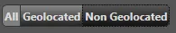
这可能不是最简单/最好的方法,但我尝试使用Kaxaml设计了一些ControlTemplates,制作出类似以下图片的效果:
你可以将这些模板存储在ResourceDictionary中,需要时应用它们,或者在构建按钮列表时使用它们。
我实际上创建了三种略有不同的样式,一个用于左右按钮,一个用于中间(你可能可以通过扩展/继承样式来简化这个过程)。省略了部分重复的代码。
<Grid>
<Grid.Resources>
<!-- Brushes for colours/backgrounds -->
<SolidColorBrush x:Key="FontBrush" Color="#DDDDDD"/>
<LinearGradientBrush x:Key="BgBrush1" StartPoint="0,0" EndPoint="0,1">
<GradientStop Offset="0" Color="#888888"/>
<GradientStop Offset="1" Color="#222222"/>
</LinearGradientBrush>
<SolidColorBrush x:Key="BorderBrush1" Color="#333333"/>
<LinearGradientBrush x:Key="CheckedBrush" StartPoint="0,0" EndPoint="0,1">
<GradientStop Offset="0" Color="#555555"/>
<GradientStop Offset="1" Color="#111111"/>
</LinearGradientBrush>
<!-- Left Button Template -->
<ControlTemplate x:Key="ToggleButtonLeft" TargetType="">
<Border
Name="Border"
Background=""
BorderBrush=""
BorderThickness="1"
CornerRadius="5,0,0,5">
<ContentPresenter
HorizontalAlignment="Center"
Margin=""
VerticalAlignment="Center"
Content=""
TextBlock.FontWeight="Bold"
TextBlock.Foreground=""/>
</Border>
<ControlTemplate.Triggers>
<Trigger Property="ToggleButton.IsMouseOver" Value="true">
<Setter TargetName="Border" Property="Background" Value="#808080"/>
</Trigger>
<Trigger Property="IsChecked" Value="true">
<Setter TargetName="Border" Property="Background" Value=""/>
</Trigger>
</ControlTemplate.Triggers>
</ControlTemplate>
<!-- Middle Button(s) Template -->
<ControlTemplate x:Key="ToggleButtonMid" TargetType="">
<Border
Name="Border"
Background=""
BorderBrush=""
BorderThickness="0,1,0,1"
CornerRadius="0" />
<!-- Other code identical to Left Button Template -->
</ControlTemplate>
<!-- Right Button Template -->
<ControlTemplate x:Key="ToggleButtonRight" TargetType="">
<Border
Name="Border"
Background=""
BorderBrush=""
BorderThickness="1"
CornerRadius="0, 5, 5, 0" />
<!-- Other code identical to Left Button Template -->
</ControlTemplate>
</Grid.Resources>
<!-- Example Usage -->
<Grid Background="#555555">
<StackPanel Height="25" Orientation="Horizontal" Margin="5">
<RadioButton Content="All" GroupName="View" Padding="2" Template=""/>
<RadioButton Content="Geolocated" GroupName="View" Padding="2" Template=""/>
<RadioButton Content="Non Geolocated" GroupName="View" Padding="2" Template=""/>
</StackPanel>
</Grid>
</Grid>
你需要为 IsPressed 状态添加额外的 Triggers,以及任何其他所需的状态(例如IsEnabled)。