我在样式化单选按钮方面遇到了很大的问题,因此我已经成功地在Chrome中实现了完美的效果,在Firefox中略微有些,但在IE中完全没有。
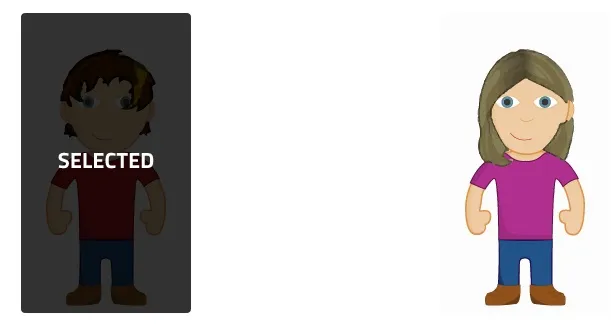
这是期望的外观(在Chrome中):
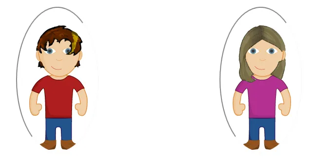
这是Firefox中的外观:
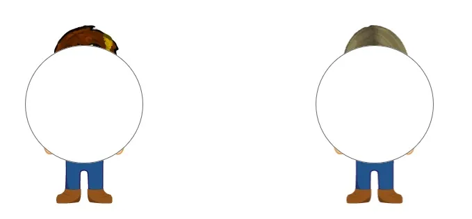
而在IE中......
我为你们准备了一个JSFiddle让你们玩耍,但我似乎无法弄清楚如何在跨浏览器方面使其工作。有什么想法吗?
JSFiddle:http://jsfiddle.net/s5rpd97b/
尽管代码已经在JSFiddle上了,但我还是要贴一下HTML代码:
   <input style="background: url(http://socialavatarnetworkscript.com/media/img/male_avatar.png);margin-right: 240px;" class="gender" name="gender" type="radio" value="male">
   <input style="background: url(http://socialavatarnetworkscript.com/media/img/female_avatar.png)" class="gender" name="gender" type="radio" value="female">
CSS:
input[type="radio"].gender::after{
    background: rgba(0, 0, 0, 0.01);
    position: absolute;
    width: 170px;
    height: 300px;
    display: block;
    content: '';
    color: white;
    font-size: 1px;
    -webkit-transition: all 0.2s ease;
    -moz-transition: all 0.2s ease;
    -ms-transition: all 0.2s ease;
    -o-transition: all 0.2s ease;
    transition: all 0.2s ease;
}
input[type="radio"].gender:checked::after{
    background: rgba(0, 0, 0, 0.8);
    position: absolute;
    width: 170px;
    height: 300px;
    display: block;
    content: 'SELECTED';
    border-radius: 4px;
    color: white;
    font-family: titillium, sans-serif;
    font-weight: 500;
    font-size: 22px;
    text-align: center;
    line-height: 300px;
    -webkit-transition: all 0.2s ease;
    -moz-transition: all 0.2s ease;
    -ms-transition: all 0.2s ease;
    -o-transition: all 0.2s ease;
    transition: all 0.2s ease;
}
input[type="radio"]{
    display: inline-block;
    -webkit-appearance: none;
    -moz-appearance:    none;
    -ms-appearance:     none;
    appearance:         none;
    border-radius: 4px  !important;
    outline: none       !important;
    border: none        !important;
}
input[type="radio"].gender{
    height: 300px;
    width: 170px;
    border-radius: 4px !important;
    outline: none !important;
    border: none !important;
}
input这样的 表单元素 作为:after和:before的选择器。 - Roko C. Buljan::after应该被渲染为如果一个新的_child_元素被插入到应用它的元素中 - 但是input元素不能有子元素。而且,跨浏览器格式化单选按钮是棘手的。为了更可靠的结果,我建议您在每个输入框后面使用额外的元素,并使用相邻兄弟选择符+来根据输入的状态进行格式化。 - CBroe