CSS - 如果有足够的空间,居中元素

7
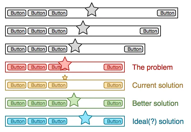
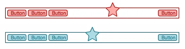
我正在制作一个菜单栏,其中心有一个logo/badge。在当前情况下(桌面上只有几个项目),这很好用,但是如果屏幕被缩放或菜单选项的数量增加,logo就会被放到菜单按钮后面。
我目前解决这个问题的方法是通过缩放logo/badge并将其移动到菜单栏之外和之上来使其更加健壮。
但理想情况下,我希望将它保持在菜单栏的“中间”,即在菜单选项之间。有人知道如何做到这一点吗?最好只使用CSS。

enter image description here

澄清一下:我希望在大屏幕上将星号居中到菜单栏,并将其推到剩余空间的中央。因此,仅使用flexbox并不是一个(完整的)解决方案。对于固定内容,我可以使用断点,但对于可能更改的内容,所需的断点是无法预测的。

enter image description here


对于较小屏幕上的“理想解决方案”,您应该使用flexbox...但这并不能解决在较大屏幕上将其“居中”的问题,因为您不希望将其相对于剩余空间居中,而是要相对于整个导航宽度居中。 - CBroe
@CBroe 没错,看起来我应该澄清一下,因为目前的三个答案都得到了同样不想要的结果。 - PixelSnader
1
我认为你不会找到一个纯CSS的解决方案,特别是在菜单项数量和动态宽度未知的情况下。如果所有按钮都有相同的固定宽度,你可能可以适应所谓的“数量查询”来确定在不同组合的菜单项数量和屏幕宽度之间切换显示方式。然后,通过绝对定位标志,可以轻松地将其居中于整个菜单宽度上。 - CBroe
@Cbroe 这让我有点震惊。我不确定是否可以将这些查询应用于此项目/元素,但它们似乎非常有用。 - PixelSnader
1
一个比较简单的替代方案是,输出菜单的系统只需计算项目数量,并将该信息放入数据属性或父元素的附加类中,以便您可以根据此应用不同的样式。也许您不需要为每个可能的项目数量都创建一个类,但是仅指示菜单是否具有超过或少于X个项目的类已经足够了... - CBroe
1个回答

1

使用弹性布局,您可以实现理想的解决方案(或者至少非常接近)。其思想是,在有足够空间的情况下,保持左右两侧宽度相等。这可以通过将左右两部分的flex-basis设置为大于其内容大小的值来实现 - 然后它不会受内容影响,一切都会对称。

在此演示中,您可以将鼠标悬停在页面上,以使宽度变小。黑线显示正文的精确中心。

.header {
  display: flex;
}

.start,
.end {
  /* this value should be larger than the minimum width on a "large" screen
     if it is, the content width will not determine the actual width, so start
     and end part will be of the same size -> the middle is centered
     using 50% - 50px here so we're neither growing nor shrinking if there is
     enough space (50px is half the middle width)
   */
  flex: calc(50% - 50px) 1;
}

.middle {
  /* this flex-basis is kind of the targeted width of the middle part within
     the star will be centered. Giving the middle a larger flex-basis than its
     contents prevents the contents from touching the left part even there is
     still ample space to the right
     Once the middle "bumped" to start/end, the middle will shrink, but it will
     still remain a space toward start/end as long as possible
   */
  flex: 100px 1;
}


.middle {
  text-align: center;
}

.end {
  text-align: end;
}

.start,
.middle,
.end {
  /* wraping would reduce the minimum width, don't want that */
  white-space: nowrap;
}


/* ---
 * these rules here are just for the demo, not for the layout
 * ---
 */

.start,
.middle,
.end,
{
  /* increase legibility without affecting horizontal layout */
  padding: 10px 0;
}

.center-line {
  width: 50%;
  border-right: 2px solid black;
  /* center on the border */
  margin-left: -1px;
  height: 30px;
}

html,
body {
  padding: 0;
  margin: 0;
}

.page {
  padding: 10px;
}

.middle {
  background: rgba(0, 0, 0, 0.1);
}

/* transition on hover */

.page {
  transition: width 1s ease-in-out;
  width: 500px;
  background: rgba(0, 0, 0, 0.1);
}

:hover .page {
  width: 250px;
}
<div class="page">
  <div class="header">
    <div class="start">Button Button Button</div>
    <div class="middle">*</div>
    <div class="end">Button</div>
  </div>
  <div class="center-line"></div>
</div>

这是一种变化,其中中间部分的宽度未知。唯一的问题是如果整个内容不能适应,则会溢出flex容器。如果你告诉中间部分它可以收缩(例如min-width: 0; overflow: hidden;),它将在开始/结束部分收缩时立即收缩,并且当内容被裁剪时也会收缩。

.header {
  display: flex;
  column-gap: 20px;
}

.start,
.end {
  /* this is no longer exact - */
  flex: 30%;
}

.middle {
  /* this flex-basis is kind of the targeted width of the middle part within
     the star will be centered. Giving the middle a larger flex-basis than its
     contents prevents the contents from touching the left part even there is
     still ample space to the right
     Once the middle "bumped" to start/end, the middle will shrink, but it will
     still remain a space toward start/end as long as possible
   */
  flex: 1;
}


.middle {
  text-align: center;
}

.end {
  text-align: end;
}

.start,
.middle,
.end {
  /* wraping would reduce the minimum width, don't want that */
  white-space: nowrap;
}


/* ---
 * these rules here are just for the demo, not for the layout
 * ---
 */

.start,
.middle,
.end,
{
  /* increase legibility without affecting horizontal layout */
  padding: 10px 0;
}

.center-line {
  width: 50%;
  border-right: 2px solid black;
  /* center on the border */
  margin-left: -1px;
  height: 30px;
}

html,
body {
  padding: 0;
  margin: 0;
}

.page {
  padding: 10px;
}

.middle {
  background: rgba(0, 0, 0, 0.1);
}

/* transition on hover */

.page {
  transition: width 2s linear;
  width: 700px;
  background: rgba(0, 0, 0, 0.1);
}

:hover .page {
  width: 300px;
}
<div class="page">
  <div class="header">
    <div class="start">Button Button Button</div>
    <div class="middle">This is the page title</div>
    <div class="end">Button</div>
  </div>
  <div class="center-line"></div>
</div>


网页内容由stack overflow 提供, 点击上面的
可以查看英文原文,
原文链接