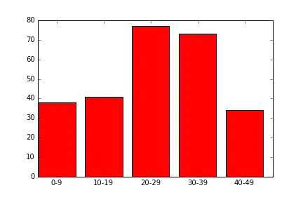
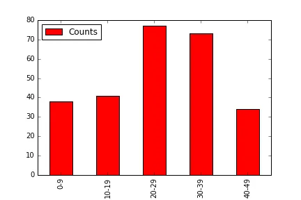
使用Matplotlib.pyplot在Python中绘制条形图

3
   Groups   Counts
1   0-9     38
3   10-19   41
5   20-29   77
7   30-39   73
9   40-49   34

我想使用matplotlib.pyplot库创建一张柱形图,x轴显示分组,y轴显示计数。我尝试使用以下代码:

    ax = plt.subplots()
    rects1 = ax.bar(survived_df["Groups"], survived_df["Counts"], color='r')
    plt.show()

但是我遇到了以下错误。
   invalid literal for float(): 0-9

显然(正如错误消息所述),您的组列的数据类型与浮点数不兼容。您的数据类型是什么?字符串?survived_df是什么类型的对象?您使用Pandas吗?那就将其添加到标签中! - dnalow
1个回答

5
plt.bar函数的第一个数组必须是对应于柱形左侧x坐标的数字。在您的情况下,[0-9, 10-19, ...] 不被视为有效参数。
但是,您可以使用DataFrame的索引进行条形图绘制,然后定义x-ticks的位置(您希望标签在x轴上的位置),然后使用组名更改x ticks的标签。
fig,ax = plt.subplots()
ax.bar(survived_df.index, survived_df.Counts, width=0.8, color='r')
ax.set_xticks(survived_df.index+0.4)  # set the x ticks to be at the middle of each bar since the width of each bar is 0.8
ax.set_xticklabels(survived_df.Groups)  #replace the name of the x ticks with your Groups name
plt.show()

进入图片描述

请注意,您还可以直接使用一行代码来使用 Pandas 的绘图功能:

survived_df.plot('Groups', 'Counts', kind='bar', color='r')

enter image description here


网页内容由stack overflow 提供, 点击上面的
可以查看英文原文,
原文链接