我有一个关于水平条形图的非常特殊的问题。 是否可以将数据标签显示在条形上?
就像这张图片中所示:绘制的图表
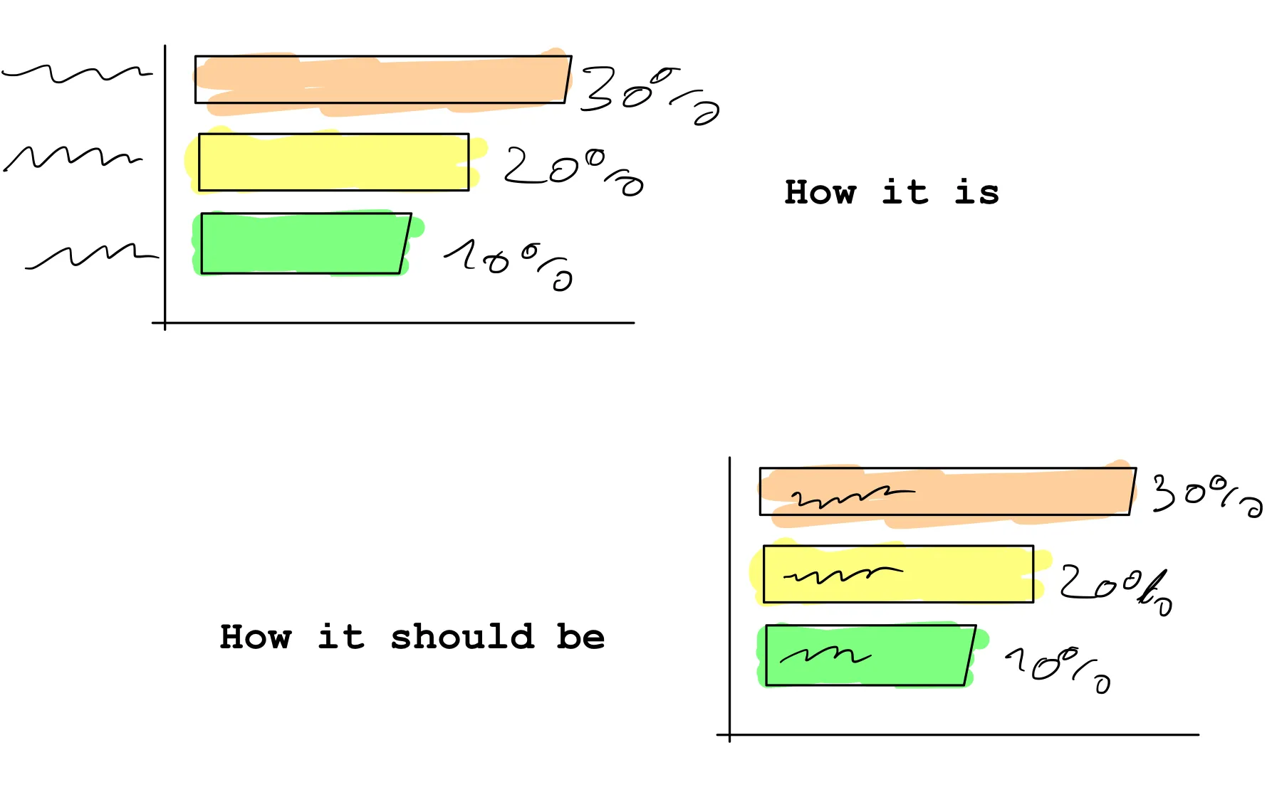
我尝试使用以下代码实现:
ticks: {
   padding: -xx,
}
不幸的是,标签消失在条形图下面,就好像条形图在标签的上一层。
这个问题能否改变?
以下是我的代码:
var ctx = document.getElementById("stakeholderChart").getContext('2d');
var stakeholderChart = new Chart(ctx, {
    type: 'horizontalBar',
    data: {
        labels: ["Point 1", "Point 2", "Point 3", "Point 4", "Point 5", "Point 6", "Point 7", "Point 8", "Point 9", "Point 10", "Point 11", "Point 12"],
        datasets: [{
            backgroundColor: "#527a82",
            data: [74, 74, 68, 67, 65, 63, 60, 60, 58, 57, 45, 44],
        }],

    },
    options: opt
});

and my options:

    var opt = {
        /*Legende ausblenden*/
        legend: {
            display: false,
        },
        /*responsive*/
        responsive: true,

        /*tooltips - hover labels*/
        tooltips: {
            enabled: false,
        },

        /*Layout*/
        layout: {
            padding: {
                right: 30,
            }
        },

        /* Label auf Balken – Werte hinter balken*/
        plugins: {
            datalabels: {
                align: 'end',
                anchor: 'end',
                color: '#fff',
                font: {
                    weight: 'bold',
                    size: 14,
                },
                formatter: function(value, context) {
                    return value + '%';
                },
            },
        },
        /*Plugins ende*/

        /*Animation*/
        animation: {
            duration: 2000
        },
        /*Animation Ende*/


        /*Achsen Einstellungen*/
        scales: {
            /* x Achse */
            xAxes: [{
                display: false,
                gridLines: {
                    display: false
                },

                ticks: {
                    beginAtZero: true,
                    max: 90,
                }

            }],
            /*x-axes ende*/

            /* Y Achse */
            yAxes: [{
                display: true,
                gridLines: {
                    display: false,
                },

                ticks: {
                    fontColor: '#fff',
                    fontStyle: 'normal',
                    fontSize: 13,
                    padding: -170,
                },
                categoryPercentage: 1.0,
                barPercentage: 0.85,

            }],
            /* y-axes ende*/
        },
        /*Scales Ende*/
    }
Thank You in advance!