无法在Cartopy自定义形状边界和立体投影中添加网格线。

3

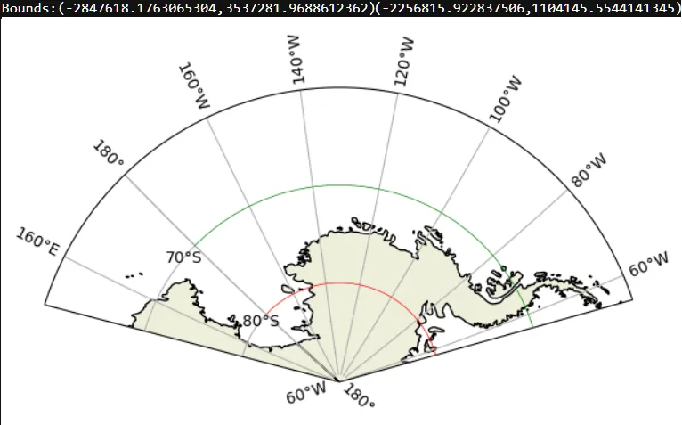
我正在绘制定制形状边界地图,重点关注南大洋的太平洋区域(160E〜180〜60W,-60S〜-90S)。添加网格线时,该区域(180〜60W)缺少网格线。

Example output showing the problem

我尝试了许多解决方案(主要是针对矩形投影),但都失败了。

import matplotlib.pyplot as plt
import matplotlib.path as mpath
import cartopy
import cartopy.crs as ccrs
import numpy as np
proj = ccrs.Stereographic(central_longitude=228, central_latitude=-70)
fig = plt.figure(figsize=(10,10))
ax = plt.axes([0,0,1,1],projection=proj)
latmin = -90
latmax = -60
lonmin = 150
lonmax = 305
lats = np.linspace(latmax, latmin, latmax - latmin + 1)
lons = np.linspace(lonmin, lonmax, lonmax - lonmin + 1)
vertices = [(lon, latmin) for lon in range(lonmin, lonmax + 1, 1)] + \
    [(lon, latmax) for lon in range(lonmax, lonmin - 1, -1)]
boundary = mpath.Path(vertices)
ax.set_boundary(boundary, transform=ccrs.PlateCarree())
ax.set_extent([170, 320, -90, -60], ccrs.PlateCarree())
ax.add_feature(cartopy.feature.LAND, zorder=1, edgecolor='k')
ax.gridlines(draw_labels=True)
plt.show()
2个回答

2

Gridlines 绘制在这种情况下存在问题。该绘图涉及特殊边界,即横跨国际日期变更线的经线 - 这可能是问题的原因。我希望 @Rutger_Kassies 的答案是您所需要的。但是,如果您仍然需要原始绘图范围,则可以尝试另一种方法。

import matplotlib.pyplot as plt
import matplotlib.path as mpath
import cartopy
import cartopy.crs as ccrs
import numpy as np

proj = ccrs.Stereographic(central_longitude=228, central_latitude=-70)
fig = plt.figure(figsize=(10/2, 10/2))
ax = plt.axes([0,0,1,1], projection=proj)

latmin = -90
latmax = -60
lonmin = 150
lonmax = 305
lats = np.linspace(latmax, latmin, latmax - latmin + 1)
lons = np.linspace(lonmin, lonmax, lonmax - lonmin + 1)
vertices = [(lon, latmin) for lon in range(lonmin, lonmax + 1, 1)] + \
    [(lon, latmax) for lon in range(lonmax, lonmin - 1, -1)]

boundary = mpath.Path(vertices)
ax.set_boundary(boundary, transform=ccrs.PlateCarree())

ax.set_extent([170, 320, -90, -60], ccrs.PlateCarree())
ax.add_feature(cartopy.feature.LAND, zorder=1, edgecolor='k')
#ax.add_feature(cartopy.feature.OCEAN, zorder=1, edgecolor='none', alpha=0.3)

# Build gridlines in 2 steps
# First set of gridlines: meridians only
# proper `xlim` is needed to get all the x-labels' visibility set correctly
gl1 = ax.gridlines(draw_labels=True, crs=ccrs.PlateCarree(), \
            xlocs=range(-180, 359, 20), \
            ylocs=[], \
            xlim=[-2847619, 3537282])  # get these from ax.get_xbound() of previous run

# Second set of gridlines: parallels of latitude only. 
# The lines are terminated at the meridian of the dateline!
gl2 = ax.gridlines(draw_labels=True, crs=ccrs.PlateCarree(), \
            y_inline=True, \
            ylocs=range(-80, -50, 10), \
            xlocs=[])

# Draw the missing parts of the parallel lines at 70, 80 deg_S
# Colors are set to `red` and `green` intentionally
lons = range(-180, -50, 5)
ax.plot(lons, -80*np.ones(len(lons)), transform=ccrs.Geodetic(), lw=0.5, color="red", zorder=30)
ax.plot(lons, -70*np.ones(len(lons)), transform=ccrs.Geodetic(), lw=0.5, color="green", zorder=30)

# Print the bounds of the plot
print("Bounds:", ax.get_xbound(), ax.get_ybound())
plt.show()

spole


还可以查看此链接:https://github.com/SciTools/cartopy/issues/697#issuecomment-157025400,查看pelson的评论以获取另一种方法。 - swatchai

0

https://stackoverflow.com/a/65690841/4265407中提到了另一种边界投影的方法,可以使网格正确绘制。

import matplotlib.pyplot as plt
import matplotlib.path as mpath
import cartopy
import cartopy.crs as ccrs

proj = ccrs.Stereographic(central_longitude=228, central_latitude=-70)
fig = plt.figure(figsize=(15,8))
ax = plt.axes([0,0,1,1],projection=proj)

ylim = [-90,-60]
xlim = [150,305]

rect = mpath.Path([[xlim[0], ylim[0]],
                   [xlim[1], ylim[0]],
                   [xlim[1], ylim[1]],
                   [xlim[0], ylim[1]],
                   [xlim[0], ylim[0]],
                   ]).interpolated(40)

proj_to_data   = ccrs.PlateCarree()._as_mpl_transform(ax) - ax.transData
rect_in_target = proj_to_data.transform_path(rect)
ax.set_boundary(rect_in_target)

ax.set_extent([150,305,-90,-58], ccrs.PlateCarree())
ax.add_feature(cartopy.feature.LAND, zorder=1, edgecolor='k')
ax.gridlines(draw_labels=True, x_inline=False, y_inline=False,
             xlocs=range(-180, 180, 10))
plt.show()

map plotting result


网页内容由stack overflow 提供, 点击上面的
可以查看英文原文,
原文链接