R ggplot:将y轴移动到极坐标图(Polar_Coord)上的网格线

5
我正在创建一个极坐标图,显示兄弟姐妹组数据之间旅行方向的直方图。更具体地说,是不同组兄弟姐妹之间的旅行方向。
以下是一个模拟示例:
mockdf <- data.frame(dir = as.numeric( runif( 1000, -pi/2, pi) ),
                 ID = sample(letters[1:2], 1000, TRUE))
ggplot(data=mockdf, aes(x=mockdf$dir)) +
  coord_polar(theta = "x", start = pi, direction = 1) +
  scale_fill_manual(name = "Sibling", values=c("black", "White")) +
  geom_histogram(bins=32, aes(fill=mockdf$ID), color= "black") +
  facet_wrap(~mockdf$ID) +
  scale_y_continuous("Number of reloactions", limits = c(-8,30)) +
  scale_x_continuous(limits = c(-pi,pi), breaks = c(0, pi/4, pi/2, 3*pi/4, 
  pi, -3*pi/4, -pi/2, -pi/4),
                     labels = c("N", "NE", "E", "SE", "S", "SW", "W", "NW"))

极坐标图示例

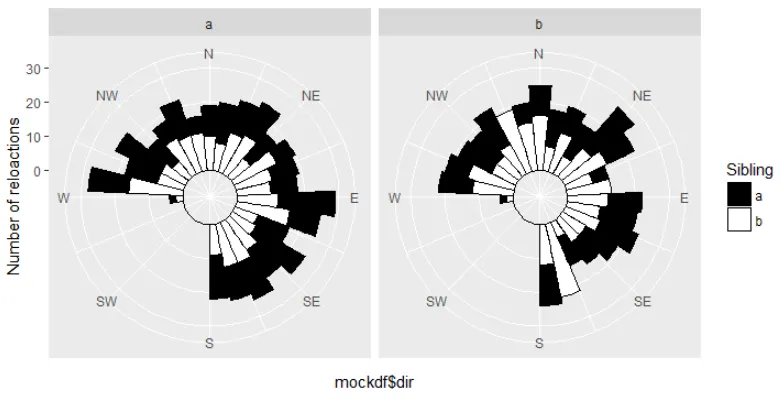
我想把y轴标签0、10、20、30移动到网格本身上(即沿着西南方向),但是我做不到。 有人知道我该如何做吗?
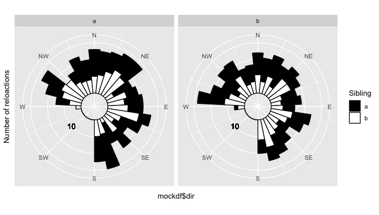

2
使用 annotate 替代内置的轴标签,并将它们放在您想要的任何位置。 - Gregor Thomas
1个回答

0

您可以在theme内使用选项来删除当前轴文本和刻度线,并使用geom_text()手动添加标签。我已经演示了如何添加第一个。

ggplot(data=mockdf, aes(x=mockdf$dir)) +
  coord_polar(theta = "x", start = pi, direction = 1) +
  scale_fill_manual(name = "Sibling", values=c("black", "White")) +
  geom_histogram(bins=32, aes(fill=mockdf$ID), color= "black") +
  facet_wrap(~mockdf$ID) +
  scale_y_continuous("Number of reloactions", limits = c(-8,30)) +
  scale_x_continuous(limits = c(-pi,pi), breaks = c(0, pi/4, pi/2, 3*pi/4, 
                                                pi, -3*pi/4, -pi/2, -pi/4),
                 labels = c("N", "NE", "E", "SE", "S", "SW", "W", "NW")) + 
  # remove text and tick marks from axis
   theme(axis.text.y = element_blank(),
         axis.ticks.y = element_blank()) + 
  # add label manually
  geom_text(x = 4, y = 10, label = "10") 

plot example with text annotation


网页内容由stack overflow 提供, 点击上面的
可以查看英文原文,
原文链接