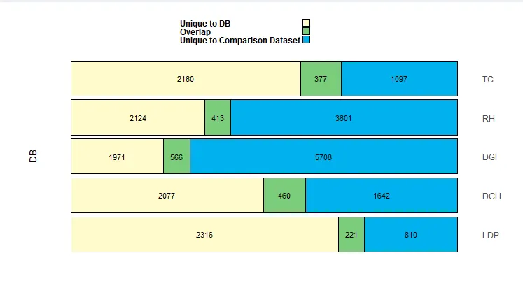
我使用下面的数据框:
Name <- c("DCH", "DCH", "DCH", "DGI", "DGI", "DGI", "LDP", "LDP", "LDP",
    "RH", "RH", "RH", "TC", "TC", "TC")
Class <- c("Class1", "Class2", "Overlap", "Class1", "Class2", "Overlap",
    "Class1", "Class2", "Overlap", "Class1", "Class2", "Overlap", "Class1", "Class2", "Overlap")
count <- c(2077, 1642, 460, 1971, 5708, 566, 2316, 810, 221, 2124, 3601,
    413, 2160, 1097, 377)
FinalDF <- data.frame(Name, Class, count)
为了创建以下ggplot图表:
 使用以下内容:
# Generate the horizontal stacked bar chart plot
stackedBarsDiagram <- function(data, numRows = 5,
barColors = c('lemonchiffon', 'palegreen3', 'deepskyblue2'),
leftlabels = c('MyDatabaseA'), rightlabels = c('MyDatabaseB', 'MyDatabaseC', 'MyDatabaseD', 'MyDatabaseE'),
headerLabels = c("Class1", "Overlap", "Class2"),
#put input$referenceDataset intead of Reference dataset"
headerLabels2 = c(paste("Unique to","DB"), "Overlap", "Unique to Comparison Dataset "),
barThickness = F, rowDensity = 'default', internalFontSize = 12, headerFontSize = 16,
internalFontColor = 'black', headerFontColor = 'black', internalFontWeight = 'standard',
externalFontWeight = 'bold', internalLabelsVisible = T, headerlLabelsVisible = T,
# Default file type of saved file is .png; .pdf is also supported
bordersVisible = T, borderWeight = 'default', plotheight = 25, plotwidth = 25, filename = "StackedBarPlot.png", plotsave = F) {
# Parameters to assist in bar width calculations
minBarWidth = 0.5
maxBarWidth = 0.7
# Calculate bar width parameter
barWidthFactor <- ((maxBarWidth - minBarWidth) / (numRows))
FinalDF <- data
# If proportional bars are specified, display them
if (barThickness == T) {
sumDF <- FinalDF %>%
group_by(Name) %>%
summarize(tot = sum(count)) %>%
mutate(RANK = rank(tot), width = minBarWidth + RANK * barWidthFactor) %>%
arrange(desc(Name))
barWidths <- rep(sumDF$width, each = 3)
print(barWidths)
} else { # If proportional bars aren't specified, just set bar thickness to 0.9
barWidths <- rep(0.9, 5)
}
# Create the stacked bar plot using ggplot()
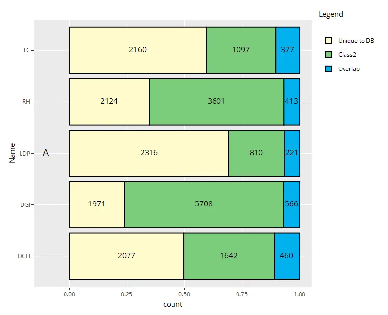
stackedBarPlot <- ggplot(data = FinalDF) +
geom_col(mapping = aes(x = Name, y = count, fill = Class), width = rep(0.9, 5),
color = "black", position = position_fill(reverse = T)) +
geom_text(size = 4, position = position_fill(reverse = T, vjust = 0.50), color = "black",
mapping = aes(x = Name, y = count, group = Class, label = round(count))) +
annotate('text', size = 5, x = (5 + 1) / 2, y = -0.1, label = c('A'), angle = 90) +
coord_flip() +
scale_fill_manual(values = c('lemonchiffon', 'palegreen3', 'deepskyblue2'), breaks = c("Class1", "Overlap", "Class2"), labels = c(paste("Unique to","DB"), "Overlap", "Unique to Comparison Dataset "),
guide = guide_legend(label.position = 'left', label.hjust = 0, label.vjust = 0.5)) +
# The limits = rev(...) function call ensures that the labels for the bars are plotted in the order
# in which they are specified in the rightLabels and leftLabels parameters in the main stackedBarChart() function call.
# This is necessary since the finalDF$Name order is reversed from the desired order.
scale_x_discrete(limits = rev(levels(FinalDF$Name)), position = 'top') +
# Blank out any default labels of ggplot() for the x and y axes
xlab('') +
ylab('') +
# Specify the style of the full plot area, including the background, legend & text sizes
theme(panel.background = element_rect(fill = 'white'),
plot.margin = unit(c(0.25, 0.25, 0.25, 0.25), 'inches'),
legend.title = element_blank(),
legend.position = 'top',
legend.direction = 'vertical',
legend.key.width = unit(0.15, 'inches'),
legend.key.height = unit(0.15, 'inches'),
legend.text = element_text(face = 'bold', size = 12, color = "black"),
axis.text = element_text(size = 12),
axis.text.x = element_blank(),
axis.ticks = element_blank())
# Display the plotly
print(stackedBarPlot)
}
print(stackedBarsDiagram(data = FinalDF,leftlabels ="DB" , numRows = 6,
barThickness = F,
barColors = c("#FFFACD","#7CCD7C","#00B2EE")))
然而,当我使用 ggplotly() 转换为交互式时:
ggplotly(stackedBarsDiagram(data = FinalDF,leftlabels ="DB" , numRows = 6,
                                     barThickness = F,
                                     barColors = c("#FFFACD", "#7CCD7C", "#00B2EE")))%>%
      layout(title = "New plot title", legend = list(orientation = "h", y = -.132, x = 0), annotations = list())
我的图例名称尽管使用了“:”,但仍未正确编辑。
scale_fill_manual(values = c('lemonchiffon', 'palegreen3', 'deepskyblue2'),
    breaks = c("Class1", "Overlap", "Class2"),
    labels = c(paste("Unique to","DB"), "Overlap", "Unique to Comparison Dataset "),
    guide = guide_legend(label.position = 'left', label.hjust = 0, label.vjust = 0.5))
它们会返回到它们的默认名称"Class1", "Overlap", "Class2"
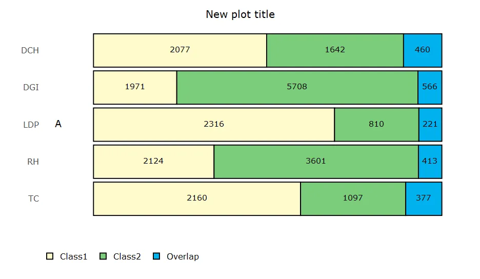
plotly是否只使用fill名称。尽管我尝试进行更改,但它在mtcars上也是如此,因此可能是plotly中的一个错误,或者它希望标签作为数据中的一个因子。 - Anonymous coward