我正在绘制一个包含三个子图的图表:
fig = plt.figure(fignum)
ax11 = plt.subplot2grid((2,2), (0,0))
ax12 = plt.subplot2grid((2,2), (0,1))
ax13 = plt.subplot2grid((2,2), (1,0), colspan=2)
ax13.axis('off')
我正在使用Pandas处理数据,想要绘制柱状图、饼图和表格。我的操作如下:
d = pd.Series(data,index)

#plotting the first subplot
d.plot(kind='bar',ax=ax11)

#plotting the second one and adjusting size of labels and percentages
(wedges, texts, autotexts) = ax12.pie(d,labels=d.index,autopct='%1.1f%%')
ax12.axis('equal')
for t in texts:
        t.set_size(7)
for t in autotexts:
        t.set_size(7)

#plotting the third axes, the table
ax13.table(cellText=table,colLabels=columns,loc='bottom')
这是最终效果:
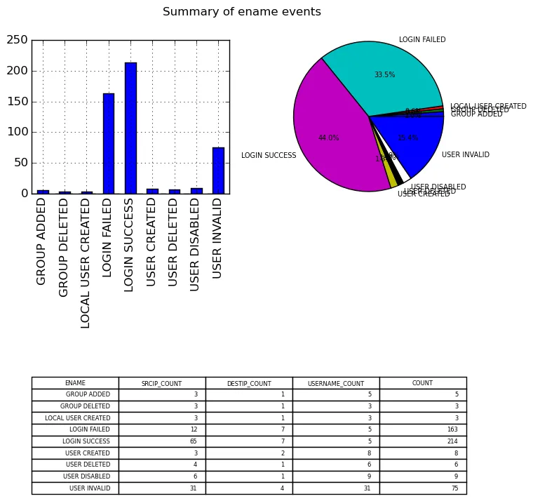
如何使饼图看起来更好,而不会出现标签重叠的现象?我尝试添加一个图例,但它覆盖了图表,我甚至不知道它是否在我指定的位置上:
ax12.legend(index,loc='lower right',fontsize=7)
有没有办法将图例移到饼图下面的空白区域?一旦图例看起来不错,我会从饼图本身中删除标签。