我想在Lollipop之前的系统中使用Material风格扁平按钮。我正在使用Android 4.4.4,我的Play Store看起来像下面这样:
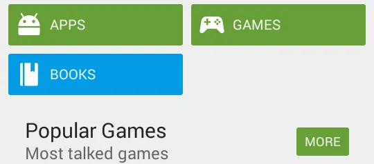
按钮和图标都很整齐地排列在APPS、GAMES、BOOKS中。
MORE按钮显示一个没有图标的按钮。
那么,我该如何创建可爱的按钮呢?点击后会发光,图标整齐地排列在那里,并带有小圆角。使用drawableLeft不起作用,因为图标会变得太大。
我猜测有一种方法可以将它放入样式表中,因为谷歌在其他应用程序中似乎都很一致地使用了这种样式。
我想在Lollipop之前的系统中使用Material风格扁平按钮。我正在使用Android 4.4.4,我的Play Store看起来像下面这样:
按钮和图标都很整齐地排列在APPS、GAMES、BOOKS中。
MORE按钮显示一个没有图标的按钮。
那么,我该如何创建可爱的按钮呢?点击后会发光,图标整齐地排列在那里,并带有小圆角。使用drawableLeft不起作用,因为图标会变得太大。
我猜测有一种方法可以将它放入样式表中,因为谷歌在其他应用程序中似乎都很一致地使用了这种样式。
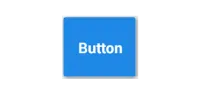
没有图标的按钮
<Button
android:layout_width="wrap_content"
android:layout_height="wrap_content"
android:text="@string/sign_up"
android:background="@drawable/action_button"
android:textColor="@color/primary_text"
android:textAppearance="?android:attr/textAppearanceMedium"
android:layout_marginRight="5dp"
android:id="@+id/fl_btn_signup" />
action_button.xml。<?xml version="1.0" encoding="utf-8"?>
<selector xmlns:android="http://schemas.android.com/apk/res/android">
<item android:state_pressed="false">
<shape android:dither="true" android:shape="rectangle">
<corners android:bottomLeftRadius="3dp" android:bottomRightRadius="3dp" android:topLeftRadius="3dp" android:topRightRadius="3dp" />
<solid android:color="#689F38" />
</shape>
</item>
<item android:state_pressed="true">
<shape android:dither="true" android:shape="rectangle">
<corners android:bottomLeftRadius="3dp" android:bottomRightRadius="3dp" android:topLeftRadius="3dp" android:topRightRadius="3dp" />
<solid android:color="#80689F38" />
</shape>
</item>
</selector>
如果您想在这些按钮中使用图标,则可以在您的Button xml中使用android:drawableLeft,或者您可以使用水平方向的LinearLayout与ImageView和TextView一起使用。
<LinearLayout
                android:orientation="horizontal"
                android:layout_width="wrap_content"
                android:layout_height="wrap_content"
                android:padding="5dp"
                android:gravity="center_vertical"
                android:background="@drawable/action_button"> //Same xml

                <ImageView
                    android:layout_width="wrap_content"
                    android:layout_height="wrap_content"
                    android:background="@drawable/ic_apps_icon" />

                <TextView
                    android:layout_width="match_parent"
                    android:layout_height="wrap_content"
                    android:text="APPS"
                    android:gravity="center"
                    android:padding="5dp"
                    android:textAppearance="?android:attr/textAppearanceMedium"
                    android:textColor="#FFFFFF" />

            </LinearLayout>
LinearLayout 中的 ImageView 和 TextView 看起来不像按钮一样可以点击。但是没有图标的按钮在稍微添加一些填充后可以很好地工作。 - Muz可以考虑使用包含图标和文本的 LinearLayout 代替按钮。
然后,您可以将圆角可绘制资源应用于此布局作为背景(每个状态都有自己的圆形可绘制对象)。
 <LinearLayout
            android:orientation="horizontal"
            android:layout_width="wrap_content"
            android:layout_height="wrap_content"
            android:padding="5dp"
            android:gravity="center_vertical"
            android:background="@drawable/round_states">

            <ImageView
                android:layout_width="wrap_content"
                android:layout_height="wrap_content"
                android:background="@drawable/icon" />

            <TextView
                android:layout_width="match_parent"
                android:layout_height="wrap_content"
                android:textColor="@android:color/white" />

 </LinearLayout>
round_states.xml
   <?xml version="1.0" encoding="utf-8"?>
  <selector xmlns:android="http://schemas.android.com/apk/res/android">
   <item android:state_pressed="true"
      android:drawable="@drawable/round_bg_pressed" /> <!-- pressed -->
   <item android:state_focused="true"
      android:drawable="@drawable/round_bg_focused" /> <!-- focused -->
   <item android:drawable="@drawable/round_bg" /> <!-- default -->
  </selector>
round_bg.xml
<?xml version="1.0" encoding="UTF-8"?>
<shape xmlns:android="http://schemas.android.com/apk/res/android">
    <solid android:color="#FFFFFF"/>
    <stroke android:width="3dip" android:color="#B1BCBE" />
    <corners android:radius="10dip"/>
    <padding android:left="0dip" android:top="0dip" android:right="0dip" android:bottom="0dip" />
</shape>
round_bg_focused.xml
<?xml version="1.0" encoding="UTF-8"?>
<shape xmlns:android="http://schemas.android.com/apk/res/android">
    <solid android:color="#FFFFFF"/>
    <stroke android:width="3dip" android:color="#B8B8FF" />
    <corners android:radius="10dip"/>
    <padding android:left="0dip" android:top="0dip" android:right="0dip" android:bottom="0dip" />
</shape>
P/s: 有一些库支持在早期的Lollipop版本上按下视图时产生涟漪效果,您可能想尝试:
https://github.com/traex/RippleEffect
https://github.com/balysv/material-ripple
drawableLeft的Button会得到相同的结果,对吗? - VikramdrawablePadding。通过使用LinearLayout,您可以更改其背景状态,并在布局中为图像设置不同的图标状态。 - ductran设计9个带有圆角(绿色或蓝色)的拉伸图像,分别用于每个按钮的背景可绘制对象。将其用作按钮的背景,并为每个按钮提供相应的宽度和高度即可。这样做就可以完成您的工作。
android:tint属性,因此您需要将@color/white更改为实际颜色。 - alanv