我正在尝试在CSS中实现一些相当棘手但也相当“简单”的内容:
说明:
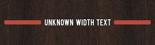
某个带有文本的元素(宽度未知),两侧各有2个元素,占据其余空间。
我想使用display:table作为容器,并对3个子元素使用display:table-cell,但它并不起作用,或者我不知道如何正确使用它。
某个带有文本的元素(宽度未知),两侧各有2个元素,占据其余空间。
我想使用display:table作为容器,并对3个子元素使用display:table-cell,但它并不起作用,或者我不知道如何正确使用它。
<header>
  <h1>Some title</h1>
</header>
header{
  display:table;
  text-align:center;
  width:50%;
}
header:before, header:after{
  content:'';
  display:table-cell;
  background:red;
  width:50%;
  border-radius:5px;
}
header > h1{ white-space:pre; padding:0 10px; }
这里使用了 display: table 和 display: table-cell 来制作这个条形图和文字。
HTML
<div class="textBarContainer">
    <div class="textBarBefore"></div>
    <div class="textBar">Text</div>
    <div class="textBarAfter"></div>
</div>
CSS
.textBarContainer {
    display: table;
    width: 100%;
}
.textBar {
    display: table-cell;
    padding: 0 10px;
    white-space: pre;
}
.textBarAfter, .textBarBefore {
    background: #cc0000;
    width: 50%;
    height: 20px;
    display: table-cell;
    content:' ';
    border-radius: 5px;
}
white-space:pre 强制文本,它就可以工作。 - vsync<ul class="columnlayout">
<li>
<div>Left content</div>
</li>
<li class="centercontent">
<div>middle text content</div>
</li>
<li>
<div>Right content</div>
</li>
</ul>
//columns layout
ul.columnlayout
{
margin:0;
width:100%;
display:block;
clear:both;
list-style-type: none;
> li
{
float:left;
margin:0;
list-style-type:none;
width:200px;
&.centercontent
{
width:auto;
}
ul.xoxo
{
list-style-type: none;
li
{
list-style-type: none;
}
}
}
}
哦,抱歉我的 .scss!
ul.columnlayout {
    margin:0;
    width:100%;
    display:block;
    clear:both;
    list-style-type: none;
   }

  ul.columnlayout li {
    float:left;
    margin:0;
    list-style-type:none;
    width:200px;
  }

    ul.columnlayout li.centercontent {
      width:auto;
    }