R ggplot2: 如何绘制具有实心颜色和透明描边的geom_points,并根据颜色上色?

5
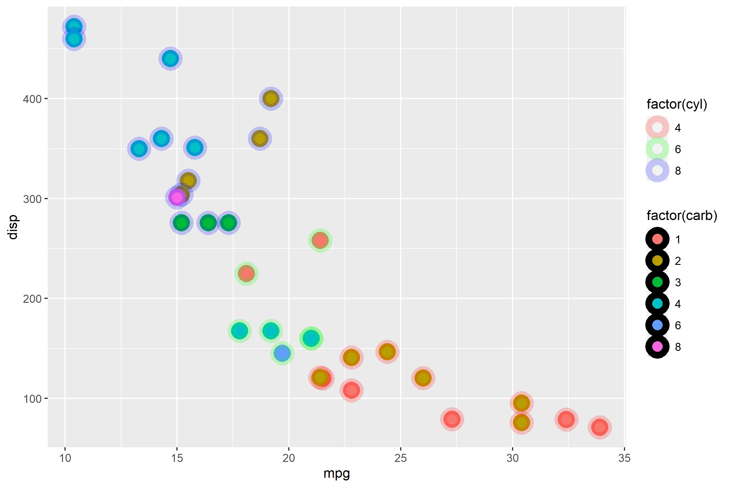
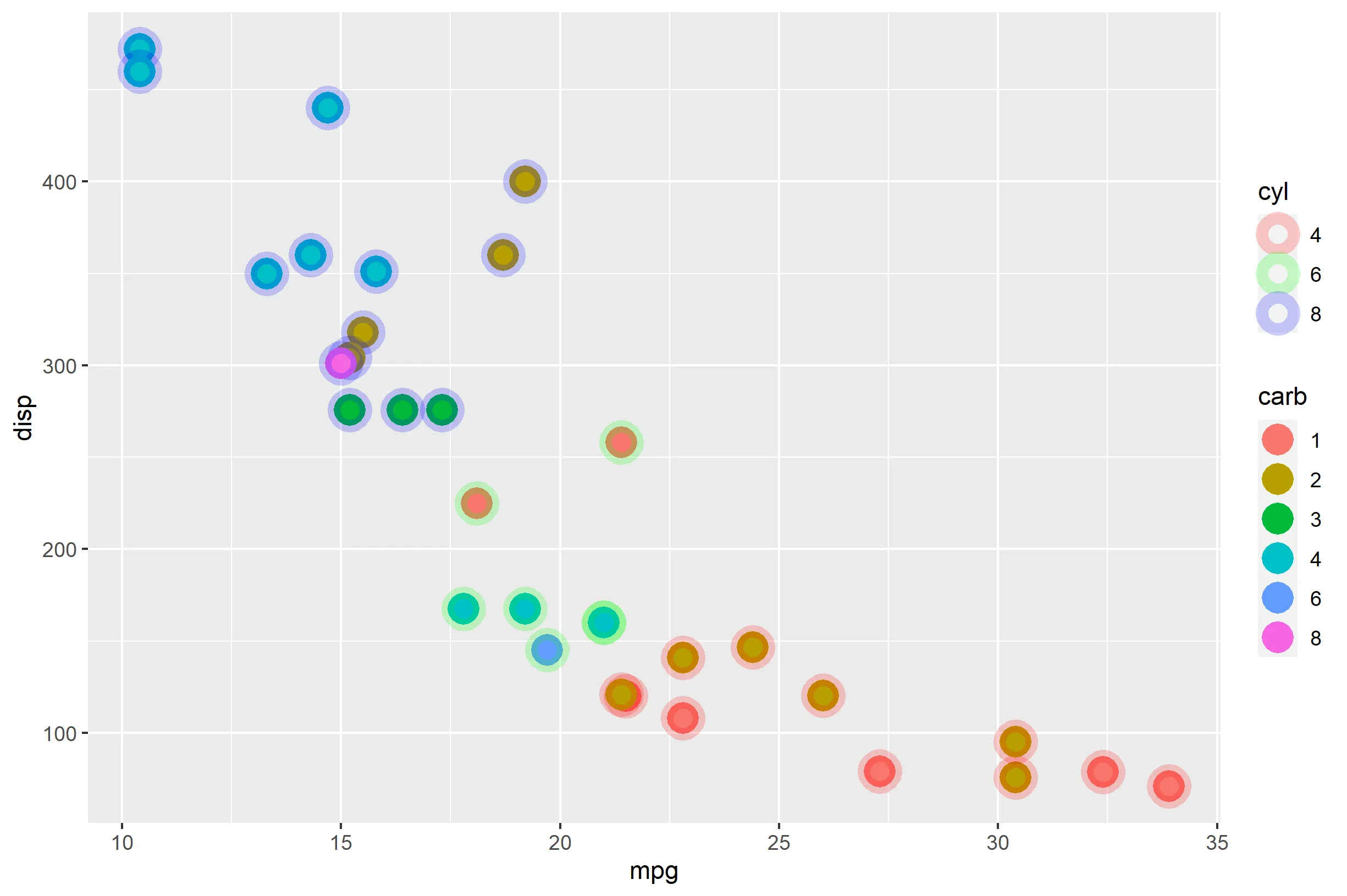
我想制作一个散点图,每个点都有一个球体。点和它的球体都根据某些列的值着色。
以下是一个最小化的示例,展示了我的要求:
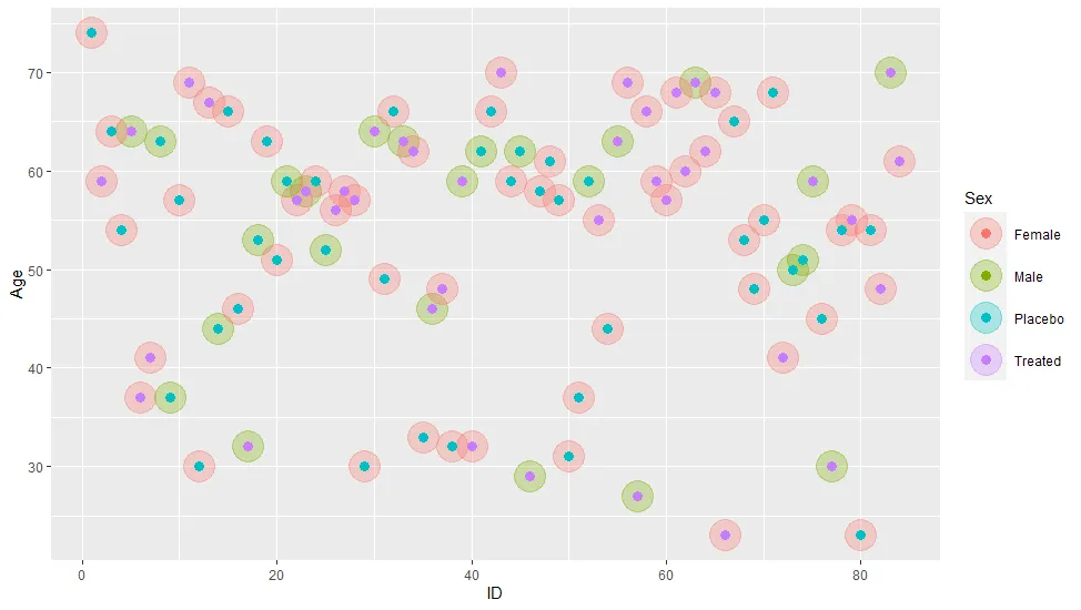
library(ggplot2)
library(vcd) # only needed for example dataset
ggplot(Arthritis, aes(x = ID, y = Age)) + 
    geom_point(aes(color=Sex), size=10, alpha=.3) + 
    geom_point(aes(color=Treatment), size=3)

enter image description here

这个“解决方案”的问题在于使用两个geom_point层会混淆图例。我猜只使用一个geom_point层并使用一个也添加描边的形状可能更有意义,就像这样:
ggplot(Arthritis, aes(x = ID, y = Age)) + 
    geom_point(aes(color=Sex, fill=Treatment), shape=21, size=5, stroke=5)

这里图例更有意义,但是我无法弄清楚如何使描边透明。这很重要,因为当点重叠时就什么也看不到了。 src=

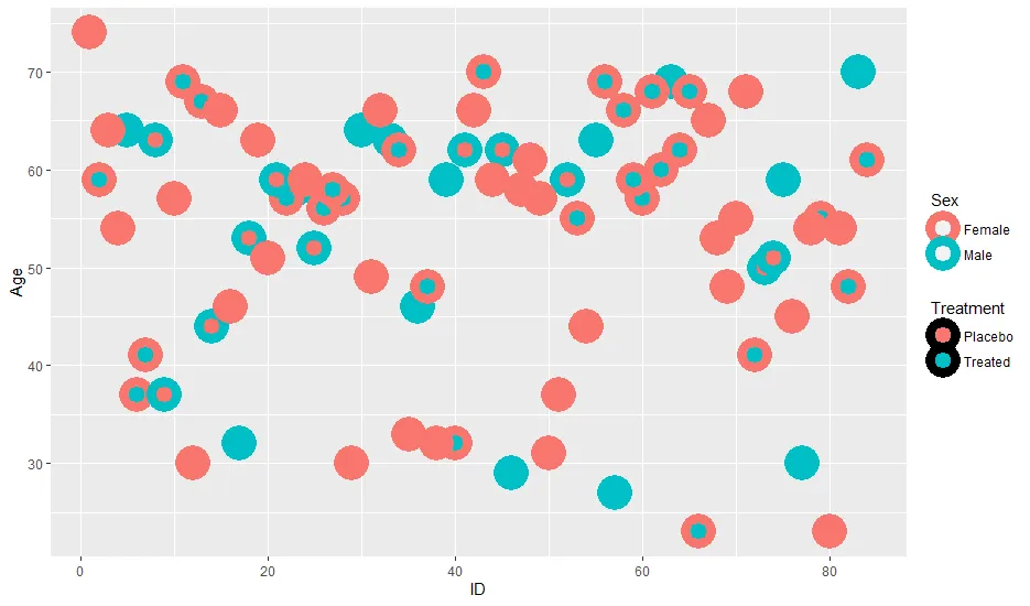
像这样的答案不能解决我的问题,因为它们使用恒定的颜色,因此可以使用函数alpha。然而,我无法弄清楚是否以及如何将其与依赖于数据的颜色一起使用。

TL;DR:如何绘制具有实心颜色和透明描边但不是恒定颜色的geom_points

3个回答

6

你已经走上了正确的道路,意识到你可以使用函数 alpha(),也认识到不能仅仅在 aes() 中放置 alpha()。但是,你可以将 alpha() 作为 scale_* 函数中的 values= 参数进行传递。以下是使用 mtcars 的示例:

ggplot(mtcars, aes(mpg, disp)) + 
  geom_point(
    aes(color=factor(cyl), fill=factor(carb)),
    shape=21, size=4, stroke=4) +
  scale_color_manual(values=alpha(rainbow(3), 0.2))

在此输入图片描述

这样做的一个问题是那些围绕“factor(carb)”图例的大黑线让我感到不舒服。非常棒。您可以使用 guides() 函数并使用 override.aes= 来指定要显示的内容以及用什么替换它。在这种情况下,您可以设置 color=NA 来覆盖继承的主题,使其透明(只留下 fill= 部分)。

ggplot(mtcars, aes(mpg, disp)) + 
  geom_point(
    aes(color=factor(cyl), fill=factor(carb)),
    shape=21, size=4, stroke=4) +
  scale_color_manual(values=alpha(rainbow(3), 0.2)) +
  guides(fill=guide_legend(override.aes = list(color=NA))) +
  labs(color="cyl", fill="carb")

在此输入图片描述

顺便说一下,geom_point 没有简单的方法将描边置于填充部分的 "后面"。您可以编写自己的定制 stat/geom 来完成这项任务,但 geom_point 总是先绘制填充再绘制描边。


非常好的解决方案。 - Limey

5
一个简单的解决方法是将大的透明圆形不再表示为点,而是填充圆形。这样你就可以使用“fill”美学来标记它们。这里使用了ggforce中的“geom_circle”。
library(ggplot2)
library(vcd)
library(ggforce)

ggplot(Arthritis) + 
  geom_circle(aes(x0 = ID, y0 = Age, r = 2, fill = Sex), alpha = .3, colour = NA) +
  geom_point(aes(x = ID, y = Age, color = Treatment), size = 3) + 
  coord_equal() + 
  scale_color_discrete(h = c(350, 190))

这是由 reprex 包 (v0.3.0) 在2020年07月01日创建的


3

或者制作第二个颜色比例尺!

library(ggplot2)
library(vcd) 
#> Loading required package: grid
library(ggnewscale)

ggplot(Arthritis, aes(x = ID, y = Age)) + 
  ## removing stroke so it does not have this awkward border around it
  geom_point(aes(color=Sex), size=10, alpha=.3, stroke = 0) +
  new_scale_color()+
  geom_point(aes(color=Treatment), size=3) 

reprex包 (v2.0.1) 创建于2022年6月15日


网页内容由stack overflow 提供, 点击上面的
可以查看英文原文,
原文链接