我有一些数据(pd Series),看起来是这样的(每日股票收益率,n = 555):
S = perf_manual.returns
S = S[~((S-S.mean()).abs()>3*S.std())]

2014-03-31 20:00:00    0.000000
2014-04-01 20:00:00    0.000000
2014-04-03 20:00:00   -0.001950
2014-04-04 20:00:00   -0.000538
2014-04-07 20:00:00    0.000764
2014-04-08 20:00:00    0.000803
2014-04-09 20:00:00    0.001961
2014-04-10 20:00:00    0.040530
2014-04-11 20:00:00   -0.032319
2014-04-14 20:00:00   -0.008512
2014-04-15 20:00:00   -0.034109
...
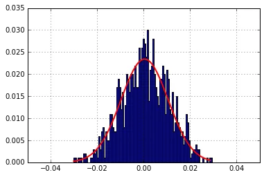
我希望从这个内容中生成一个概率分布图,使用以下方法:
print stats.normaltest(S)

n, bins, patches = plt.hist(S, 100, normed=1, facecolor='blue', alpha=0.75)
print np.sum(n * np.diff(bins))

(mu, sigma) = stats.norm.fit(S)
print mu, sigma
y = mlab.normpdf(bins, mu, sigma)
plt.grid(True)
l = plt.plot(bins, y, 'r', linewidth=2)

plt.xlim(-0.05,0.05)
plt.show()
我得到了以下内容:
NormaltestResult(statistic=66.587382579416982, pvalue=3.473230376732532e-15)
1.0
0.000495624926242 0.0118790391467
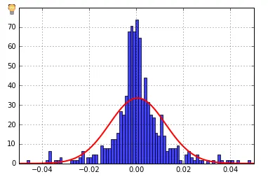
我认为y轴是计数,但我想要概率。怎么做呢?我尝试了很多StackOverflow的答案,但还是无法解决。
seaborn吗?它有几个内置的复合图,可能包含你正在寻找的内容(一旦你弄清楚数据的含义)。 - cphlewis