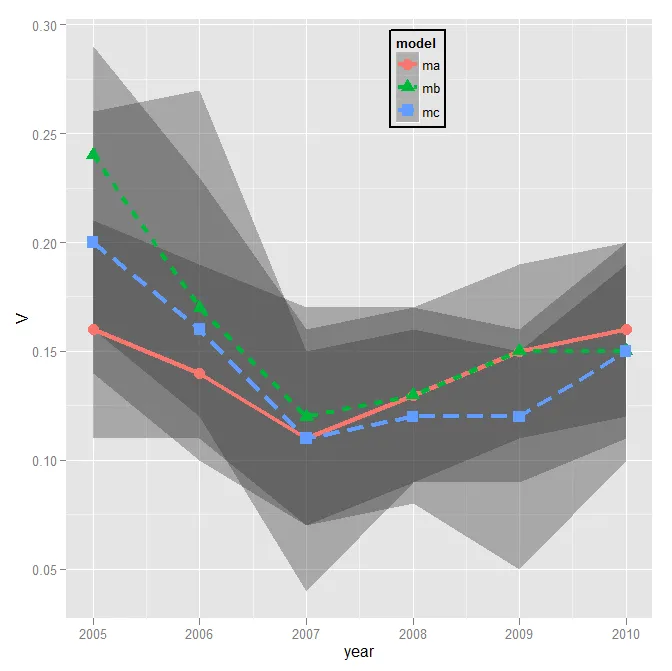
我非常困难地修改我的图例。这里是一个可重现的示例:
dtt <- structure(list(model = structure(c(1L, 1L, 1L, 1L, 1L, 1L, 2L, 2L, 2L, 2L, 2L, 2L, 3L, 3L, 3L, 3L, 3L, 3L), .Label = c("ma", "mb", "mc"), class = "factor"), year = c(2005L, 2006L, 2007L, 2008L, 2009L, 2010L, 2005L, 2006L, 2007L, 2008L, 2009L, 2010L, 2005L, 2006L, 2007L, 2008L, 2009L, 2010L), V = c(0.16, 0.14, 0.11, 0.13, 0.15, 0.16, 0.24, 0.17, 0.12, 0.13, 0.15, 0.15, 0.2, 0.16, 0.11, 0.12, 0.12, 0.15), lower = c(0.11, 0.11, 0.07, 0.09, 0.11, 0.12, 0.16, 0.12, 0.04, 0.09, 0.09, 0.11, 0.14, 0.1, 0.07, 0.08, 0.05, 0.1), upper = c(0.21, 0.19, 0.17, 0.17, 0.19, 0.2, 0.29, 0.23, 0.16, 0.17, 0.16, 0.2, 0.26, 0.27, 0.15, 0.16, 0.15, 0.19)), .Names = c("model", "year", "V", "lower", "upper"), class = "data.frame", row.names = c(NA, -18L))
我的图表是这样生成的:
ggplot(dtt, aes(x=year, y=V, group = model, colour = model, ymin = lower, ymax = upper)) +
    geom_ribbon(alpha = 0.35, linetype=0)+
    geom_line(aes(linetype=model), size = 1.5) +
    geom_point(aes(shape=model), fill = "white", size = 4)  +
    theme(legend.position=c(.6,0.8)) +
    theme(legend.background = element_rect(colour = 'black', fill = 'grey90', size = 1, linetype='solid'))
这将生成以下内容:
现在,我想要做的是:
- 更改图例的标题
- 更改图例项出现的顺序
- 更改图例项的文本。
我已经尝试了很多方法,但没有取得太大的成功。到目前为止,最好的结果是添加了以下内容:
scale_colour_hue(name = "Model 1",
    breaks=c("mb", "ma", "mc"),
    labels=c("MBB", "MAA", "MCC"))
但它生成了这样一个丑陋的东西:
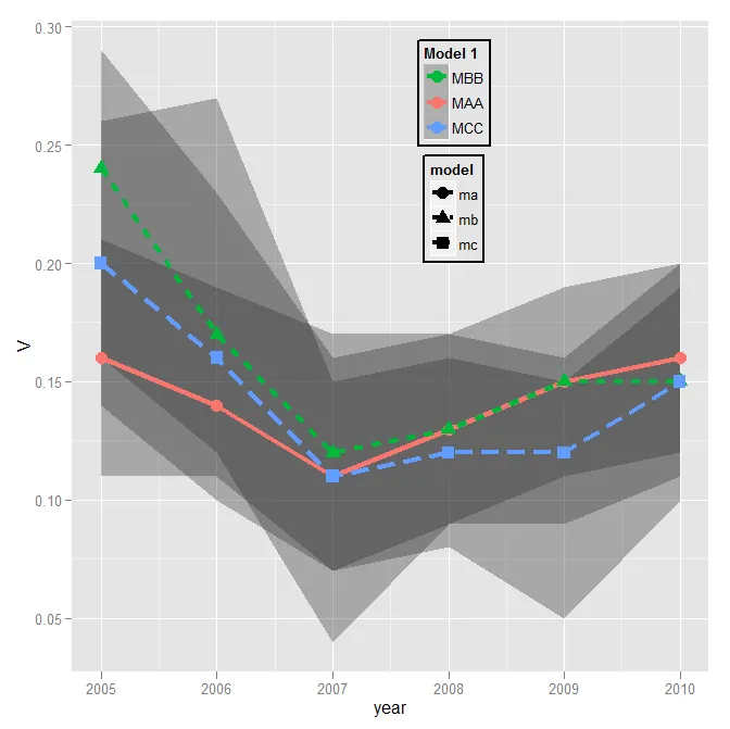
你会发现,现在多了一个不必要的图例,并且图例中的形状与绘图中的不匹配!
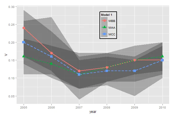
最后,我想让图例中的图形指示蓝色和绿色线条是虚线,而不是实线 - 但我完全不知道如何做到这一点。
任何帮助都将不胜感激,
labels参数用于重命名因子水平。 - Andrielower和upper?我认为学习价值是在dtt中实验定义的。我在这里开了一个新线程 https://stackoverflow.com/q/44167480/54964 - Léo Léopold Hertz 준영