如何使用Basemap(Python)绘制具有50个州的美国地图?

19
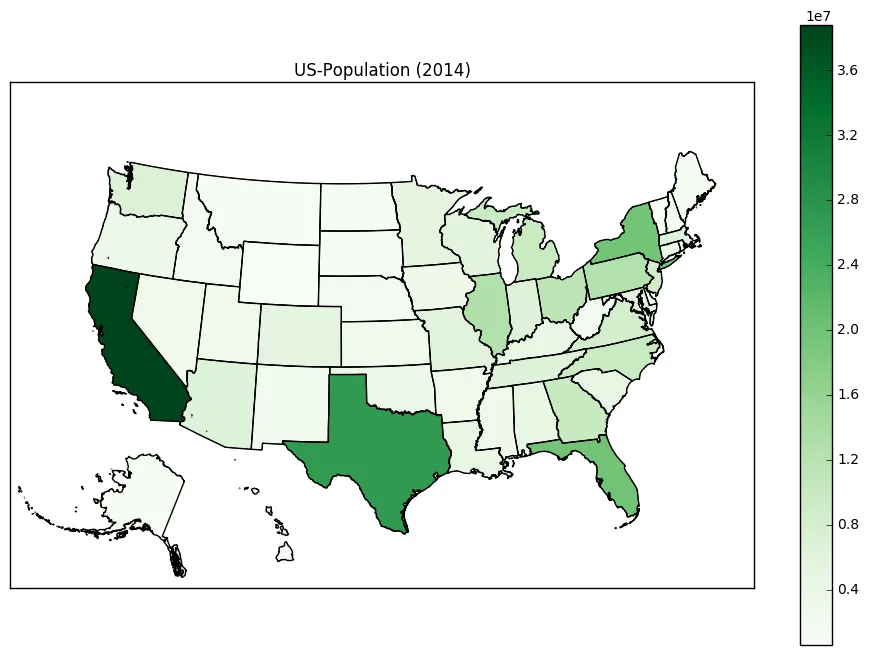
我知道强大的Basemap软件包可以用来绘制带有州边界的美国地图。我已经从Basemap GitHub存储库中改编了这个示例,以绘制48个州的人口密度对应的彩色地图: enter image description here 
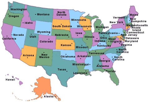
现在我的问题是:是否有一种简单的方法将阿拉斯加和夏威夷添加到该地图中,并将它们放置在自定义位置(例如左下角)?类似于这样:

enter image description here

import numpy as np
import matplotlib.pyplot as plt
from mpl_toolkits.basemap import Basemap as Basemap
from matplotlib.colors import rgb2hex
from matplotlib.patches import Polygon
# Lambert Conformal map of lower 48 states.
m = Basemap(llcrnrlon=-119,llcrnrlat=22,urcrnrlon=-64,urcrnrlat=49,
        projection='lcc',lat_1=33,lat_2=45,lon_0=-95)
# draw state boundaries.
# data from U.S Census Bureau
# http://www.census.gov/geo/www/cob/st2000.html
shp_info = m.readshapefile('st99_d00','states',drawbounds=True)
# population density by state from
# http://en.wikipedia.org/wiki/List_of_U.S._states_by_population_density
popdensity = {
'New Jersey':  438.00,
'Rhode Island':   387.35,
'Massachusetts':   312.68,
'Connecticut':    271.40,
'Maryland':   209.23,
'New York':    155.18,
'Delaware':    154.87,
'Florida':     114.43,
'Ohio':  107.05,
'Pennsylvania':  105.80,
'Illinois':    86.27,
'California':  83.85,
'Hawaii':  72.83,
'Virginia':    69.03,
'Michigan':    67.55,
'Indiana':    65.46,
'North Carolina':  63.80,
'Georgia':     54.59,
'Tennessee':   53.29,
'New Hampshire':   53.20,
'South Carolina':  51.45,
'Louisiana':   39.61,
'Kentucky':   39.28,
'Wisconsin':  38.13,
'Washington':  34.20,
'Alabama':     33.84,
'Missouri':    31.36,
'Texas':   30.75,
'West Virginia':   29.00,
'Vermont':     25.41,
'Minnesota':  23.86,
'Mississippi':   23.42,
'Iowa':  20.22,
'Arkansas':    19.82,
'Oklahoma':    19.40,
'Arizona':     17.43,
'Colorado':    16.01,
'Maine':  15.95,
'Oregon':  13.76,
'Kansas':  12.69,
'Utah':  10.50,
'Nebraska':    8.60,
'Nevada':  7.03,
'Idaho':   6.04,
'New Mexico':  5.79,
'South Dakota':  3.84,
'North Dakota':  3.59,
'Montana':     2.39,
'Wyoming':      1.96,
'Alaska':     0.42}
# choose a color for each state based on population density.
colors={}
statenames=[]
cmap = plt.cm.hot # use 'hot' colormap
vmin = 0; vmax = 450 # set range.
for shapedict in m.states_info:
    statename = shapedict['NAME']
    # skip DC and Puerto Rico.
    if statename not in ['District of Columbia','Puerto Rico']:
        pop = popdensity[statename]
        # calling colormap with value between 0 and 1 returns
        # rgba value.  Invert color range (hot colors are high
        # population), take sqrt root to spread out colors more.
        colors[statename] = cmap(1.-np.sqrt((pop-vmin)/(vmax-vmin)))[:3]
    statenames.append(statename)
# cycle through state names, color each one.
ax = plt.gca() # get current axes instance
for nshape,seg in enumerate(m.states):
    # skip DC and Puerto Rico.
    if statenames[nshape] not in ['District of Columbia','Puerto Rico']:
        color = rgb2hex(colors[statenames[nshape]]) 
        poly = Polygon(seg,facecolor=color,edgecolor=color)
        ax.add_patch(poly)
plt.title('Filling State Polygons by Population Density')
plt.show()

2
注意:所有新的软件开发应尽可能使用Cartopy,现有的软件应开始切换到使用Cartopy的过程中。https://matplotlib.org/basemap/users/intro.html - Max Ghenis
3个回答

26

如果有人感兴趣,我已经成功修复了它。阿拉斯加和夏威夷每个部分的(x,y)坐标应进行翻译。在翻译之前,我还将阿拉斯加缩小了35%。

第二个for循环应该修改如下:

for nshape,seg in enumerate(m.states):
    # skip DC and Puerto Rico.
    if statenames[nshape] not in ['Puerto Rico', 'District of Columbia']:
    # Offset Alaska and Hawaii to the lower-left corner. 
        if statenames[nshape] == 'Alaska':
        # Alaska is too big. Scale it down to 35% first, then transate it. 
            seg = list(map(lambda (x,y): (0.35*x + 1100000, 0.35*y-1300000), seg))
        if statenames[nshape] == 'Hawaii':
            seg = list(map(lambda (x,y): (x + 5100000, y-900000), seg))

        color = rgb2hex(colors[statenames[nshape]]) 
        poly = Polygon(seg,facecolor=color,edgecolor=color)
        ax.add_patch(poly)

这是使用“Greens”颜色映射生成的新美国地图。

输入图片描述


10

上面的答案很好,对我非常有帮助。

我注意到夏威夷的8个主要岛屿之外还有许多延伸数英里的小岛。这些在亚利桑那州、加利福尼亚州和俄勒冈州(或内华达州和爱达荷州)中创建了小点,具体取决于你如何翻译夏威夷。为了删除这些小岛,需要对多边形的面积设置条件。最好通过一次循环遍历states_info对象来实现:

# Hawaii has 8 main islands but several tiny atolls that extend for many miles.
# This is the area cutoff between the 8 main islands and the tiny atolls.
ATOLL_CUTOFF = 0.005

m = Basemap(llcrnrlon=-121,llcrnrlat=20,urcrnrlon=-62,urcrnrlat=51,
    projection='lcc',lat_1=32,lat_2=45,lon_0=-95)

# load the shapefile, use the name 'states'
m.readshapefile('st99_d00', name='states', drawbounds=True)

ax = plt.gca()


for i, shapedict in enumerate(m.states_info):
    # Translate the noncontiguous states:
    if shapedict['NAME'] in ['Alaska', 'Hawaii']:
        seg = m.states[int(shapedict['SHAPENUM'] - 1)]
        # Only include the 8 main islands of Hawaii so that we don't put dots in the western states.
        if shapedict['NAME'] == 'Hawaii' and float(shapedict['AREA']) > ATOLL_CUTOFF:
            seg = list(map(lambda (x,y): (x + 5200000, y-1400000), seg))
        # Alaska is large. Rescale it.
        elif shapedict['NAME'] == 'Alaska':
            seg = list(map(lambda (x,y): (0.35*x + 1100000, 0.35*y-1300000), seg))
        poly = Polygon(seg, facecolor='white', edgecolor='black', linewidth=.5)
        ax.add_patch(poly)

2
“解决方案”仅使用从Census.gov网站下载的shapefile文件, 我的空间映射知识也有限,希望此解决方案适用于某些人..
我必须为我的一个项目进行这个特定任务,我的主管需要一个可高度编辑和直观的映射代码以供其他成员使用。所以这就是我如何设法在一个图中获取所有多边形。
核心思想:在图中创建3个不同的轴(一个用于内陆州,一个用于阿拉斯加和一个用于夏威夷),并操纵轴限制和轴坐标
注意:轴限制取决于使用的shapefile文件的CRS信息(此处使用CRS:4269)
import matplotlib.pyplot as plt
import geopandas as gpd

shp_path="<add your shapefile path here>"
usa_state_shp= gpd.read_file(shp_path)
usa_state_shp= usa_state_shp.to_crs("EPSG:4269") # to replicate the plot shown below

fig = plt.figure(figsize=(20,10))
plt.rcParams["font.family"]="Times New Roman"
plt.rcParams["font.size"]=12
ax1.set_title("USA")
ax1 = plt.axes()  # for the inland states
ax3 = plt.axes([0.27, 0.35, 0.12, 0.12]) # for Alaska
ax2 = plt.axes([0.35, 0.17, 0.14, 0.14]) # For Hawaii

usa_state_shp.boundary.plot(ax=ax1, linewidth=.4, edgecolor='black')
usa_state_shp.boundary.plot(ax=ax2, linewidth=.4, edgecolor='black')
usa_state_shp.boundary.plot(ax=ax3, linewidth=.4, edgecolor='black')

ax1.set_xlim(-128,-65)
ax1.set_ylim(15,50)
ax1.grid(alpha=0.3)
ax1.spines['bottom'].set_color('red')
ax1.spines['top'].set_color('red')
ax1.spines['left'].set_color('red')
ax1.spines['right'].set_color('red')
ax1.xaxis.label.set_color('red')
ax1.yaxis.label.set_color('red')
ax1.tick_params(axis='both', colors='red')
#ax1.legend()
#ax1.set_axis_off();

ax2.set_xlim(-162,-154)
ax2.set_ylim(18,22.5)
ax2.grid(alpha=0.4)
ax2.set_title("Hawaii")
ax2.set_xlabel("")
ax2.set_ylabel("")
#ax2.set_axis_off();
ax2.spines['bottom'].set_color('red')
ax2.spines['top'].set_color('red')
ax2.spines['left'].set_color('red')
ax2.spines['right'].set_color('red')
ax2.xaxis.label.set_color('red')
ax2.yaxis.label.set_color('red')
ax2.tick_params(axis='both', colors='red')

ax3.set_ylim(50,75)
ax3.set_title("Alaska")
ax3.set_xlim(-180,-125)
ax3.grid(alpha=0.4)
ax3.set_xlabel("")
ax3.set_ylabel("")
#ax3.set_axis_off();
ax3.spines['bottom'].set_color('red')
ax3.spines['top'].set_color('red')
ax3.spines['left'].set_color('red')
ax3.spines['right'].set_color('red')
ax3.xaxis.label.set_color('red')
ax3.yaxis.label.set_color('red')
ax3.tick_params(axis='both', colors='red')

生成的地图将类似于这个样子:https://istack.dev59.com/O1jco.webp

enter image description here


网页内容由stack overflow 提供, 点击上面的
可以查看英文原文,
原文链接