我希望能够创建散点图和折线图,并了解比特币价格与人们推文情绪之间是否存在关系。我有一个包含“复合”、“积极”、“中立”和“消极”的列,希望它们展示比特币价格和人们情绪之间的关系。请问是否有解决方案可以应用各种数据可视化技术来展示比特币情绪和价格随时间的关系?或许像散点图或折线图这样的方式。谢谢!
from vaderSentiment.vaderSentiment import SentimentIntensityAnalyzer
import pandas as pd
from matplotlib import pyplot as plt
import seaborn as sns

analyzer = SentimentIntensityAnalyzer()
df=pd.read_csv('cleaned_with_price.csv', header = 0)
df2 = df.drop(['Unnamed: 0', 'id', 'fullname', 'url', 'timestamp', 'replies', 'likes', 'retweets'], axis=1)

## removed unnecesarry stuff
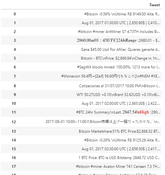
tweets_list = df2['text'].tolist()
tweet_df = pd.DataFrame(tweets_list, columns = ['Tweet'])
tweet_df
这给出了以下结果,
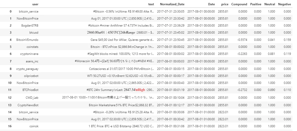
## add columns for each score in the dataframe

tweet_df.Tweet = tweet_df.Tweet.astype('str')

df2['Compound'] = [analyzer.polarity_scores(twt)['compound'] for twt in tweet_df['Tweet']]
df2['Positive'] = [analyzer.polarity_scores(twt)['pos'] for twt in tweet_df['Tweet']]
df2['Neutral'] = [analyzer.polarity_scores(twt)['neu'] for twt in tweet_df['Tweet']]
df2['Negative'] = [analyzer.polarity_scores(twt)['neg'] for twt in tweet_df['Tweet']]
df2
这将输出以下内容:
有人能否推荐一种解决方案来应用不同的数据可视化技术,以显示比特币情绪与随时间变化的价格之间的关系?