我尝试调整您的数值并发现它们不够平滑以计算曲率。事实上,即使是一阶导数也存在缺陷。原因如下:
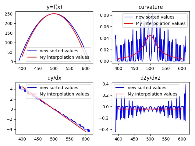
您可以看到,蓝色的数据看起来像一个抛物线,它的导数应该像一条直线,但实际上并非如此。当您进行二阶导数时,情况会变得更糟。红色的图形是使用10000个点计算出的平滑抛物线(使用100个点尝试后,效果相同:完美的线和曲率)。我编写了一个小脚本来“丰富”您的数据,人为地增加点的数量,但结果只会更糟。如果您想尝试,请查看我的脚本。
import numpy as np
import matplotlib.pyplot as plt
def enrich(x, y):
x2 = []
y2 = []
for i in range(len(x)-1):
x2 += [x[i], (x[i] + x[i+1]) / 2]
y2 += [y[i], (y[i] + y[i + 1]) / 2]
x2 += [x[-1]]
y2 += [y[-1]]
assert len(x2) == len(y2)
return x2, y2
data = np.loadtxt('newsorted.txt')
x = data[:, 0]
y = data[:, 1]
for _ in range(0):
x, y = enrich(x, y)
dx = np.gradient(x, x)
dy = np.gradient(y, x)
d2x = np.gradient(dx, x)
d2y = np.gradient(dy, x)
cur = np.abs(d2y) / (np.sqrt(1 + dy ** 2)) ** 1.5
x2 = np.linspace(400, 600, num=100)
y2 = -0.0225*(x2 - 500)**2 + 250
dy2 = np.gradient(y2, x2)
d2y2 = np.gradient(dy2, x2)
cur2 = np.abs(d2y2) / (np.sqrt(1 + dy2 ** 2)) ** 1.5
plt.figure(1)
plt.subplot(221)
plt.plot(x, y, 'b', x2, y2, 'r')
plt.legend(['new sorted values', 'My interpolation values'])
plt.title('y=f(x)')
plt.subplot(222)
plt.plot(x, cur, 'b', x2, cur2, 'r')
plt.legend(['new sorted values', 'My interpolation values'])
plt.title('curvature')
plt.subplot(223)
plt.plot(x, dy, 'b', x2, dy2, 'r')
plt.legend(['new sorted values', 'My interpolation values'])
plt.title('dy/dx')
plt.subplot(224)
plt.plot(x, d2y, 'b', x2, d2y2, 'r')
plt.legend(['new sorted values', 'My interpolation values'])
plt.title('d2y/dx2')
plt.show()
我的建议是使用抛物线对数据进行插值,然后计算出尽可能多的插值点以供使用。
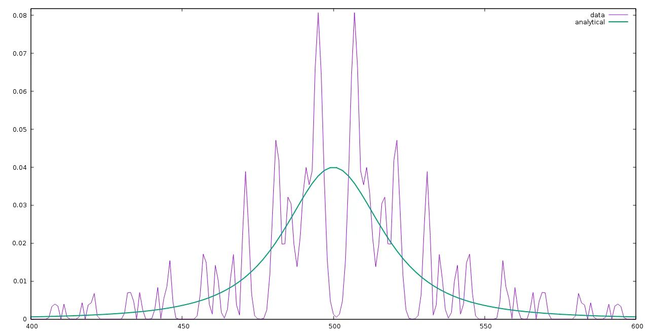 为什么两者之间会有如此大的偏差?如何获得准确的解析值。
x(t), y(t)描述。如果x是你的自变量,那么dx/dx==1。你是指在t或其他自变量上等距离分布吗? - FHTMitchell