居中排列的元素网格中最后一行左对齐

51
我是一位有用的助手,可以为您翻译文本。
我有一堆相同大小的块集合,设置为display:inline-block在一个div中,该div设置了text-align:center以对齐这些块。
|        _____   _____   _____   _____       |
|       |     | |     | |     | |     |      |
|       |  1  | |  2  | |  3  | |  4  |      |
|       |_____| |_____| |_____| |_____|      |
|        _____   _____   _____   _____       |
|       |     | |     | |     | |     |      |
|       |  5  | |  6  | |  7  | |  8  |      |
|       |_____| |_____| |_____| |_____|      |
|                                            |

这些块水平填充 div,当浏览器窗口缩小时,一些块会断开到新行,创建更多的行和较少的列。我希望所有内容仍然保持居中,并且最后一行与左侧对齐,如下所示:
|        _____   _____   _____        |
|       |     | |     | |     |       |
|       |  1  | |  2  | |  3  |       |
|       |_____| |_____| |_____|       |
|        _____   _____   _____        |
|       |     | |     | |     |       |
|       |  4  | |  5  | |  6  |       |
|       |_____| |_____| |_____|       |
|        _____   _____                |
|       |     | |     |               |
|       |  7  | |  8  |               |
|       |_____| |_____|               |
|                                     |

目前发生的情况是这样的:

|        _____   _____   _____        |
|       |     | |     | |     |       |
|       |  1  | |  2  | |  3  |       |
|       |_____| |_____| |_____|       |
|        _____   _____   _____        |
|       |     | |     | |     |       |
|       |  4  | |  5  | |  6  |       |
|       |_____| |_____| |_____|       |
|            _____   _____            |
|           |     | |     |           |
|           |  7  | |  8  |           |
|           |_____| |_____|           |
|                                     |

我无法像某个建议那样添加额外的填充div,因为可能会有任意数量的块,并且行数和列数将根据浏览器宽度而变化。出于同样的原因,我也不能直接为块#7设置样式。无论有多少列,这些块必须始终保持居中
这里有一个演示示例:

http://codepen.io/anon/pen/IDsxn

我觉得这是可能的。我希望不使用flexbox,因为它只支持ie10+,而我需要支持ie9+。我真的很想要一个纯CSS的解决方案,但如果您告诉我JS是唯一的方法,我很愿意看到它的实现。
供参考-类似的问题,尽管没有得到充分的解释: 如何在多行flexbox中左对齐最后一行/行 CSS-将图像的最后一行左对齐到居中的div中 修复流体容器网格中元素的最后一行居中对齐,以使容器保持居中 使用CSS居中多个内联块,并将最后一行与左侧对齐
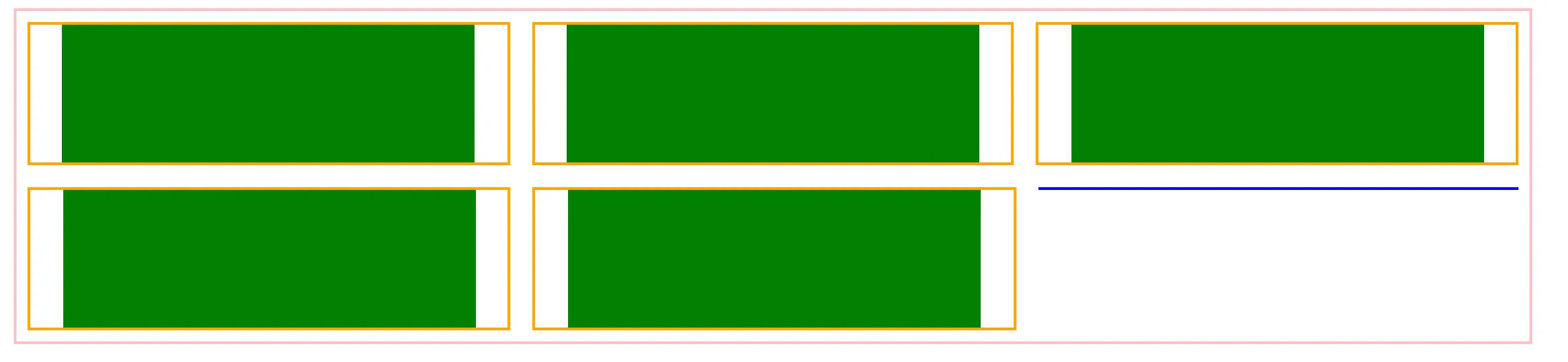
1
@j08691 - 如果屏幕宽度小于容器的最大宽度,那么你会看到这个问题。 - andi
1
在容器上放置一个背景颜色,然后你会看到它并不完美居中。 - andi
1
我猜这可能不可能。或者你需要很多媒体查询来精确指定每个屏幕大小的容器宽度。 - andi
1
@IvanDurst,我已经花了相当长的时间来研究它,我正在发现为什么内联元素如此棘手。它们本质上是文本(因此您的HTML中的空白可能会变得奇怪)。一旦它们触及所在宽度的末尾,就没有收缩包装。您无法指示行何时结束,这就是为什么我们不能轻松地进行悬挂标点符号的原因。这是一个难题:) - Costa Michailidis
1
有趣的是,我在你的问题中找到了我的答案。 - user3442612
显示剩余9条评论
8个回答

16

使用display inline-block解决方案

自适应网格布局更简单:标记和CSS都更少,因此在生产站点中实现并根据您的确切需求进行调整会更加容易。

=>> 演示 <<=(调整结果窗口大小以查看效果)

html, body {
    margin:0;
    padding:0;
}
#container{
    font-size:0;
    margin:0 auto;
    width:1000px;
}
.block {
    font-size:20px;
    width: 150px;
    height: 150px;
    margin:25px;
    background: gold;
    display:inline-block;
}

@media screen and (max-width: 430px) {
    #container{
        width:200px;
    }
}

@media screen and (min-width: 431px) and (max-width: 630px) {
   #container{
        width:400px;
    }
}
@media screen and (min-width: 631px) and (max-width: 830px) {
   #container{
        width:600px;
    }
}
@media screen and (min-width: 831px) and (max-width: 1030px) {
   #container{
        width:800px;
    }
}
<div id="container">
    <div class="block">1</div>
    <div class="block">2</div>
    <div class="block">3</div>
    <div class="block">4</div>
    <div class="block">5</div>
    <div class="block">6</div>
    <div class="block">7</div>
    <div class="block">8</div>
    <div class="block">9</div>
    <div class="block">10</div>
    <div class="block">11</div>
    <div class="block">12</div>
    <div class="block">13</div>
</div>

这涉及以下内容:

  1. 4个媒体查询,用于200像素宽的块和可扩展到1000像素的容器。根据网格元素的宽度和容器的总宽度,您可能需要做更少或更多。

  2. 去除内联块元素之间的空格(在下面的演示中我使用了字体大小技术,但您也可以使用其他技术(请参见如何删除内联块元素之间的空格?了解其他技术)

  3. 固定的块之间的边距

一行中块的数量随容器的大小而自适应。 text-align属性保持默认值left,因此最后一项对齐到左侧。


适应块和容器之间的浮动边距

=>> 演示 <<= (您需要将结果窗口调整为750像素以下以查看其效果)

html, body {
    margin:0;
    padding:0;
    min-width:150px;
}
.wrap {
    float:left;
    position:relative;
}
.foto {
    width: 150px;
    height: 150px;
    background: gold;
    position:absolute;
}

#warning{display:none;}
@media screen and (min-width: 631px) {
    .wrap {
        width:20%;
        padding-bottom:25%;
    }
    .wrap:nth-child(4n+2), .wrap:nth-child(4n+3){
        
    }
    .wrap .foto {
        top:-75px;
        margin-top:100%;
        right:-30px;
    }
    .wrap:nth-child(4n+2){
        margin:0 5% 0 7.5%;
    }
    .wrap:nth-child(4n+3){
     margin-right:7.5%;
    }
    .wrap:nth-child(4n+2) .foto{
        left:50%;
        margin-left:-75px;
    }
    .wrap:nth-child(4n+3) .foto{
        right:50%;
        margin-right:-75px;
    }
    .wrap:nth-child(4n) .foto{
        left:-30px;
    }   
    #container{
        margin-top:-45px;
    }
}

@media screen and (min-width: 481px) and (max-width: 631px) {
    .wrap {
        width:25%;
        padding-bottom:33.3%;
    }
    .wrap:nth-child(3n+2){
        margin:0 12.5%;        
    }
    .wrap .foto {
        top:-75px;
        margin-top:100%;
        right:-37px;
    }
     .wrap:nth-child(3n+2) .foto{
        left:50%;
        margin-left:-75px;
    }
     .wrap:nth-child(3n) .foto{
        left:-37px;
    }
    #container{
        margin-top:-37px;
    }
}


@media screen and (min-width: 331px) and (max-width: 480px) {
    .wrap {
        width:33.3%;
        padding-bottom:50%;
        clear:left;
    }
    .wrap:nth-child(even) {
        float:right;
        clear:right;
    }
    .wrap .foto {
        top:-75px;
        margin-top:100%;
        right:-50px;
    }
    .wrap:nth-child(even) .foto {
        left:-50px;
    }
    .wrap:nth-child(4n+3) .foto, .wrap:nth-child(4n+4) .foto {
        bottom:-75px;
        margin-bottom:100%;
    }
    #container{
        margin-top:-25px;
    }
}


@media screen and (max-width: 330px) {
    .wrap {
        width:50%;
        padding-bottom:100%;
        clear:left;
    }
    .wrap:nth-child(odd) .foto {
        right:-75px;
        bottom:0;
        bottom:-75px;
        margin-bottom:100%;
    }
    .wrap:nth-child(even) .foto {
        top:0px;
        right:-75px;
        top:-75px;
        margin-top:100%;
    }
}

@media screen and (min-width: 751px) {
    #warning{
        color:#fff;
        display:block;
        position:fixed;
        width:100%;
        height:50%;
        top:25%;
        left:0;
        background:#000;
        text-align:center;
        font-size:30px;
}
<div id="container">
    <div class="wrap"><div class="foto">1</div></div>
    <div class="wrap"><div class="foto">2</div></div>
    <div class="wrap"><div class="foto">3</div></div>
    <div class="wrap"><div class="foto">4</div></div>
    <div class="wrap"><div class="foto">5</div></div>
    <div class="wrap"><div class="foto">6</div></div>
    <div class="wrap"><div class="foto">7</div></div>
    <div class="wrap"><div class="foto">8</div></div>
    <div class="wrap"><div class="foto">9</div></div>
    <div class="wrap"><div class="foto">10</div></div>
    <div class="wrap"><div class="foto">11</div></div>
    <div class="wrap"><div class="foto">12</div></div>
    <div class="wrap"><div class="foto">13</div></div>
    <div class="wrap"><div class="foto">14</div></div>
    <div class="wrap"><div class="foto">15</div></div>
</div>

<!-- FOLLOWING JUST FOR THE DEMO -->
<div id="warning">I haven't written the code for windows bigger than 751px.<br/>
    You must resize this window under 751px.</div>

这种技术涉及以下内容:
  1. 浮动
  2. position:absolute;
  3. :nt-child() css选择器
  4. 媒体查询
它将块居中于其容器,并在所有块和容器的顶部/左侧/右侧/底部提供相同的边距。由于此解决方案使用浮动,因此最后一行与左侧对齐。
一行中块的数量会根据窗口的宽度进行自适应。

12

值得一提的是:现在已经是2017年,网格布局模块可以直接实现此功能

* {
    margin:0;
    padding:0;
}

.container {
  display: grid;
  grid-template-columns: repeat(auto-fill, 100px);
  grid-gap: 10px;
  justify-content: center;
  align-content: flex-start;
  margin: 0 auto;
  text-align: center;
  margin-top: 10px;
}
.block {
  background-color: #ddd;
  border: 1px solid #999;
  height: 100px;
  width: 100px;
}
<div class="container">
  <div class="block">Foo</div>
  <div class="block">Foo</div>
  <div class="block">Foo</div>
  <div class="block">Foo</div>
  <div class="block">Foo</div>
  <div class="block">Foo</div>
  <div class="block">Foo</div>
  <div class="block">Foo</div>
  <div class="block">Foo</div>
  <div class="block">Foo</div>
  <div class="block">Foo</div>
  <div class="block">Foo</div>
  <div class="block">Foo</div>
  <div class="block">Foo</div>
  <div class="block">Foo</div>
  <div class="block">Foo</div>
  <div class="block">Foo</div>
  <div class="block">Foo</div>
  <div class="block">Foo</div>
  <div class="block">Foo</div>
  <div class="block">Foo</div>
  <div class="block">Foo</div>
  <div class="block">Foo</div>
</div>

(Codepen演示).

如果浏览器支持满足您的需求-那就使用网格布局。如果不行,那么请继续阅读....


正如@Web-tiki的回答中所提到的,您可以通过一系列媒体查询来使用CSS。

话虽如此,如果您使用像LESS这样的预处理器,这并不是一个难以完成或容易出错的任务。(尽管,是的,CSS仍然会很长丑)

更新的Codepen (调整窗口大小以查看结果)

以下是如何利用LESS设置媒体查询:

首先,根据您需要的设计设置一些LESS变量:

@item-width:100px;
@item-height:100px;
@marginV: 4px;
@marginH: 2px;
@min-cols:2;
@max-cols:9; //set an upper limit of how may columns you want to write the media queries for

接下来:

设置一个迭代 mixin,例如:(你可以将这段代码粘贴到 http://less2css.org

.loopingClass (@index-width) when (@index-width <= @item-width * @max-cols) {
    @media (min-width:@index-width) {
        .container{
            width: @index-width;
        }
    }

    .loopingClass(@index-width + @item-width + 2*@marginH);
}

.loopingClass (@item-width * @min-cols + @min-cols*@marginH*2);

上述mixin将以以下形式生成一系列媒体查询:
@media (min-width: 208px) {
  .container {
    width: 208px;
  }
}
@media (min-width: 312px) {
  .container {
    width: 312px;
  }
}
@media (min-width: 416px) {
  .container {
    width: 416px;
  }
}
@media (min-width: 520px) {
  .container {
    width: 520px;
  }
}
@media (min-width: 624px) {
  .container {
    width: 624px;
  }
}
@media (min-width: 728px) {
  .container {
    width: 728px;
  }
}
@media (min-width: 832px) {
  .container {
    width: 832px;
  }
}

使用剩余的CSS(LESS):

.container {
  margin: 0 auto;
  text-align: center;
  overflow: auto;
    min-width: @min-cols * @item-width;
    max-width: @max-cols * @item-width;
    display: block;
    list-style:none;
}
.block {
  background-color: #ddd;
  border:1px solid #999;
  box-sizing:border-box;
  float: left;
  height: @item-height;
  width: @item-width;
  margin:@marginV @marginH;
}

...你将获得所需的结果。

...并且它非常容易定制布局:

我所需要做的就是根据我的需求更改在LESS mixin中使用的变量 - 我可以得到我想要的确切布局。


1
+1 为创意加分。虽然我很难接受许多媒体查询。 - Ivan Durst
1
我刚刚在帖子中添加了一个CSS网格解决方案 :) - Danield

12

这里有一个非常简单的JavaScript解决方案(还需要对CSS进行一些小改动):

http://jsfiddle.net/ha68t/

我测试过,它运行良好。

CSS:

.container {
  margin: 0 auto;
  max-width:960px;
  background-color: gold;
}

.block {
  background-color: #ddd;
  border:1px solid #999;
  display: block;
  float: left;
  height: 100px;
  margin: 4px 2px;
  width: 100px;
}

JavaScript:

$(document).ready(function(){
    setContainerWidth();
});

$(window).resize(function(){
   setContainerWidth();
});

function setContainerWidth()
{
    $('.container').css('width', 'auto'); //reset
    var windowWidth = $(document).width();
    var blockWidth = $('.block').outerWidth(true);
    var maxBoxPerRow = Math.floor(windowWidth / blockWidth);
    $('.container').width(maxBoxPerRow * blockWidth);
}

需要使用jQuery :)


这是本页面上最简单的实现,即使它需要使用一点js。我不再需要这个解决方案了,但其他人可能会需要! - Ivan Durst
2
在你的问题中,你说你“真的想要一个纯CSS的解决方案”,但是却标记了这个答案作为被接受的答案。不确定发生了什么事情,是反向日吗?如果是,那是否意味着它不是反向日?但如果不是,那是否意味着即使它不是反向日,它也是反向日?我是谁?现在几点了?沃尔多在哪里?那是什么非常明亮的光?妈妈?…… - Cthulhu
@Cthulhu:哈哈,“我真的很想要一个纯CSS的解决方案,但如果你告诉我JS是唯一的方法,我很乐意看到它的实现。”他付诸行动了。我最喜欢他的解决方案。就是这样! - Ivan Durst
1
这真的展示了CSS有多糟糕,如果被接受的解决方案使用jQuery :( - daniel.sedlacek

3
尝试使用简单的CSS实现:
CSS:
.row{text-align:center;font-size:0;} .block{text-align:center;display:inline-block;width:150px;height:15px;margin:5px; border:1px solid #dddddd;font-size:13px;}
HTML:
<div class="row">
  <div class="block"></div> 
</div>

.row{text-align:center;font-size:0;}
    .block{text-align:center;display:inline-block;width:150px;height:150px;margin:5px; border:1px solid #dddddd;font-size:13px;line-height:150px;}
<div class="row">
      <div class="block">1</div> 
      <div class="block">2</div> 
      <div class="block">3</div> 
      <div class="block">4</div> 
      <div class="block">5</div> 
      <div class="block">6</div> 
      <div class="block">7</div> 
      <div class="block">8</div> 
    </div>


这里的元素没有在容器中心对齐 - 它们是左对齐的。左右两侧的边距需要相同。 - Ivan Durst
我没有看到任何问题,请详细说明一下。我已经编辑了边距问题。 - Rakesh Vadnal
元素需要在容器中居中,现在它们是左对齐的。请再次阅读问题 :) - Ivan Durst
@Ivan Durst,现在检查一下,我已经将该行的文本对齐方式更改为text-align:center;。 - Rakesh Vadnal
除了这个解决方案,以上所有方法都没有正确地为我工作。太好了! :) 这正是我所寻找的。 - szatti1489

3

使用flexbox、一些伪元素、额外的div和经过很多挫折后,我能够在没有媒体查询的情况下实现这一点(因为我需要将我的网格放在许多不同大小的元素内,媒体查询对我来说不是很有效)。

一个注意点:项目之间的间距是流动的。

演示:http://codepen.io/anon/pen/OXvxEW

CSS:

.wrapper {
    display: flex;
    flex-wrap: wrap;
    border: 2px solid #ffc0cb;
    max-width: 1100px;
    margin: 0.5rem auto;
    justify-content: center;
}

.wrapper:after {
    content: ' ';
    flex: 1;
    height: 100%;
    border: 1px solid #00f;
    margin: 0.5rem;
}

.child {
    flex: 1;
    border: 2px solid #ffa500;
    min-width: 300px;
    margin: 0.5rem;
    text-align: center;
}

.child-contents {
    width: 300px;
    border: 2px solid #008000;
    height: 100px;
    margin: 0 auto;
}

HTML:

<div class='wrapper'>
    <div class='child'>
        <div class='child-contents'></div>
    </div>
    <div class='child'>
        <div class='child-contents'></div>
    </div>
    <div class='child'>
        <div class='child-contents'></div>
    </div>

    ...etc., more .child's...

</div>

最终结果如下,绿色矩形为 divs。粉/橙色边框仅用于参考,以便您了解正在发生的情况。如果您删除粉/橙色边框,则应该得到所需的网格(但请注意,间距是流体的)。

enter image description here


我会在有时间的时候再仔细看一下,但你可能有所发现。(尽管在Safari 9.1中出现了故障) - Ivan Durst
这种方法对我真的很有效!在伪元素上使用 flex: auto 真的有很大的作用。我已经寻找这个解决方案很久了。谢谢! - richardaum

2

迄今为止,唯一的清洁解决方案是使用CSS网格布局模块Codepen演示)。

基本上,必要的相关代码可以归结为以下内容:

ul {
  display: grid; /* (1) */
  grid-template-columns: repeat(auto-fill, 120px); /* (2) */
  grid-gap: 1rem; /* (3) */
  justify-content: center; /* (4) */
  align-content: flex-start; /* (5) */
}

1) 将容器元素设置为网格容器

2) 使用宽度为120像素的“auto”列数设置网格。 (对于响应式布局,使用auto-fill值)。

3) 为网格行和列设置间隙/间距。

4) 和5) - 类似于flexbox。

body {
  margin: 0;
}
ul {
  display: grid;
  grid-template-columns: repeat(auto-fill, 120px);
  grid-gap: 1rem;
  justify-content: center;
  align-content: flex-start;
  
  /* boring properties: */
  list-style: none;
  width: 90vw;
  height: 90vh;
  margin: 2vh auto;
  border: 5px solid green;
  padding: 0;
  overflow: auto;
}
li {
  background: tomato;
  height: 120px;
}
<ul>
  <li>1</li>
  <li>2</li>
  <li>3</li>
  <li>4</li>
  <li>5</li>
  <li>6</li>
  <li>7</li>
  <li>8</li>
  <li>9</li>
  <li>10</li>
</ul>

Codepen Demo (调整窗口大小以查看效果)


浏览器支持 - Caniuse

目前受到Chrome (Blink)和Firefox的支持,IE和Edge有部分支持(请参阅Rachel Andrew的这篇文章)。


CSS网格布局的更多信息:


1
使用 flexbox:
.container {
  display: -webkit-flex;
   display: flex;
   -webkit-flex-direction: row; 
   flex-direction: row;
   -webkit-justify-content: flex-start;
   justify-content: flex-start;
   flex-wrap:wrap;
}

.block {
  background-color: #ddd;
  border:1px solid #999;
  display: inline-block;
  height: 100px;
  margin: 4px 2px;
  width: 100px;
}

完成。


3
谢谢你的反馈。问题在于整个块集都左对齐容器内,因此在容器内的某些尺寸会在右边出现尴尬的白色边距(请参见此pen并调整窗口大小:http://codepen.io/anon/pen/pvXoEZ)。 你可以通过justify-content:center;解决这个问题,但底部的块将居中对齐,而不是与第一列对齐,这是最初的问题。 我们也希望支持IE9+,但仍希望看到Flexbox的解决方案。我们已经接近成功了! - Ivan Durst
1
@IvanDurst,你可以在.block中添加flex-grow: 1; - 9ete
1
@hawkeye126,如果你在.block中添加flex-grow:1,那么你会调整最后一行的块大小,这不是@IvanDurst想要的。 - Gabriel Kohen
1
@GabrielKohen 是正确的 - 我们不想单独调整任何块的大小,它们是固定大小的。 - Ivan Durst

0

针对您的问题,没有“正常”的解决方案,只有上述的“变通方法”。

情况是这样的,您的块容器将填满可用空间,直到达到最大可用/设置值,然后将所有内部块断开到下一行,这将导致容器溢出。即使使用其他配置,如浮动,也会出现相同的行为。这就是渲染方式 - 每次都贪婪地占用空间来计算内部元素的行为。

也许未来的Flexboxes可以实现这一点 - 但我没有阅读完整的规范。只是一个猜测...


谢谢Mohre,你可能是对的。顺便说一下,这应该是一个评论,而不是答案。 - Ivan Durst

网页内容由stack overflow 提供, 点击上面的
可以查看英文原文,
原文链接