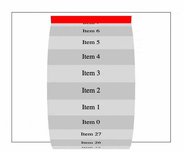
我有一个在x轴上旋转的3D css轮/圆柱形动画。我的问题是动画似乎在其容器之外上下移动。以下是示例GIF...
(function($) {

  const $wheel = $('.wheel .wheel__inner');
  const items = 28;
  const diameter = $wheel.height();
  const radius = diameter / 2;
  const angle = 360 / items;
  const circumference = Math.PI * diameter;
  const height = circumference / items;

  for (let i = 0; i < items; i++) {
    var transform = `rotateX(${ angle * i }deg) translateZ(${ radius }px)`;

    $('<div>', {
      class: 'wheel__segment'
    }).css({
      'transform': transform,
      'height': height,
    }).html(`<span>Item ${ i }</span>`).appendTo($wheel);
  }

})(jQuery);
*,
*:before,
*:after {
box-sizing: border-box;
}
.wheel {
perspective: 1000px;
border: 1px solid #333;
margin: 50px;
}
.wheel .wheel__inner {
background-color: red;
position: relative;
width: 200px;
height: 350px;
margin: 0 auto;
transform-style: preserve-3d;
animation-iteration-count: infinite;
animation-timing-function: linear;
animation-name: spin;
animation-duration: 6s;
}
.wheel .wheel__inner .wheel__segment {
display: flex;
justify-content: center;
align-items: center;
width: 100%;
height: 40px;
position: absolute;
top: 50%;
background-color: #ccc;
}
.wheel .wheel__inner .wheel__segment:nth-child(even) {
background-color: #ddd;
}
@-webkit-keyframes spin {
0% {
transform: rotateX(360deg);
}
50% {
transform: rotateX(180deg);
}
100% {
transform: rotateX(0deg);
}
}<script src="https://cdnjs.cloudflare.com/ajax/libs/jquery/3.3.1/jquery.min.js"></script>
<div class="wheel">
<div class="wheel__inner">
</div>
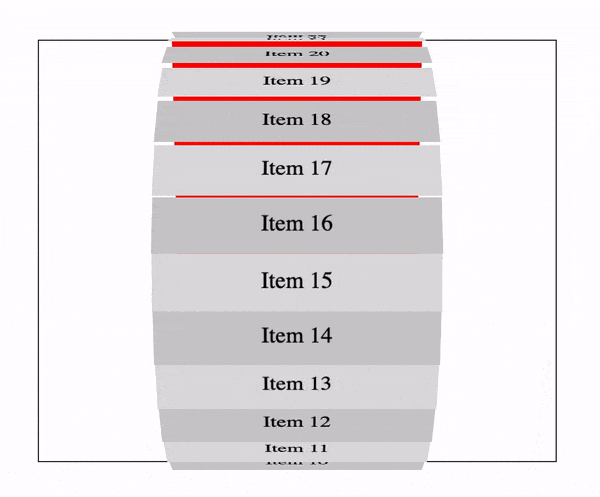
</div>我可以通过为每个分段添加 transform-origin: 50% 0; 来停止上下运动,但这会引起新问题。分段之间有间隙!如下所示...
( function( $ ) {

    const $wheel = $( '.wheel .wheel__inner' );
    const items = 28;
    const diameter = $wheel.height();
    const radius = diameter / 2;
    const angle = 360 / items;
    const circumference = Math.PI * diameter;
    const height = circumference / items;

    for ( let i = 0; i < items; i++ ) {
        var transform = `rotateX(${ angle * i }deg) translateZ(${ radius }px)`;

        $( '<div>', {
            class: 'wheel__segment'
        } ).css( {
            'transform': transform,
            'height': height,
        } ).html( `<span>Item ${ i }</span>` ).appendTo( $wheel );
    }

} )( jQuery );
*, *:before, *:after {
box-sizing: border-box;
}
.wheel {
perspective: 1000px;
border: 1px solid #333;
margin: 50px;
}
.wheel .wheel__inner {
background-color: red;
position: relative;
width: 200px;
height: 350px;
margin: 0 auto;
transform-style: preserve-3d;
animation-iteration-count: infinite;
animation-timing-function: linear;
animation-name: spin;
animation-duration: 6s;
}
.wheel .wheel__inner .wheel__segment {
display: flex;
justify-content: center;
align-items: center;
width: 100%;
height: 40px;
position: absolute;
top: 50%;
background-color: #ccc;
transform-origin: 50% 0;
}
.wheel .wheel__inner .wheel__segment:nth-child(even) {
background-color: #ddd;
}
@-webkit-keyframes spin {
0% {
transform: rotateX(360deg);
}
50% {
transform: rotateX(180deg);
}
100% {
transform: rotateX(0deg);
}
}<script src="https://cdnjs.cloudflare.com/ajax/libs/jquery/3.3.1/jquery.min.js"></script>
<div class="wheel">
<div class="wheel__inner">
</div>
</div>