将对角线分割成3个div

4

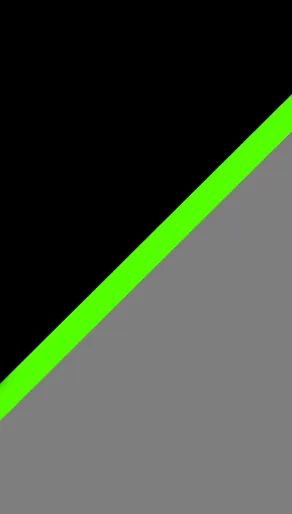
尝试实现像图片所示的效果,但不确定最佳方法,因为我想在悬停时改变div的高度。

容器div必须是100%宽度、100%高度,里面的div完全响应。

边框、伪元素或背景对于这种情况不起作用。

enter image description here

html

<div class="container">
  <div class="top"></div>
  <div class="center">
    <p>text text</p>
  </div>
  <div class="bottom"></div>
</div>

css

.container{
      width: 100%;
      height: 100vh;
      overflow: hidden;
     //  transform: skewY(-45deg);
     //  transform: rotate(-45deg);
}
.top, .bottom {
    width: 100%;
    height: calc(50% - 20px);
}
.top {
    background: black;
}
.bottom {
    background: grey;
}
.center {
    background: green;
    height: 40px;
    width: 100%;
}
p {
  color: white;
  line-height: 10px;
  text-align: center;
}

jsfiddle 中,您将看到旋转和skewY都已经注释。

请尝试以下答案:http://stackoverflow.com/questions/38142498/split-div-with-diagonal-line - Alfin Paul
为什么不使用渐变背景? - Roko C. Buljan
不确定能否使用渐变背景来动画化整个事物。 - Tyra Pululi
3个回答

1

 .gradient{ width: 250px; height: 500px;
  background: -webkit-linear-gradient(-45deg, #000 0% , #000 45%, #53ff00 45%, #53ff00 50%, #7e7e7e 50%, #7e7e7e 100%);
  background: -moz-linear-gradient(-45deg, #000 0% , #000 45%, #53ff00 45%, #53ff00 50%, #7e7e7e 50%, #7e7e7e 100%);
  background: linear-gradient(-45deg, #000 0% , #000 45%, #53ff00 45%, #53ff00 50%, #7e7e7e 50%, #7e7e7e 100%);
  
  }
<div class="gradient"></div>

您可以使用线性渐变。

谢谢回复,我试图避免使用这种方法,因为它会导致悬停。 - Tyra Pululi

1

希望这对你有用。

如果想要纯CSS解决方案,你可以尝试这个。 它使用了三角形面积和其他所有计算。 我给父级DIV设置了width: 300px;height:600px;,然后进行了计算。您可能需要相应地进行更改。 我使用SCSS编写我的CSS,所以对我来说很容易。尽管我已经尝试使用calc进行更多的计算,使其更加友好。

.parent {
  position: relative;
  width: 300px;
  overflow: hidden;
  display: flex;
  flex-direction: column;
  height: 600px;
  /* Not relevant. this was used to show a Guide-point of intersection of one of triangle's side. 
  &:before {
    content: '';
    width: 2px;
    height: 2px;
    background: #000;
    position: absolute;
    left: calc(50% - 1px);
    top: -1px;
    display: block;
  }
  &:after {
    content: '';
    width: 2px;
    height: 2px;
    background: #000;
    position: absolute;
    left: calc(50% - 1px);
    bottom: -1px;
    display: block;
  }
  */
}

.child {
  min-height: 20px;
  padding: 15px;
  transform: skewY(-30deg);
  transition: all 0.2s ease;
  display: flex;
  align-content: center;
  align-items: center;
}

.child:hover {
  height: calc(100% - 40px);
}

.child:hover~.child {
  height: 20px;
}

.child__inner {
  transform: skewY(30deg);
  color: #fff;
}

.child--top {
  background: tomato;
  height: calc(50% - 20px);
  margin-top: calc((150px / 1.73)* -1);
  padding-top: calc((150px / 1.73) * 2);
}

.child--middle {
  background: DeepSkyBlue;
}

.child--bottom {
  background: MediumSeaGreen;
  height: calc(50% - 20px);
  margin-bottom: calc((150px / 1.73)* -1);
  padding-bottom: calc((150px / 1.73) * 2);
}
<div class="parent">
  <div class="child child--top">
    <div class="child__inner">
      Lorem ipsum dolor sit amet, consectetur adipisicing elit. Delectus, accusantium. Illo minima ipsa, at dignissimos perspiciatis nesciunt. Hic quae porro assumenda possimus fugit, velit eaque magni, reiciendis veritatis perspiciatis recusandae?
    </div>
  </div>
  <div class="child child--middle">
    <div class="child__inner">

    </div>
  </div>
  <div class="child child--bottom">
    <div class="child__inner">

    </div>
  </div>
</div>

如果您想检查SCSS,以下是代码。
.parent {
  position: relative;
  width: 300px;
  overflow: hidden;
  display: flex;
  flex-direction: column;
  height: 600px;
  /* Not relevant. this was used to show a Guide-point of intersection of one of triangle's side. 
  &:before {
    content: '';
    width: 2px;
    height: 2px;
    background: #000;
    position: absolute;
    left: calc(50% - 1px);
    top: -1px;
    display: block;
  }
  &:after {
    content: '';
    width: 2px;
    height: 2px;
    background: #000;
    position: absolute;
    left: calc(50% - 1px);
    bottom: -1px;
    display: block;
  }
  */
}

.child {
  min-height: 20px;
  padding: 15px;
  transform: skewY(-30deg);
  transition: all 0.2s ease;
  display: flex;
  align-content: center;
  align-items: center;

  &:hover {
    height: calc(100% - 40px);
  }
  &:hover ~ .child {
    height: 20px;
  }
  &__inner {
    transform: skewY(30deg);  
    color: #fff;
  }
  &--top {
    background: tomato;
    height: calc(50% - 20px);
    margin-top: calc((150px / 1.73)* -1);
    padding-top: calc((150px / 1.73) * 2);
  }
  &--middle {
    background: DeepSkyBlue;
  }
  &--bottom {
    background: MediumSeaGreen;
    height: calc(50% - 20px);
    margin-bottom: calc((150px / 1.73)* -1);
    padding-bottom: calc((150px / 1.73) * 2);
  }
}

参考资料: 三角形及其边长高度/宽度的面积


看起来不错,你觉得用这种方法可以改变比例吗?例如,当悬停在番茄div上时,高度会增加,DeepSkyBlue会向下移动,而MediumSeaGreen div的高度会减少? - Tyra Pululi
1
其他选项不是纯CSS的话,就只能用JS计算尺寸了,对吧? - Tyra Pululi
是的,在悬停时进行动画是可能的。这将再次需要一些计算,因为它必须成比例。 - Deepak Yadav
@TyraPululi 我已经更新了答案,加入了基本动画。你可以根据自己的需求进行修改或自定义。虽然需要一些努力,但是这是可行的。 - Deepak Yadav
我遇到了一个小问题,我需要在顶部div和底部div中放置一些文本,但我无法找到如何定位文本的方法。 - Tyra Pululi
@TyraPululi,有一个名为child__inner的div。请将您的文本添加到该div中。 - Deepak Yadav

0

使用border样式非常简单:

#id1 {
        background-color: #53ff00;
            position: relative;
            width:100px;
    }
    #id2 {
        width: 0;
        height: 0;
        border-top: 100px solid #000;
        border-right: 100px solid transparent;      
    }
    #id3 {
        width: 0;
        height: 0;
       border-bottom: 100px solid #969696;
        border-left: 100px solid transparent;
       margin-top:-65px
    }
    #top{
        height: 50px;
        background-color: #000;
        width:100px;
    }
    #bottom{
        height: 50px;
        background-color: #969696;
        margin-top: -4px;
        width:100px;
    }
<script src="https://ajax.googleapis.com/ajax/libs/jquery/2.1.1/jquery.min.js"></script>
    <div id="top"></div>
    <div id="id1">
      <div id="id2"></div>
      <div id="id3"></div>
    </div>
    <div id="bottom"></div>

完整的CSS形状请查看此链接: CSS形状


感谢回复,伪元素在这种情况下也行不通。容器必须是100%的宽度和高度,并且完全响应式的。 - Tyra Pululi

网页内容由stack overflow 提供, 点击上面的
可以查看英文原文,
原文链接