我正在寻找一种方法,可以使模态对话框始终保持在屏幕范围内,即其高度始终小于屏幕高度,并相应地调整其宽度。我尝试了:
.modal-dialog {
  max-height: 100%;
}
但这似乎没有任何效果。
一个示例:
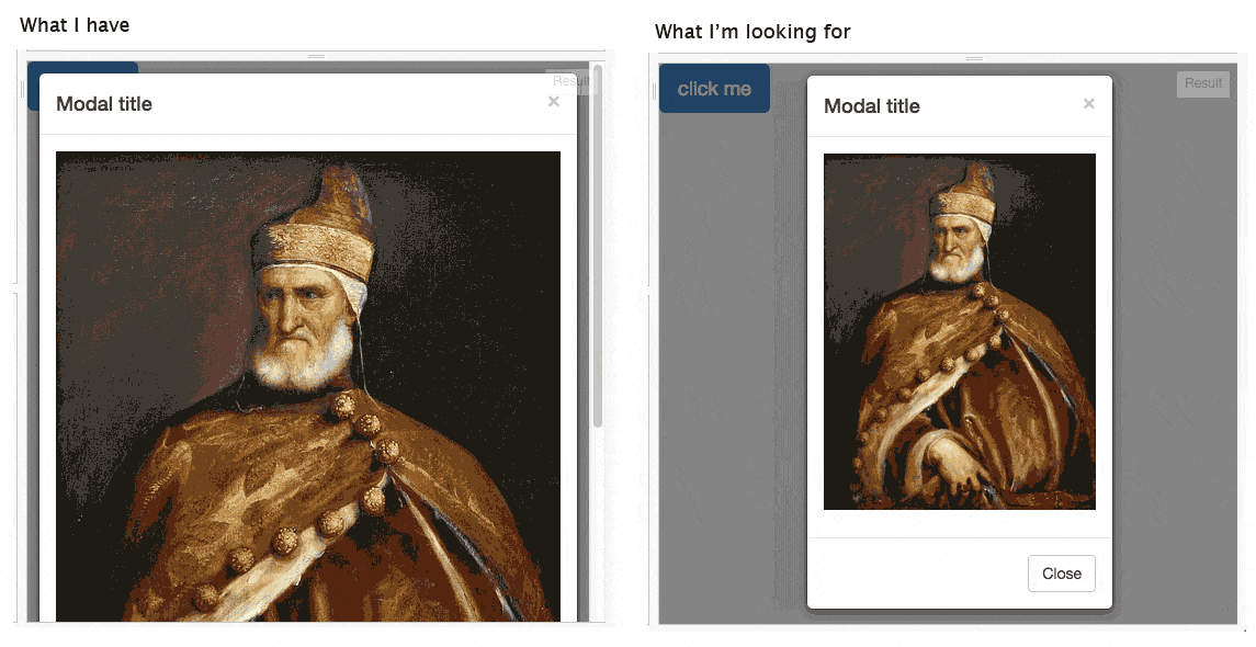
如果存在纯CSS解决方案(无js),我更喜欢它。为了清晰起见,我要寻找的是max-height而不是height(即模态框不能比屏幕更高)。
我正在寻找一种方法,可以使模态对话框始终保持在屏幕范围内,即其高度始终小于屏幕高度,并相应地调整其宽度。我尝试了:
.modal-dialog {
max-height: 100%;
}
但这似乎没有任何效果。
一个示例:
如果存在纯CSS解决方案(无js),我更喜欢它。为了清晰起见,我要寻找的是max-height而不是height(即模态框不能比屏幕更高)。
使用 视窗单位 结合 calc 使用。像这样:
.img-responsive {
    max-height: calc(100vh - 225px);
}
......其中225px对应于包围对话框顶部和底部部分的视口的高度之和。
此外,为了处理模态框的宽度,我们需要设置更多属性:
.modal {
    text-align:center;
}
.modal-dialog {
    display: inline-block;
    width: auto;
}
我们可以用 padding + 负边距技术代替 calc,代码如下:
.img-responsive {
    max-height: 100vh;
    margin: -113px 0;
    padding: 113px 0;
}
PS: viewport单位的浏览器支持非常好,详见
calc 的方法。 - Danield将焦点放在modal-body而不是modal-dialog上。
在您的CSS中添加以下内容:
max-height: 80vh;
overflow-y: auto;
.modal-body {
    max-height: 80vh; overflow-y: auto;
}
根据个人喜好调整 VH 高度。
脚本
$('#myModal').on('show.bs.modal', function () {
$('.modal-content').css('max-height',$( window ).height()*0.8);
$('.modal-content img').css('max-height',(($( window ).height()*0.8)-86));
});
默认情况下,宽度和高度的默认值被设置为自动和100%。您只需按照以下方式修改视区内的图像和目标ID:
/*let target has the same value as modal-dialog*/
#myModal {
    width:auto;
    height:auto;
    margin:0 auto;
}
/*modify image inside modal-dialog*/
.modal-dialog,.modal-dialog img { /*same value to avoid overwidth*/
    width:70%;
    height:70%;
    margin:0 auto;
}
.modal-dialog img {
    width:100%;
    height:100%;
    margin:0 auto;
}
.modal-dialog {/*modify the modal-dialog*/
/*ONLY CHANGE THIS, NOT others (#myModal or .modal-image img)*/
    width:60%;
    height:60%;
    margin:0 auto;
}
更新的 演示:
如果您确保父元素已设置高度,则应该可以轻松完成。我在此处为标题和页脚分别设置了10%的高度,并将主体设置为80%,以便它们总共为100% :)
.modal, .modal-dialog, .modal-content{
  height: 100%;

}
.modal-header, .modal-footer {height:10%;}
.modal-body {height:80%;}
.img-responsive {
    max-height:100%;
}
.modal-content p{ height: 100%; } - Achilles首先确定容器大小,然后设置模态框大小。
例如:
.modal{height:100%;width:50%;margin: 0 auto;}
.modal-dialog{overflow:hidden; max-height:96%;}
 .modal-dialog {
      max-height: 225px;
      max-width:  200px;
      margin-left: auto;
      margin-right: auto;
    }
尝试在Fiddle上进行一些CSS更改。
CSS:
.modal-dialog {
 height: 100%;
 margin: 0;
 padding: 10px;
}
.modal-content { height:100%; }
.modal-body {
position: absolute;
padding: 15px;
left:0;
right:0;
top: 55px;
bottom: 65px;
margin: auto;
}
.modal-body > p {
height: 100%;
margin: 0;
}
.img-responsive{
max-height: 100%;
max-width: 100%;
margin:auto;
}
.modal-footer {
position: absolute;
bottom: 0;
left: 0;
right: 0;
}
我认为你应该在 .modal-dialog 上使用 overflow: hidden,同时使用一种样式来保持图像的比例。